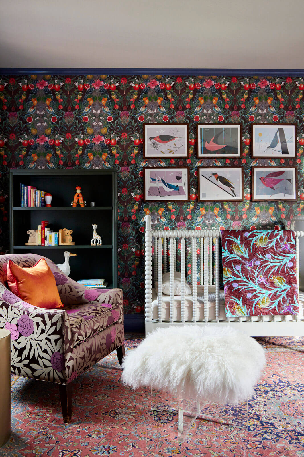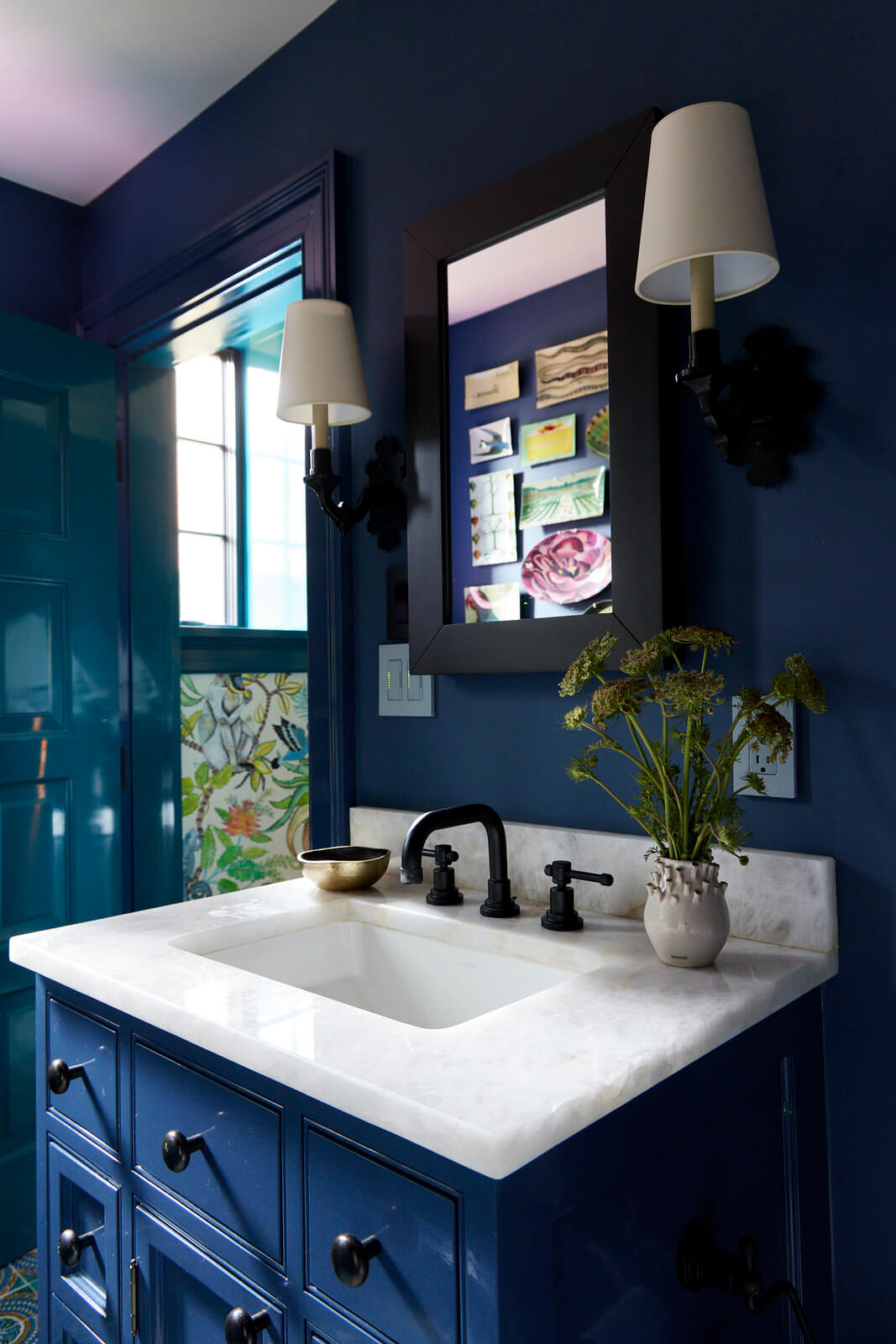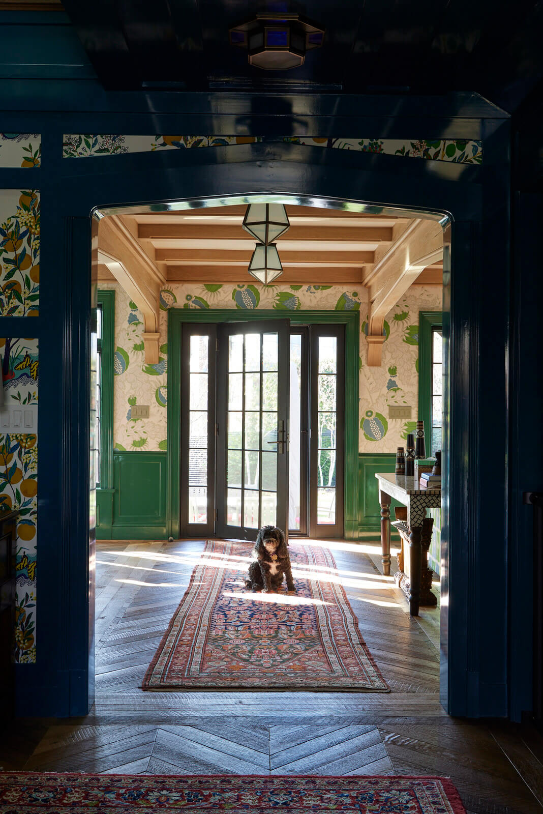
“I want no white walls.”
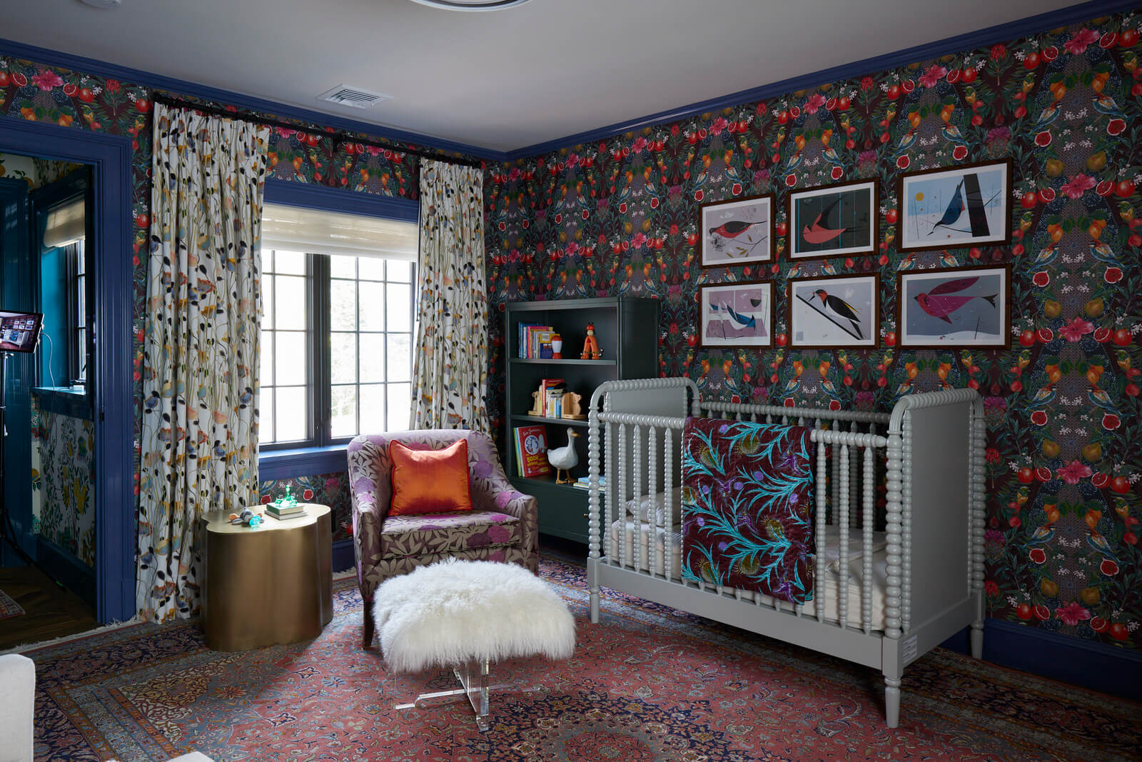
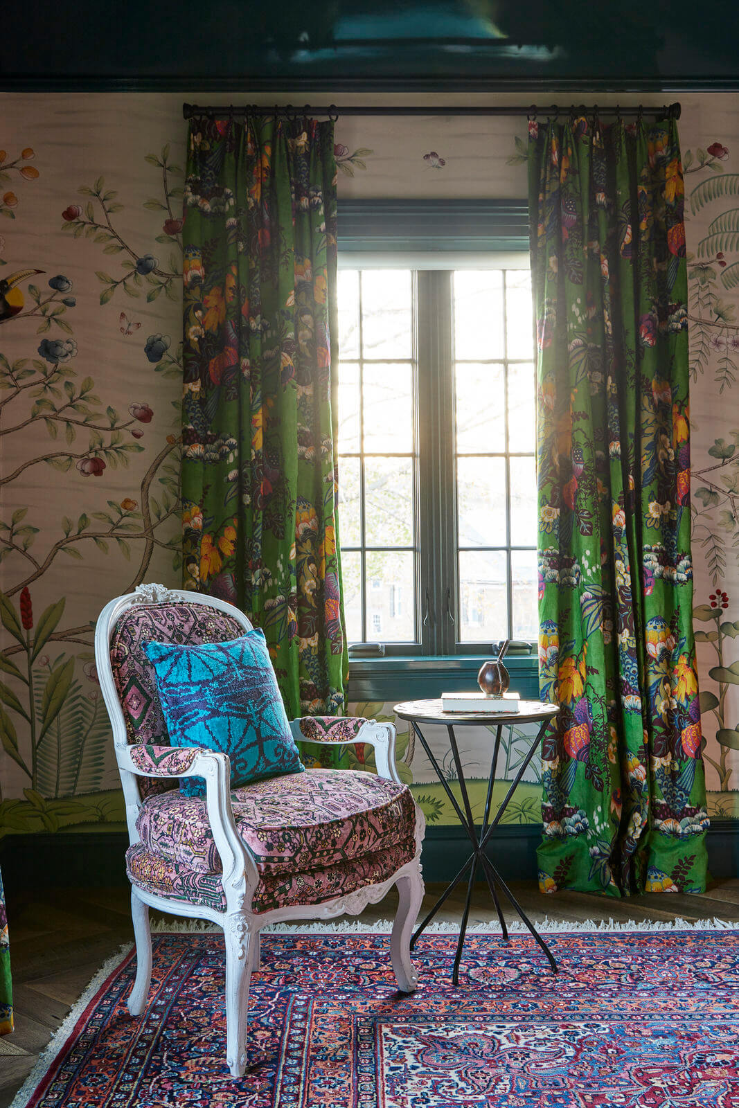
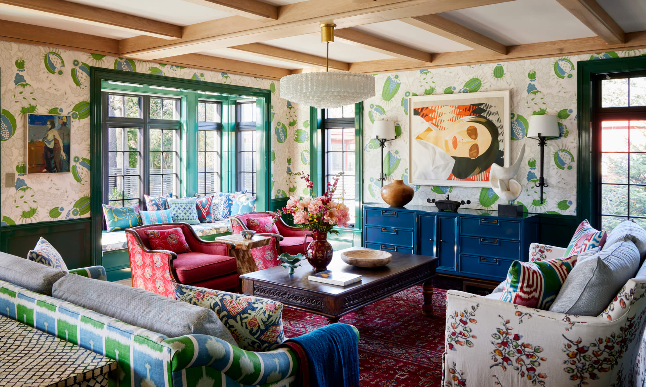
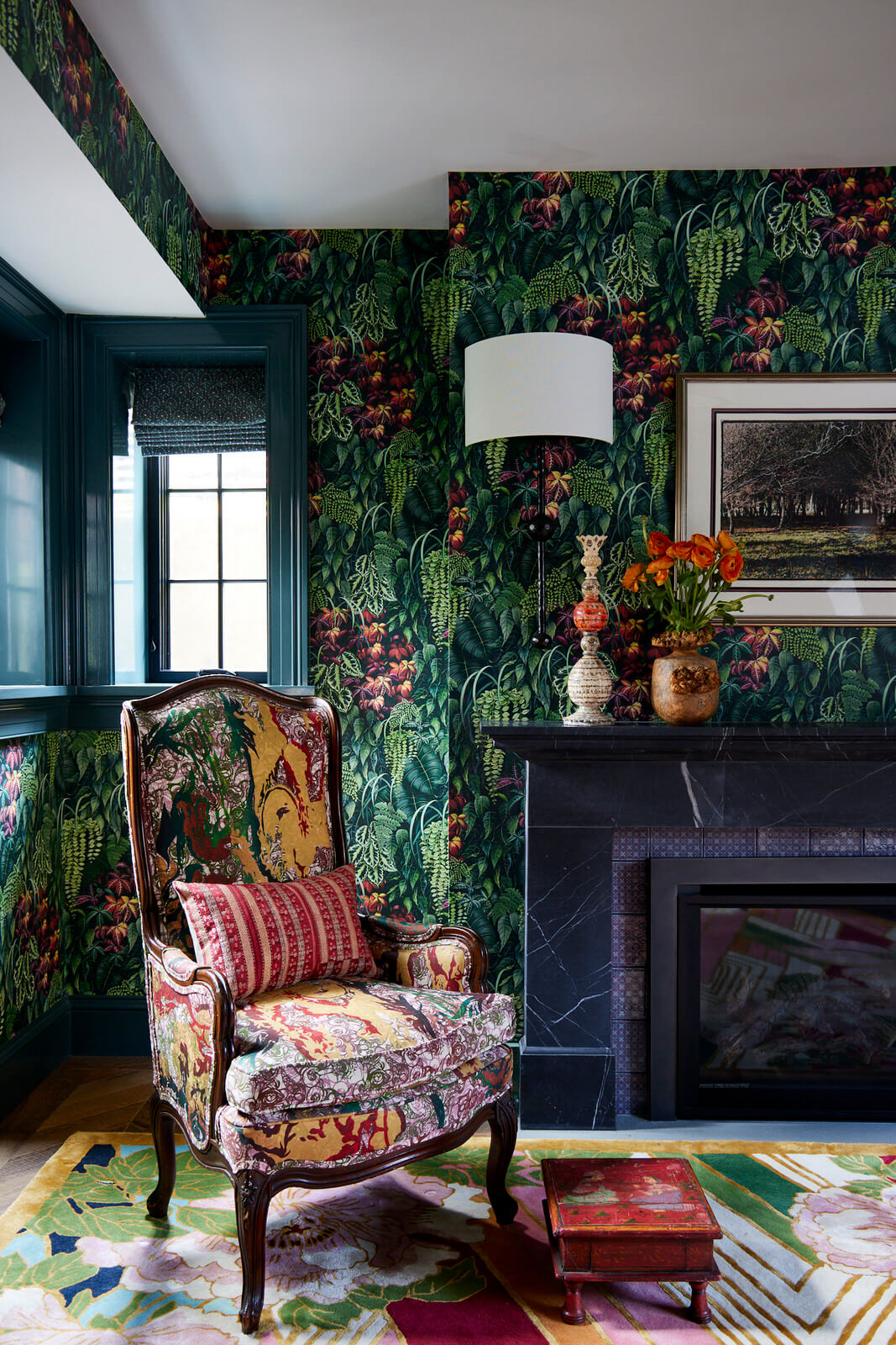
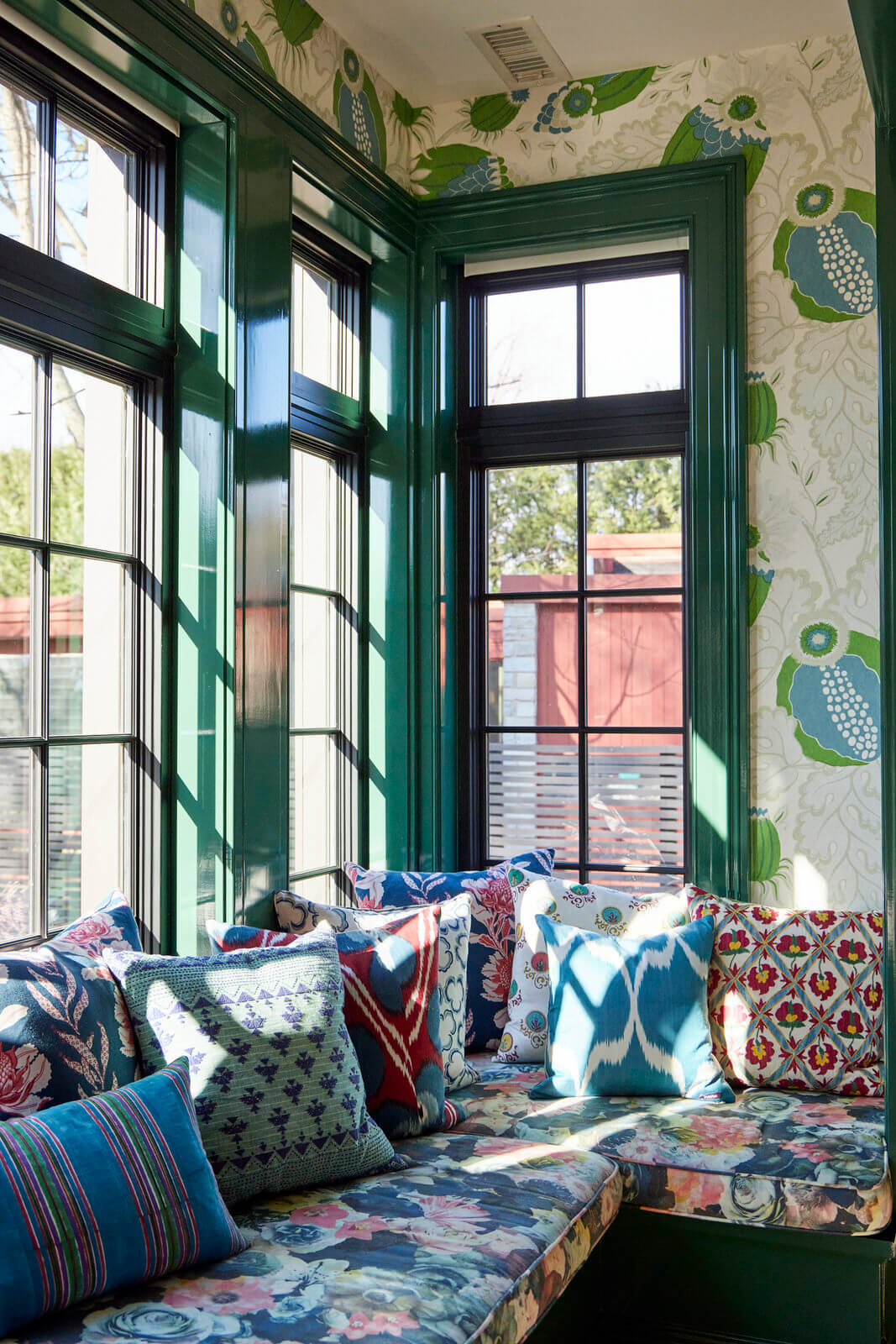
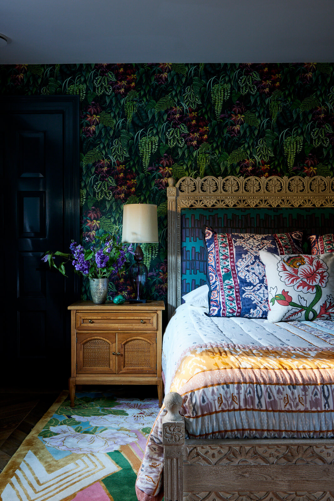
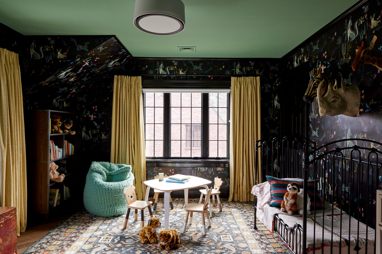
With those five words, KCD had its Tudor home interior design directive and began the process of gathering ideas + inspiration. Since we’re known as the go-to interior designers for color and pattern, those words also served as confirmation that we and our client were perfectly in synch. With that, a happy collaboration took off in this “Millennial Gothic” home, a modern take on the house’s original Tudor interior design style.
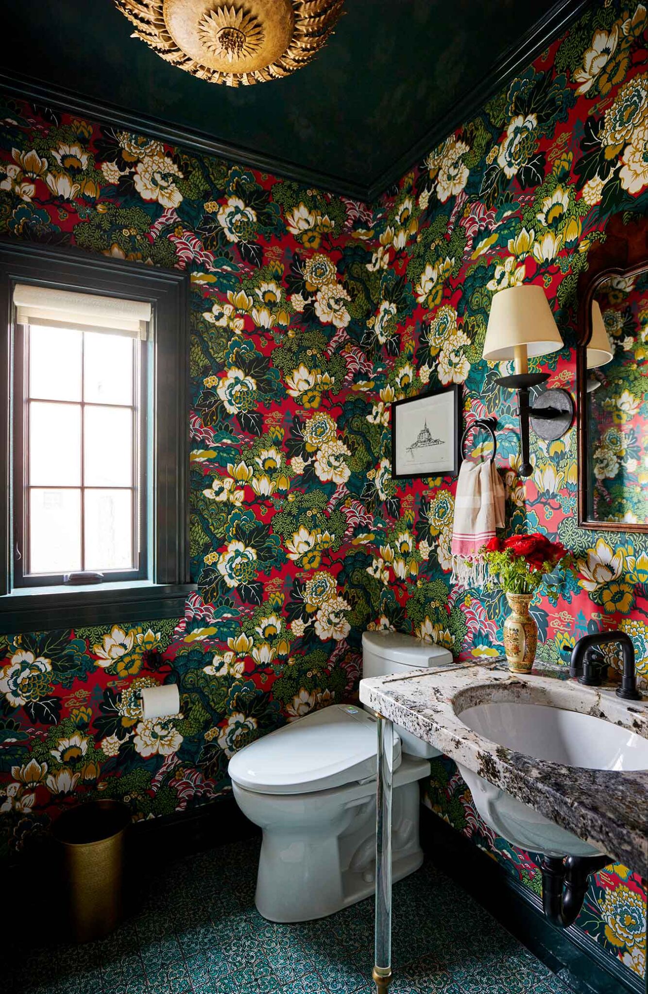
Built in 1939, the 4500 square foot house was landmarked, meaning: no changes could be made to the front façade. But we could change the back…and we did. It was essential to bringing light and life into the dark spaces, which, following a 1980s remodel, left the home with little of its original character. We designed the interiors to feel like they’d been there forever and working closely with ART architects, modernized the spaces to create and interior design for a young family of four to live and grow.
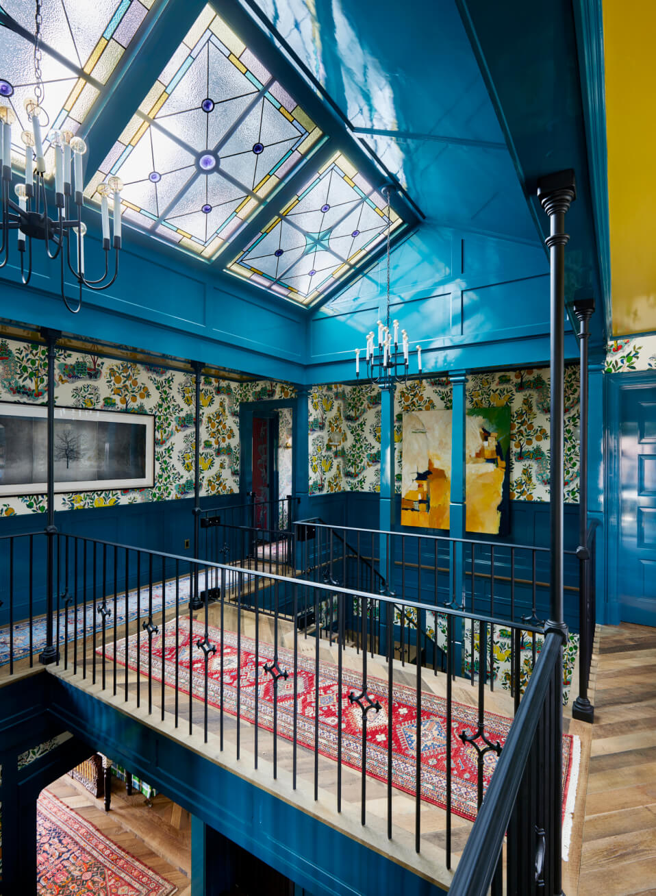
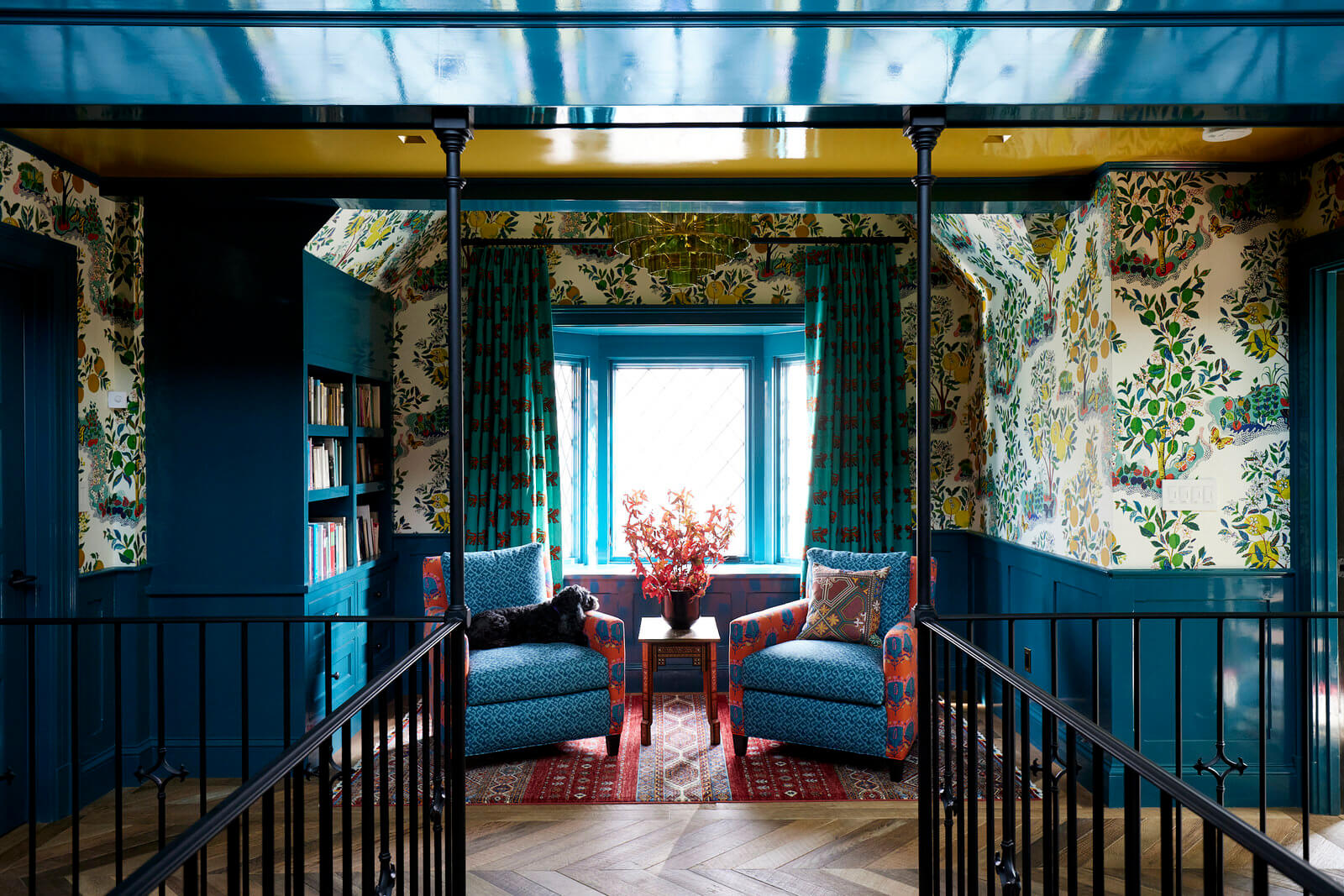
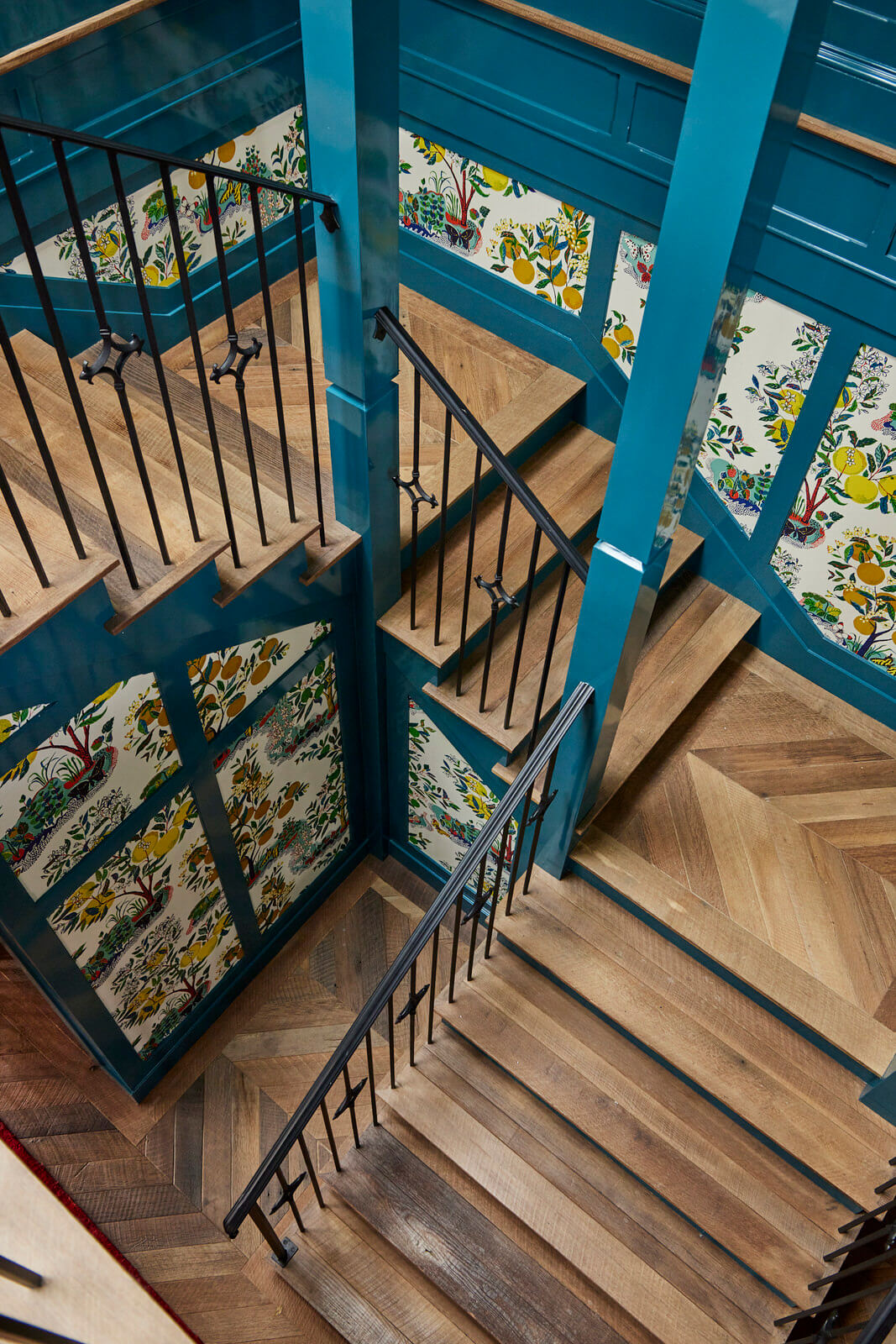
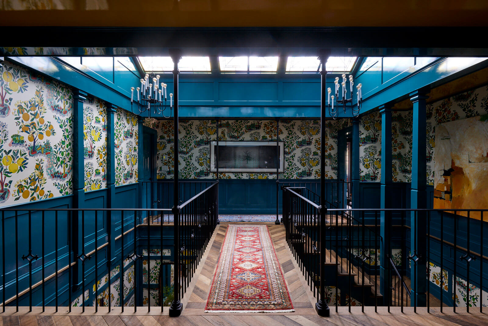
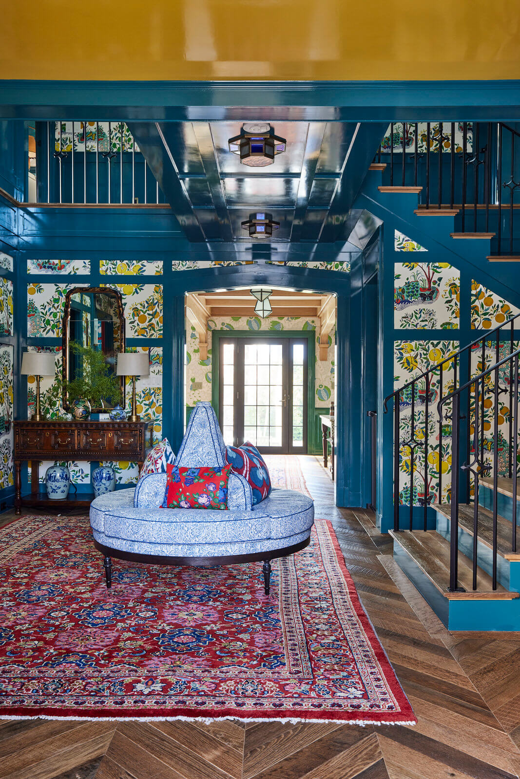
Everything radiated from the home’s double height entryway we nicknamed “the knuckle,” and so it’s where we started our color story. Asking the question: “What color should this entrance be,” and hearing the answer…teal…inspired our color (and pattern) progression as all the rooms radiate from this central point. The Boston interior design evolved to a balanced mix of scale, proportion and color; when we were done, harmony reigned, and beauty flourished. (Schumacher’s Citrus Garden, complete with lemons and luscious colors, definitely boosted the beauty factor!)
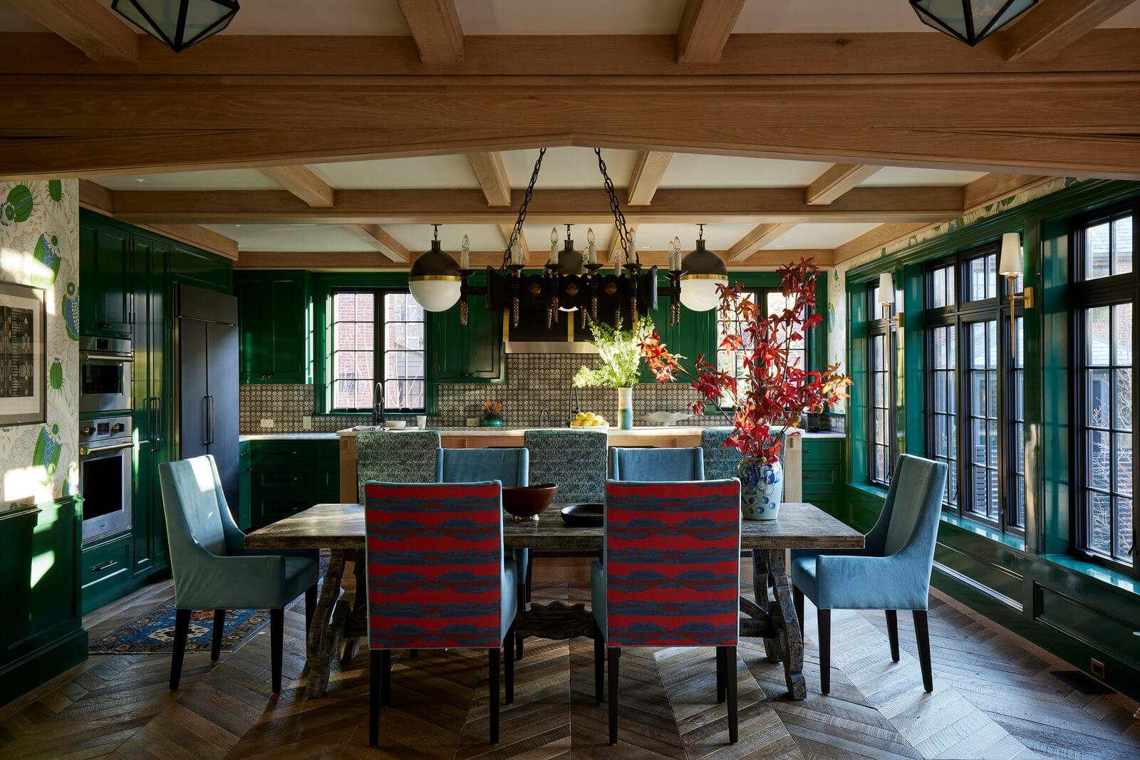
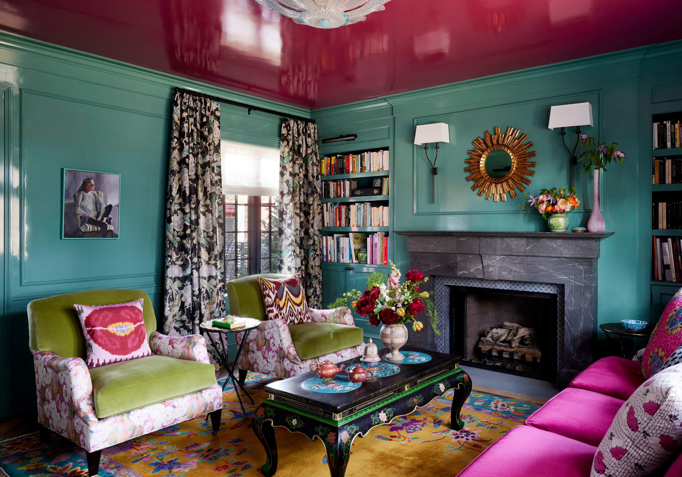
The kitchen design, which is open to the main family living and dining space, was planned meticulously, and though the florals and motifs of the wallpaper and furniture give it a decidedly feminine vibe, it’s counter-balanced with masculine details of dark bronze and black finishes—a nod to the chef of the family, the “man of the house”. But “the woman of the house” was well represented too, especially in the library where we fulfilled her wish for a pink ceiling in the library, like all our color choices throughout, it was gentle, but vibrant.
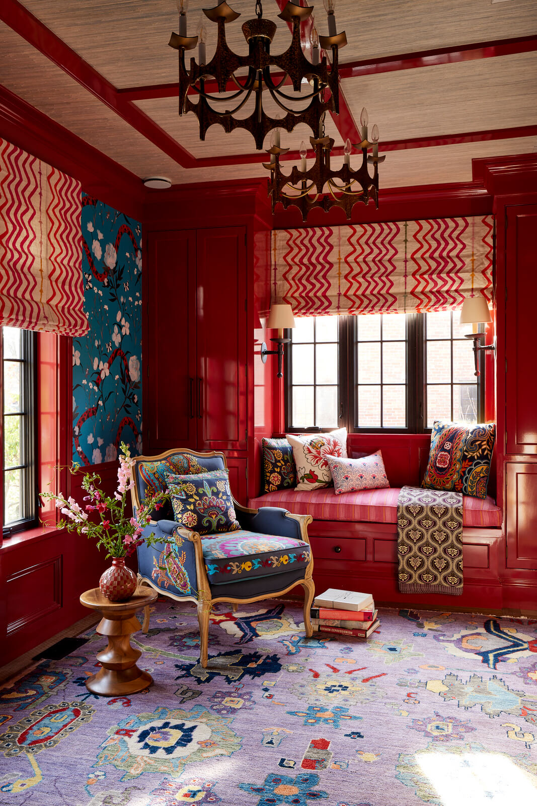
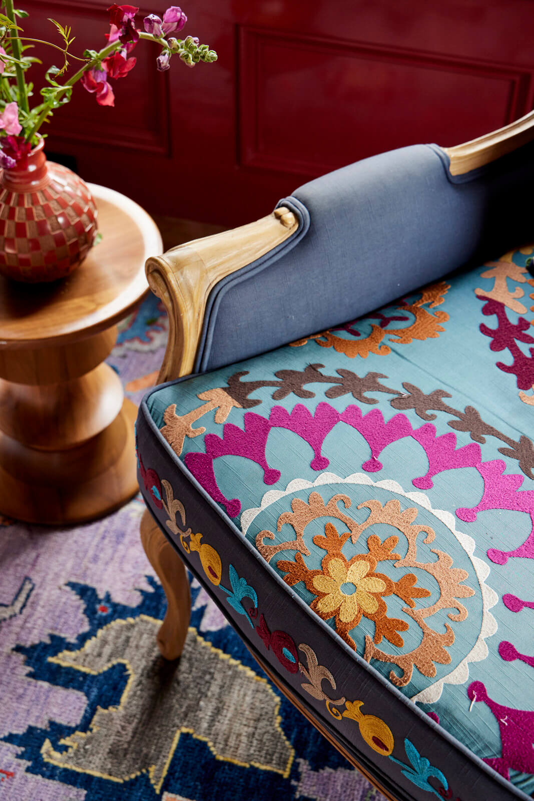
From start to finish we always had one eye on our original concept of Tudor Interior Design meets Modern Millennial, and the other eye on the young family’s needs, leading us to often select performance fabrics so life could happen without fear of spills or messes.
It feels good to be in this home. Maybe it’s due to those three words spoken so early in the journey, because “no white walls’ definitely make for a happy, fun, and beautiful place to live.
