NYC Office Interior Design seen in Interior Design Magazine
A teachers advocacy group– serious and focused–wanted a crisp, minimal NYC Office Interior Design for their Manhattan Financial District offices, and KCD was happy to oblige. And then we felt the need to inject the personality of the organization into the 13,500 square foot space. So we created a brand expression that says serious, organized, focused and with a profound purpose…the education and enrichment of our nation’s children by the empowerment of our teachers.
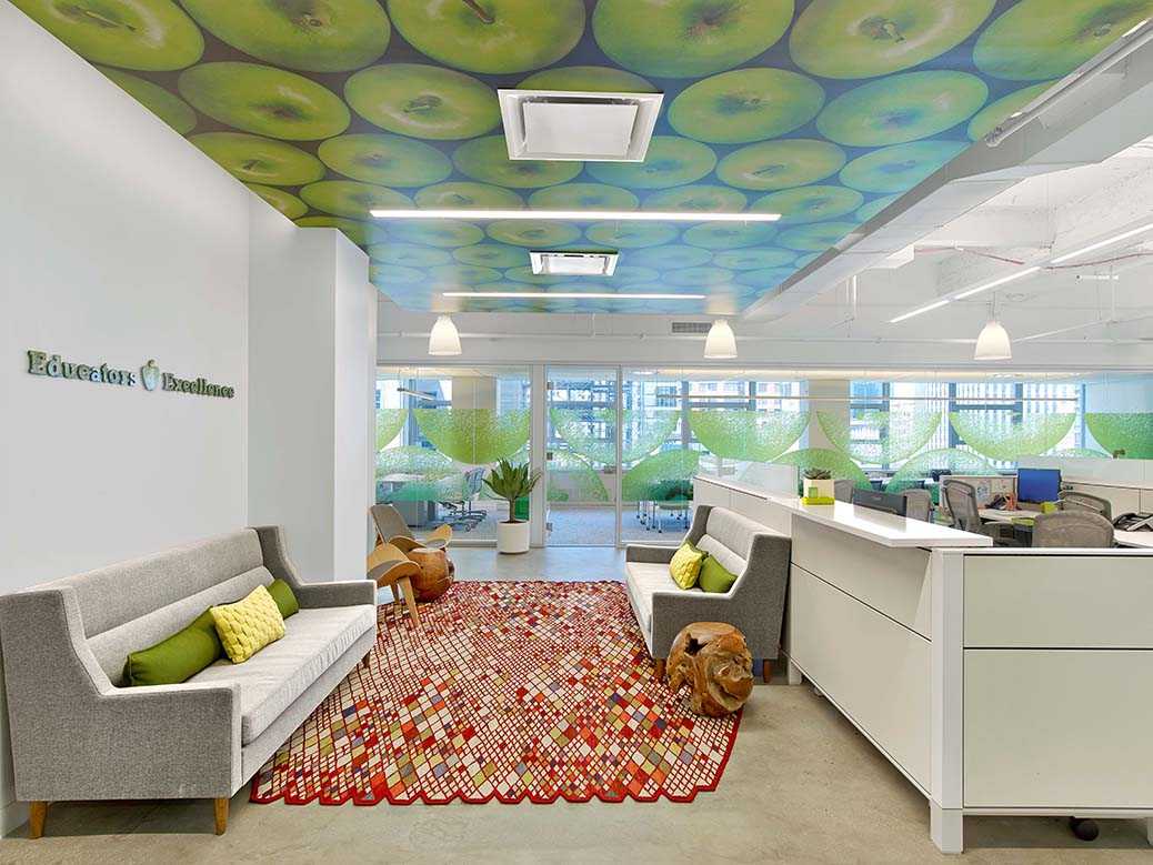
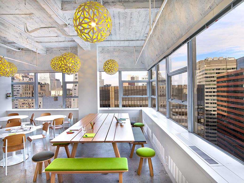
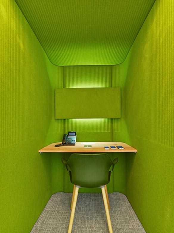
How do kids learn, we wondered? Through play, we remembered. (Thinking back over our own decades.) So we created playful interiors grounded within a solid foundation. We added our version of “magic carpets” to look like rolling hills, designed a picnic table for the cafe—outfitted with data ports—to make spontaneous meetings and conferences easy (oh, and you can eat there, too.) Phone booths, made of felt, provide the possibility of private calls in public areas. The little mushroom stools are not just fun they’re also great ergonomically, and do triple duty being used for the group’s impromptu work style: grab a person, grab a seat (okay, a mushroom stool), have a meeting.
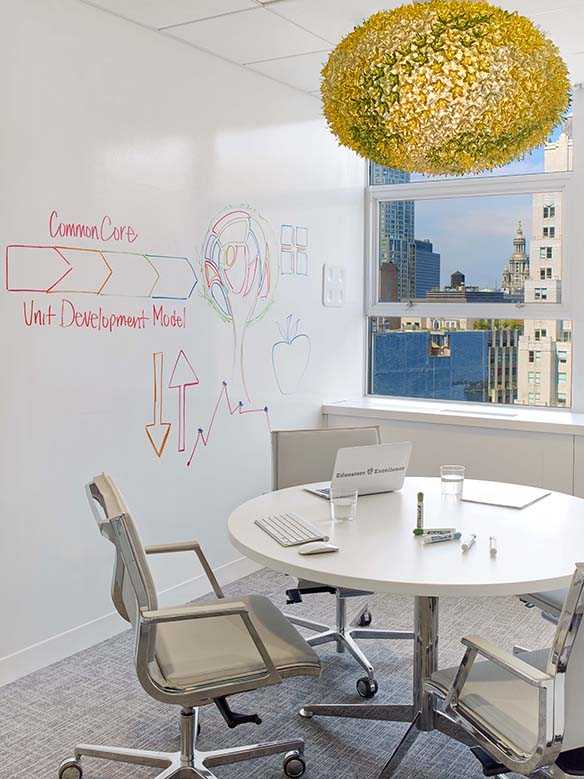
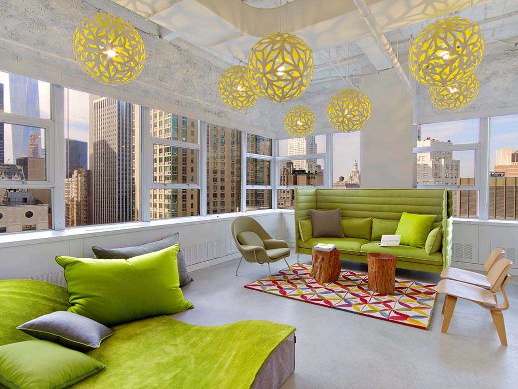
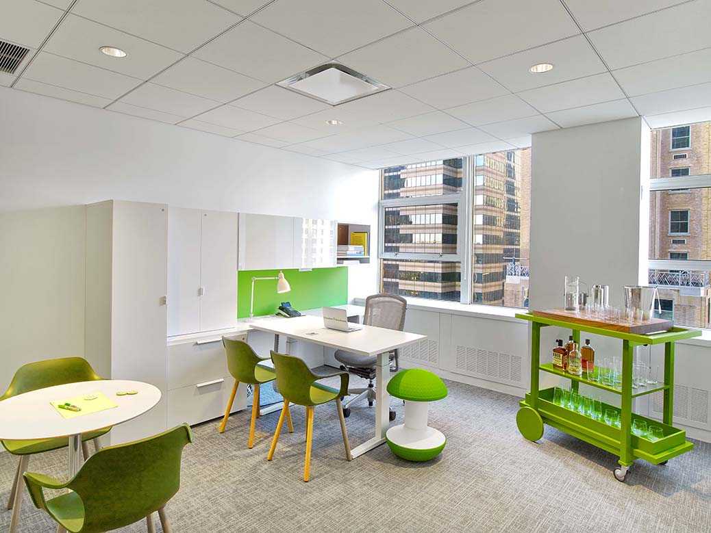
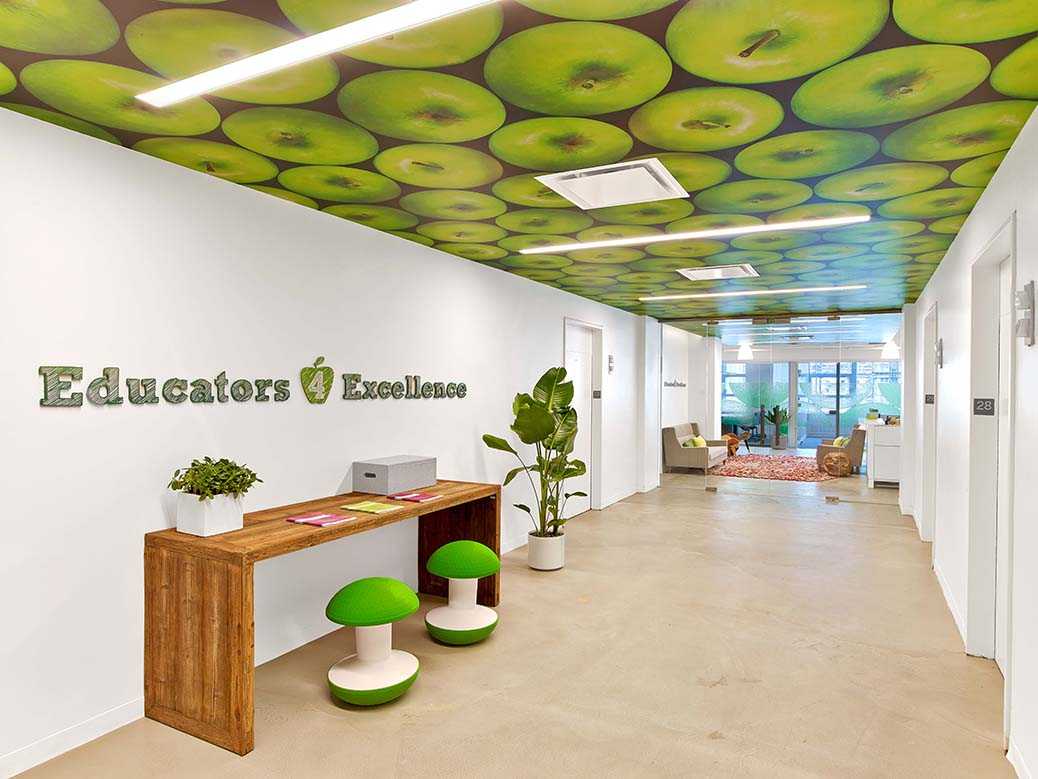
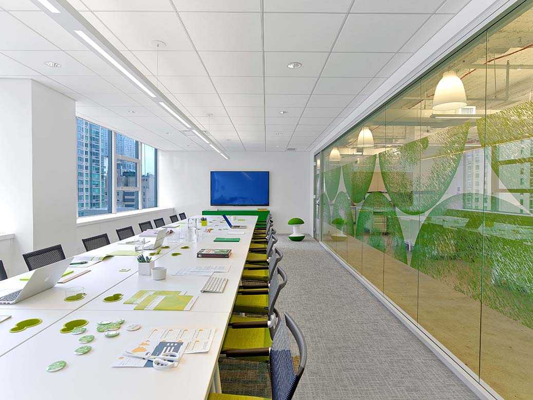
About that green we used as an accent…we were inspired by the green apple on their logo. Then, searching for a new expression of it, KCD interpreted the green in ways that weren’t expected yet were still appreciated for their beauty, and all while reinforcing the brand. The perfect example of accent meets brand? The apples on the ceiling art. Walk out of the elevator and into the lobby and look up. A powerful statement greets you: ceiling graphic with 100s of Granny Smith apples. KCD developed the artwork all throughout the offices, and here those gorgeous, large green apples guide you right into the reception area. We designed the more transparent apple graphics and used them on the glass partitions into the conference areas—supporting our belief that views of the river, of Brooklyn and of lower Manhattan should be enjoyed, but not (too) distracting. These partition graphics serve to (slightly) obscure without taking too much away.
We loved being part of this project, loved creating spaces to inspire teachers in the same way they inspire students every day, everywhere.
