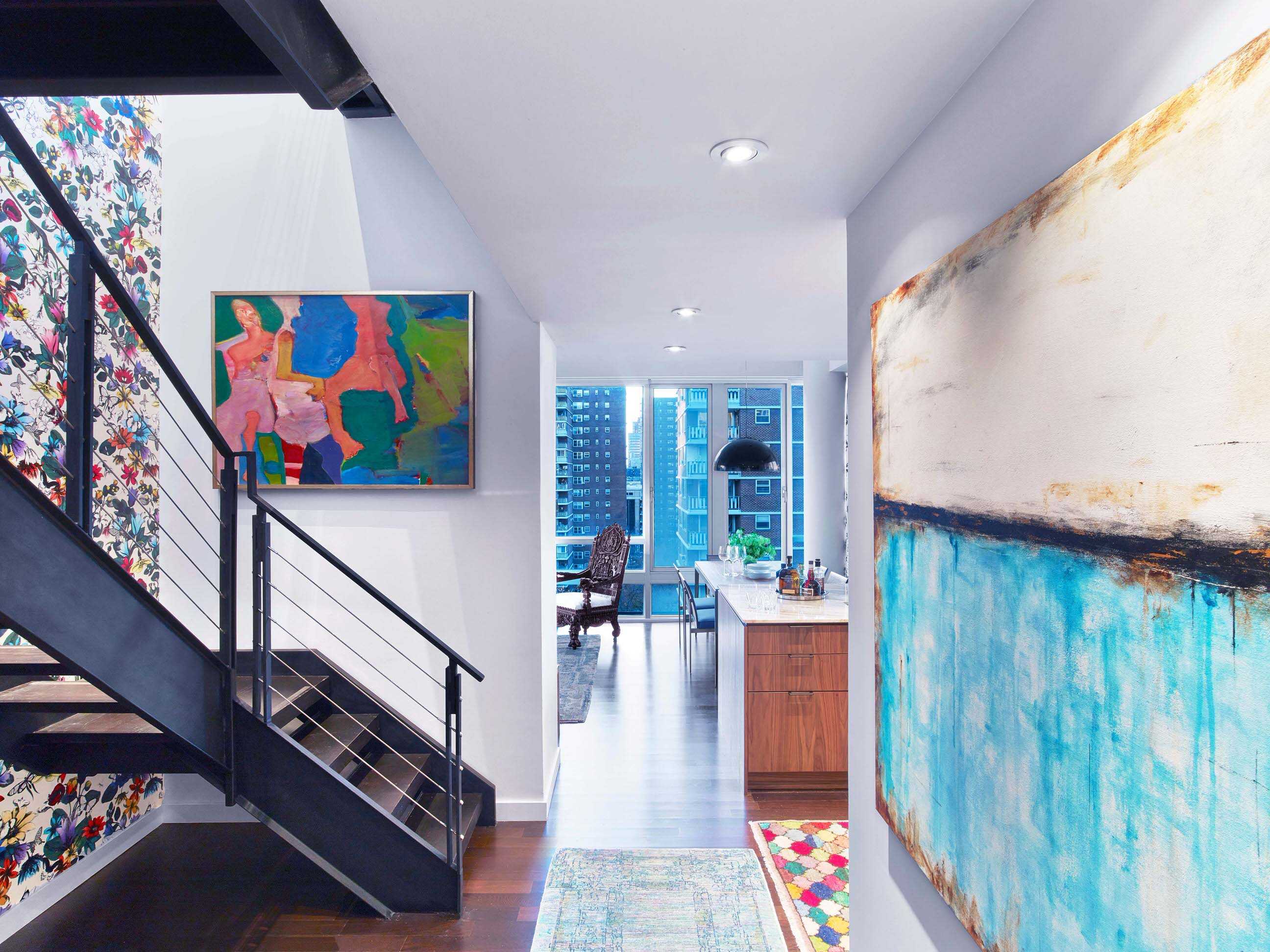
Chelsea Interior Design featured on Open House New York
For this Chelsea Interior Design project, the client said to us: “This is going to be our home for a very long time and we want it to reflect us.” And then they added something else, “ Do what you do best.”With that vote of confidence, but more than that–with their complete trust, we began designing their 2800 square foot Chelsea Penthouse. (And soon Kati Curtis Design began gutting it!)
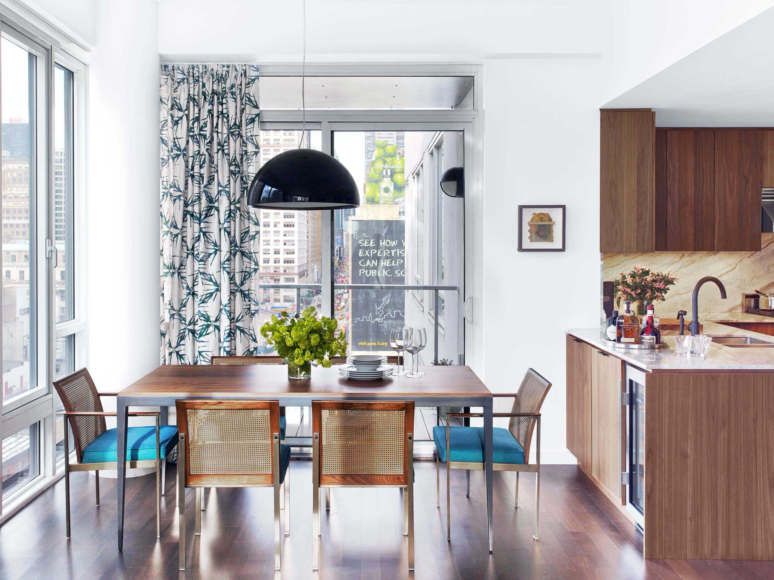
But the thought stayed with us, and throughout the journey we kept asking ourselves, “ What do we do best?” This was a white box begging for warmth. We created that with walnut wood in the kitchen, then added more with the colorful marble with its green, gold, brown specks.
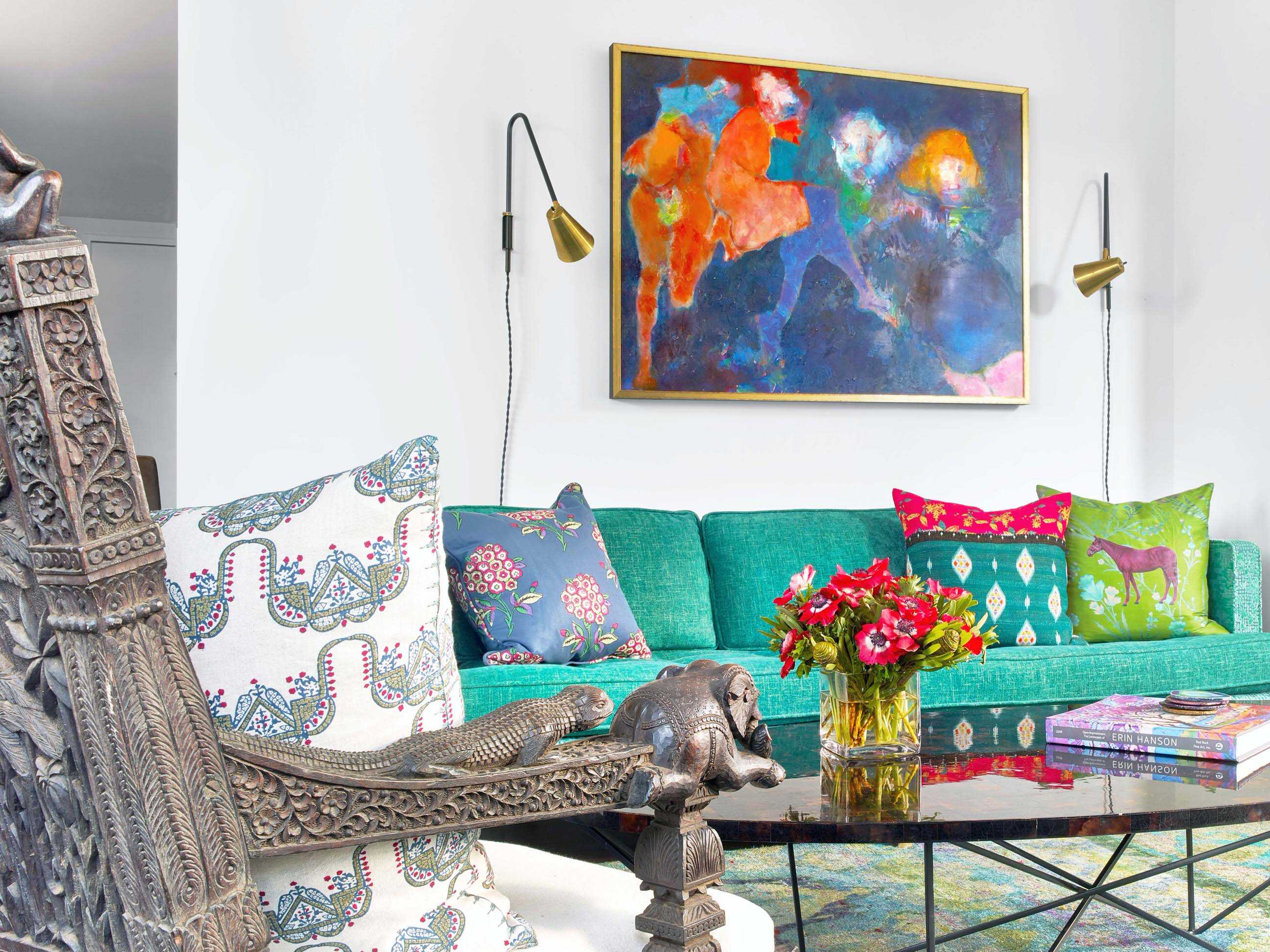
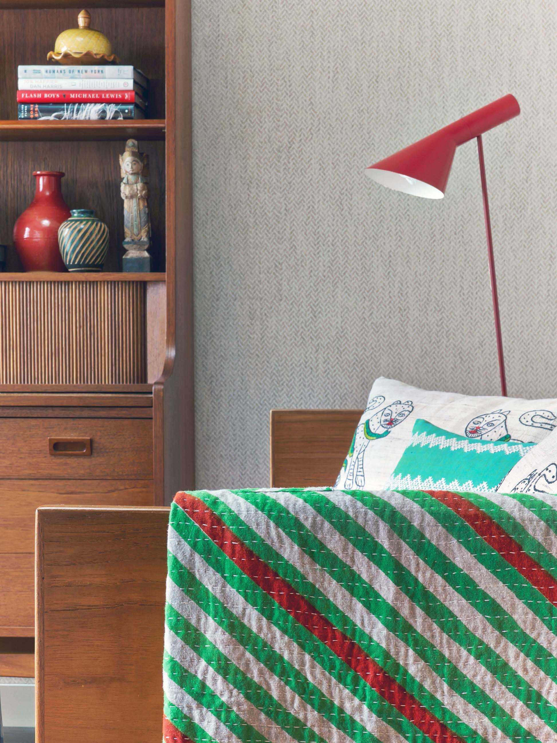
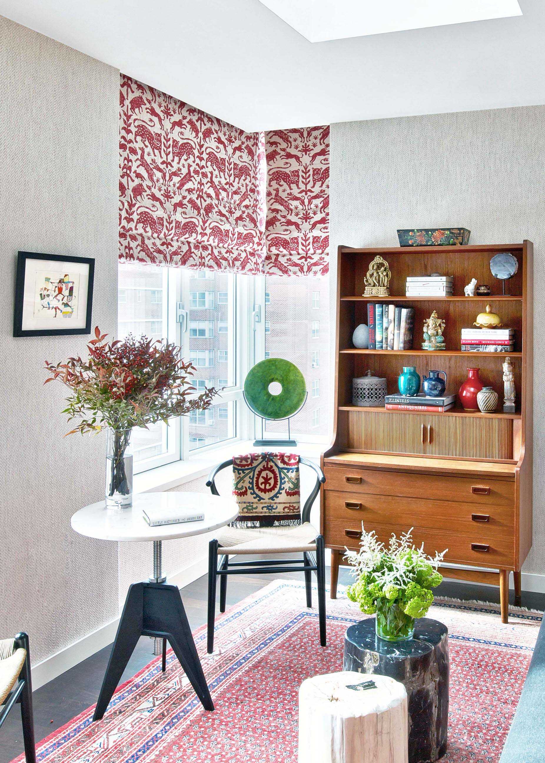
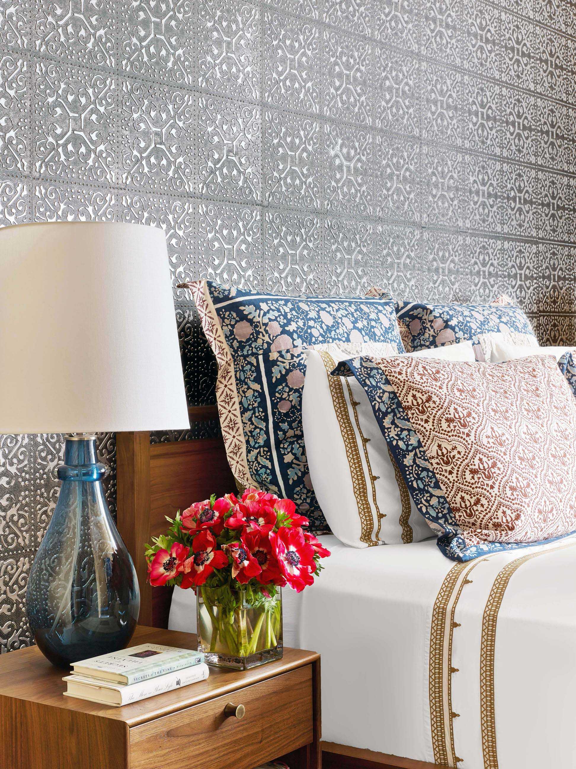
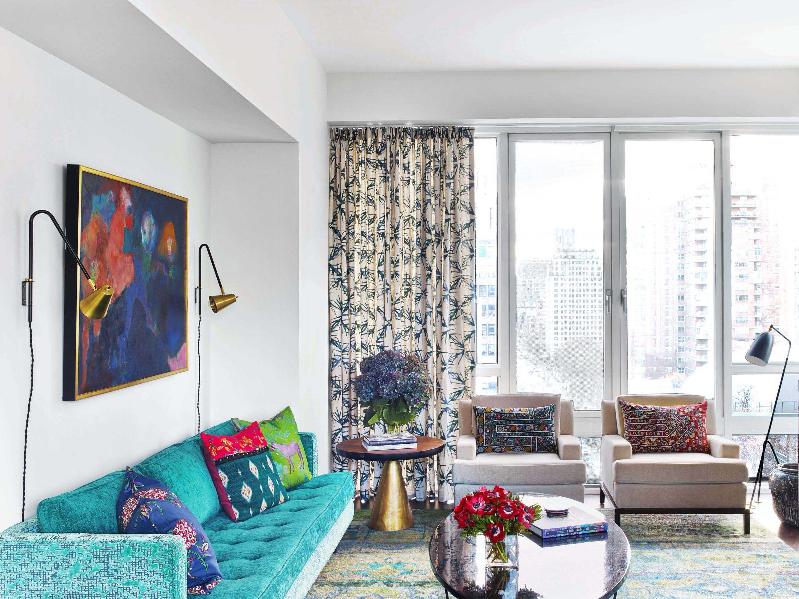
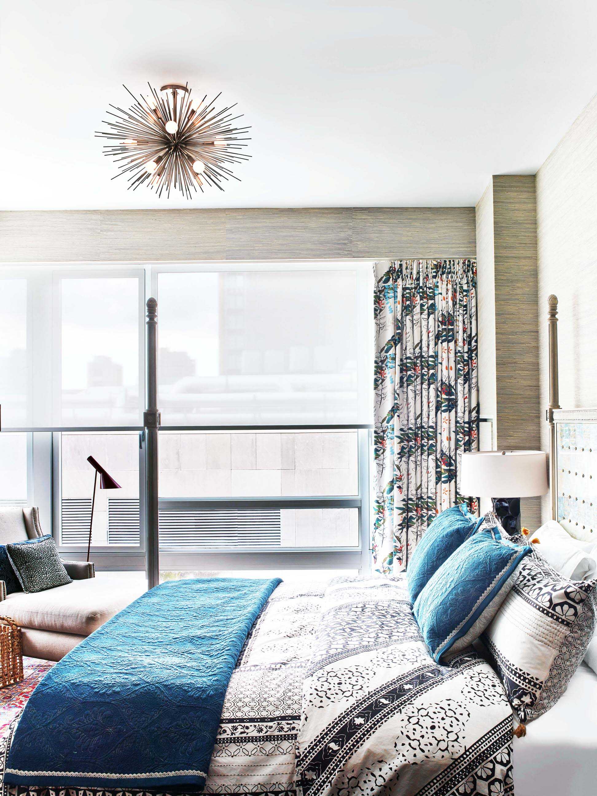
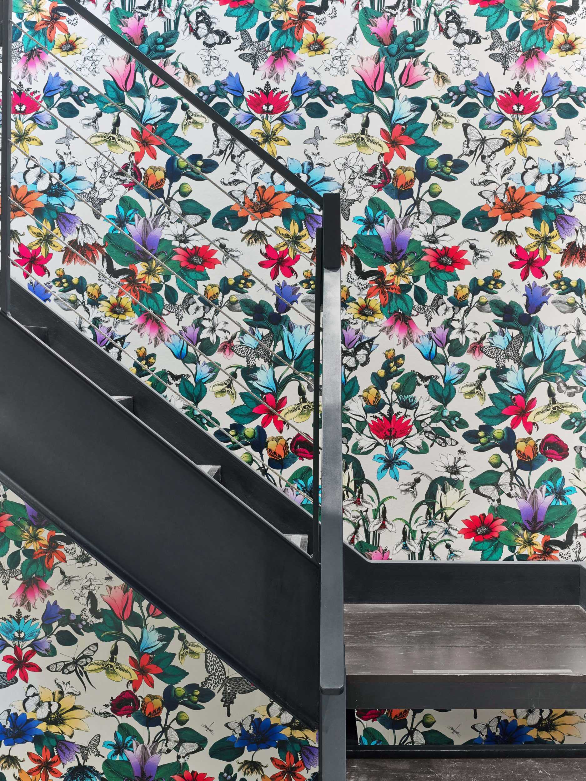
All along the way we found clues to the answer. It was there when we pushed them towards a new level of pattern and color. It was there again when we asked them to consider an evocative mix of antiques (hello, 14th century? Indian chair) with the new (well, relatively new mid-century modern.) And when we asked them to stretch, (okay, leap) out of their comfort zone. (“A flower wall?”) We brought them more variety, gave them more texture, added more layers because each one reflected who they are: equestrian elements–her love for horses; Indian influences– their love of travel, and a room dedicated to extended visits– their love of family.
The walls? We left them completely absolutely white– a virgin canvas that gave us the chance to add more colors within the room. And then we looked up. And wondered what to do with the living room’s (very) large expanse of ceiling? The answer: a Venetian plaster ceiling, adding a subtle textural element in the room.
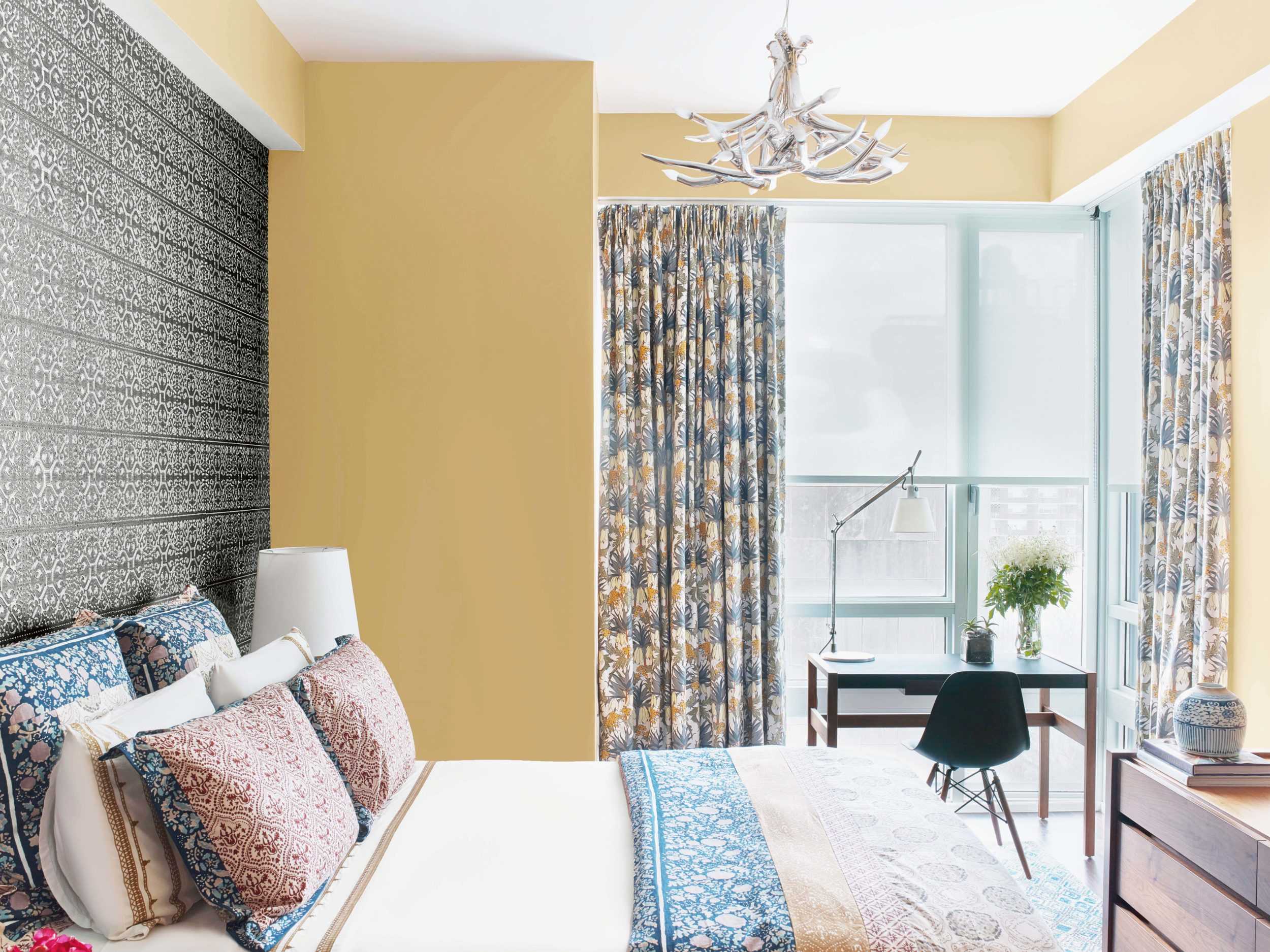
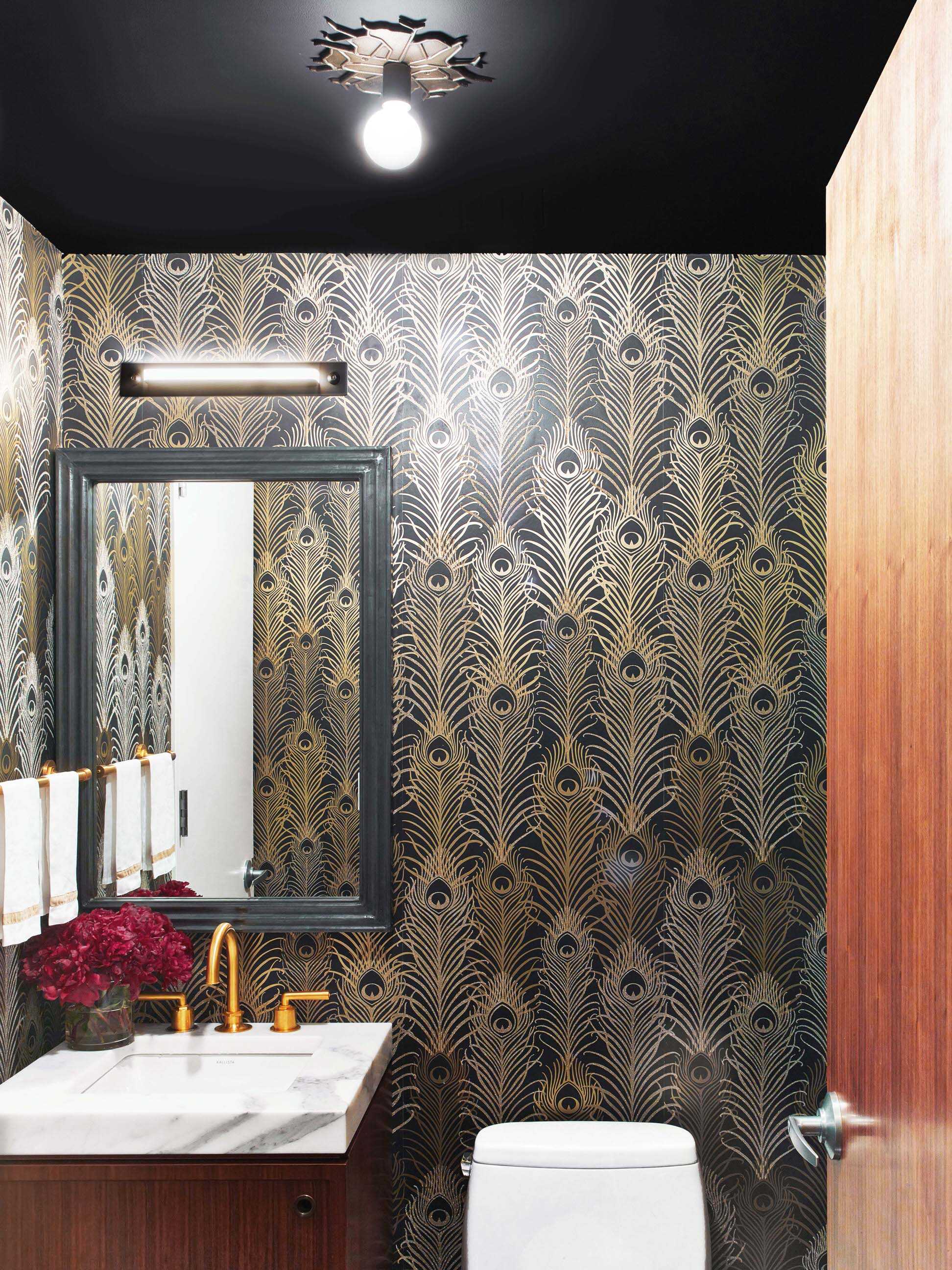
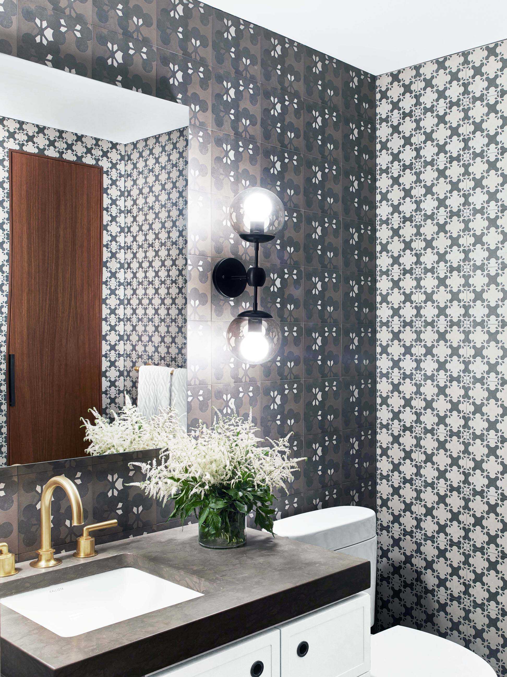
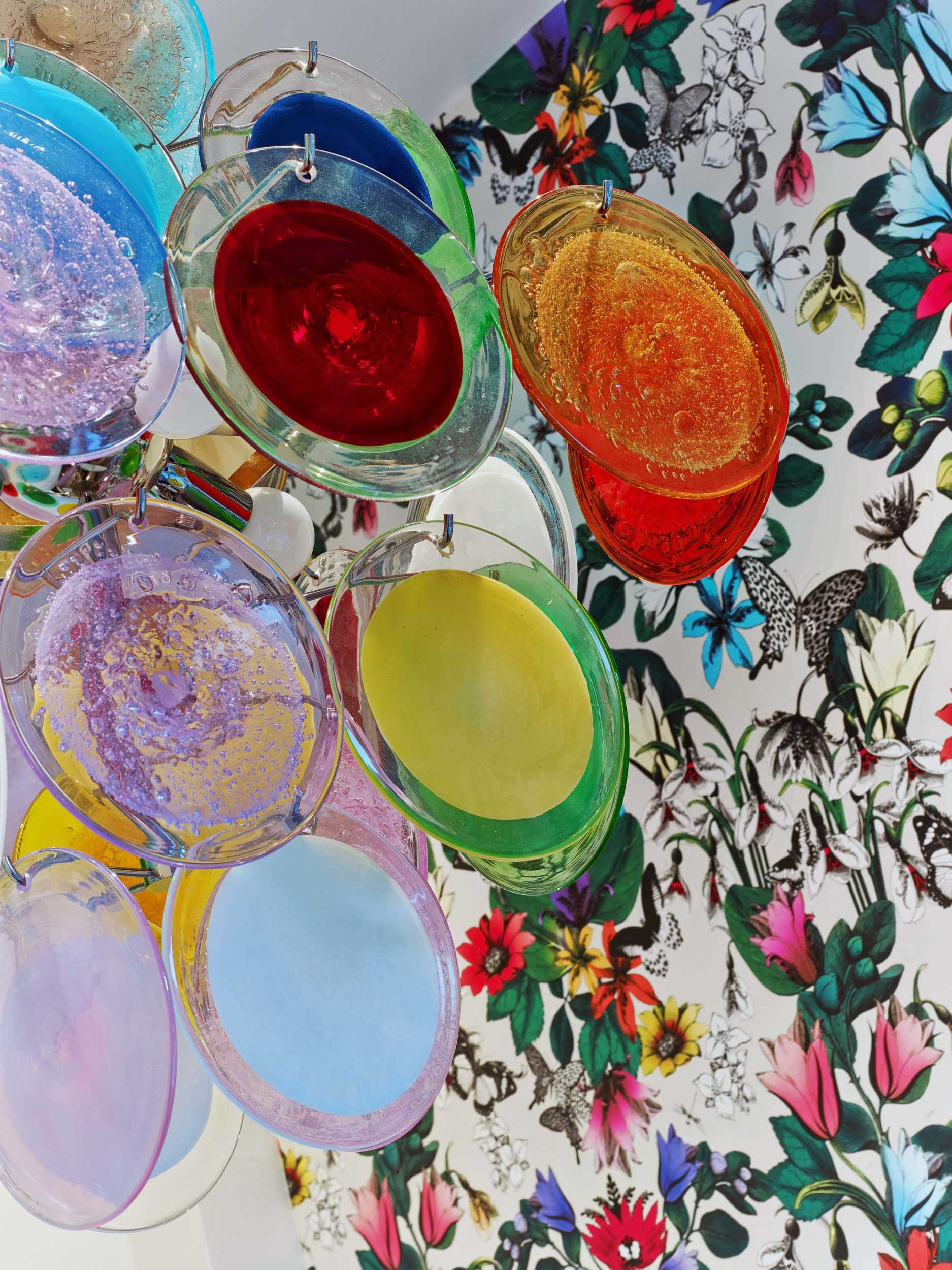
Then, one last time, we asked ourselves, “What do we do best?”But this time we added, “And what do we love most?”We knew immediately. The
contrast of the raw and edgy with the refined and the beautiful—the kind of beauty that stops us flat in our tracks (and sometime takes our
breath away, too) Here, we did that in the largest statement possible: the staircase through the penthouse. We took it from its stark, gloss white form and brought it back to its original, striking architectural feature of blackened steel– highlighting the rawness of the structure against the refined elements in this beautiful penthouse.
It’s a home that reflects the open, adventurous spirit of the client.

