After the year we've all had, we're seeing more and more of our clients ask for extra color in their homes. Of course, we are more than happy to oblige. Bold color statements are a great way to brighten up your home and perk up your spirits on even the darkest of days. Here at KCD, we are no strangers to color, so today, we're sharing our secrets to mastering bold color. Take a look below for colorful interior design inspiration!
Monochromatic Color Inspiration
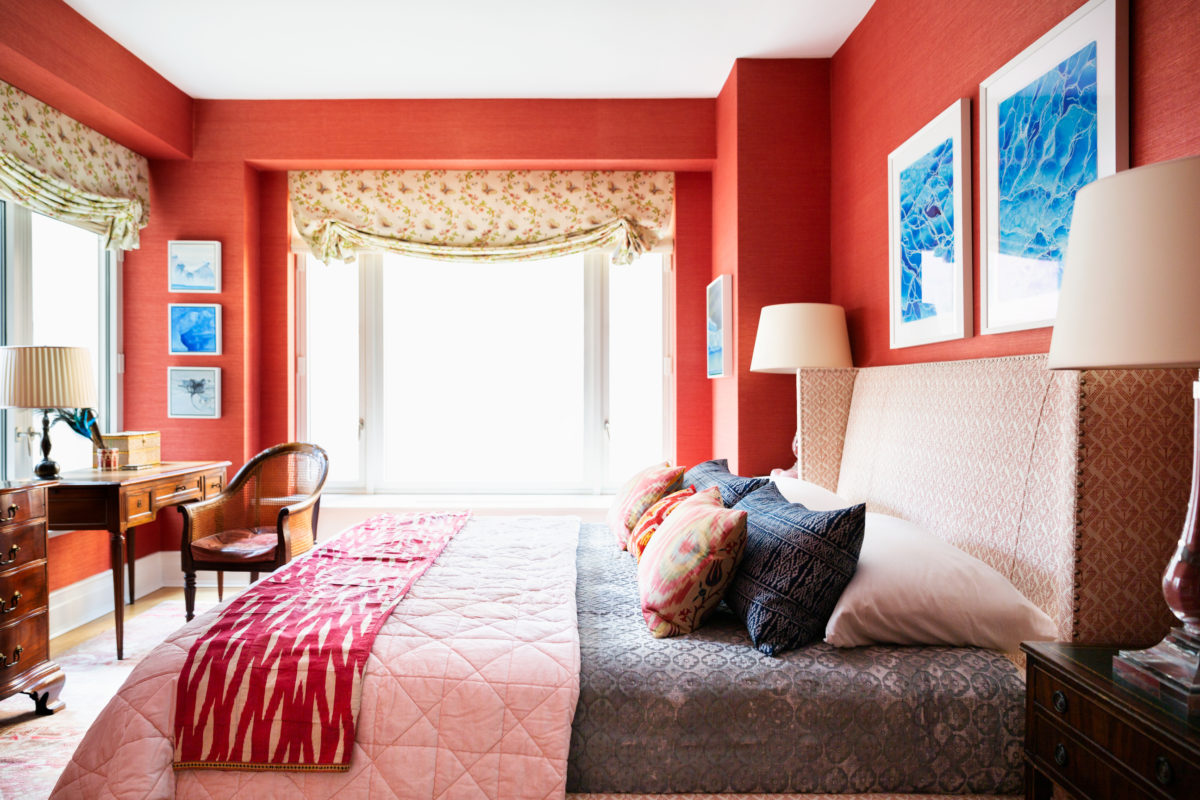
One of the most obvious ways to make a bold color statement in your interior design is to use a monochromatic color palette. In our client's Central Park West apartment, she insisted on a "red" bedroom. Of course we wanted to honor her wishes, but we needed to figure out a way to make it feel natural and not overwhelming. Red has a tendency to be overstimulating when used too much, so it's all about balance. We started with a red grasscloth wallpaper, which was the star of the show. With such a bold color, it's important to keep it simple. The grasscloth texture gave that bit of visual interest without feeling too busy. We then moved to the bed, which featured a red blockprint fabric upholstery, and was complimented by the antique red ikat at the foot of the bed.
Complimentary Colors
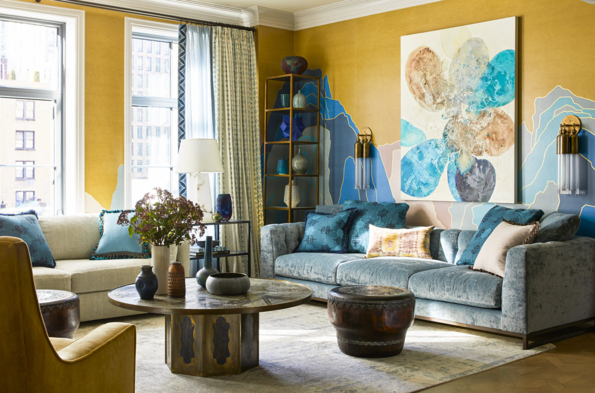
Next, we have complimentary color schemes. Complimentary colors are on opposite ends of the color wheel. In this Upper West Side Pied a Terre, we used a beautiful teal and a delicious gold to create a warm and inviting space that didn't feel too busy. The Fromental wallpaper incorporated both colors seamlessly in the mountain drawings, while also incorporating some neutrals to give it balance. The teal sofa grounds the room together, and we added in pillows of varying shades to fill the space. Finally, we added hints of green, the result of blue and yellow, to tie it all together.
Rich Layers
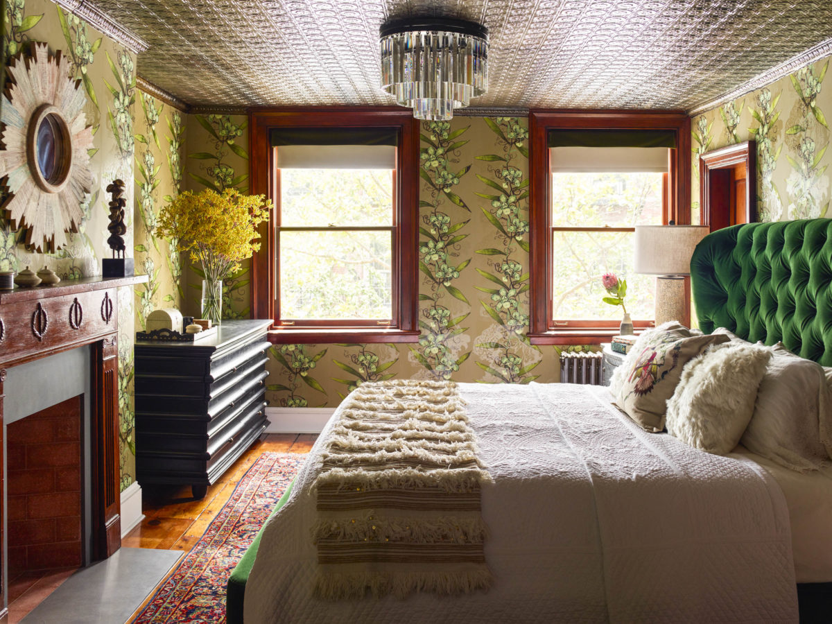
When making a bold color statement, you want to focus not just on the colors themselves, but also the textures. In this West Village townhouse interior design, we used green as the primary focus, but drew in that lush feeling with the fabrics and textures around the room. The statement piece in this space being the bed, we used a deep green velvet that feels luxurious and inviting. To continue that feeling, we incorporated a delicate matelasse coverlet and Moroccan wedding blanket to compliment the green. Adding in the neutral tones help make the bold colors stand out. The walls feature a beautiful floral wallpaper with a variety of shades of green. Finally, on the floor we used a colorful vintage rug that had accents of green, but ultimately let the green from the bed and the walls shine through.
Contrast to Offset
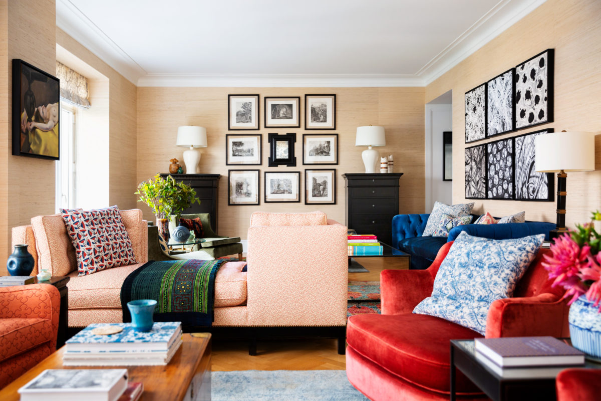
Last but not least, the most important part of making a successful color statement is contrast. At our client's Central Park West design, we mixed the light pink sofa with darker red and orange seating. On the walls, we added black and white original art to give the space balance. Throughout the space, we also added in more complimentary colors, such as blue and green, to balance the warmth. All of these elements combined give a perfectly balanced, yet bold feel.
Whether you're looking for a full room transformation or simply adding color into an existing space, we hope this interior design inspiration gives you some ideas to get started. For more inspiration, check out our Portfolio here on the site, or pop on over to our Pinterest and give us a follow for every day inspiration! If you're ready to get started on your own color statement, you can contact us here to get started. See you next week!
