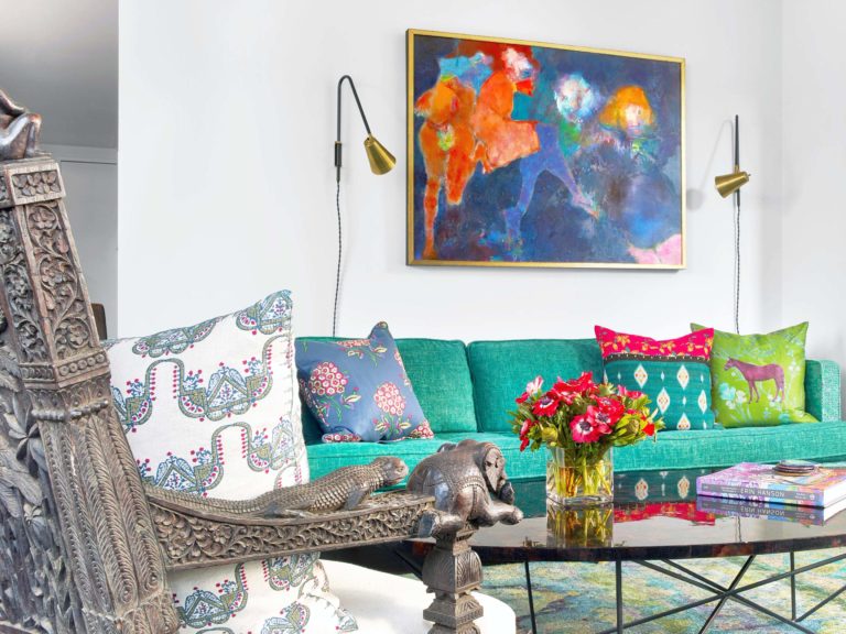
One of the most common questions I get asked as an NYC interior designer is, "How do I mix interior design styles?" Many times, clients have family heirloom pieces they want to include, but don't want the design to feel dated. Or, it may be a very modern apartment that they want to make feel a little more traditional. Here at Kati Curtis Design, we pride ourselves in having a very layered approach to interior design; it's what makes our special sauce (so to speak). So today we wanted to share some of our best practices for creating a balanced, layered look with different interior design styles. Take a look!
Using Color to Balance Different Interior Design Styles
The first thing we look at when creating a design is the color palette. No matter what design styles you are trying to mix, color is one of the common themes you can look at to bring it all together. One of the easiest ways to do this is to work within a color scale. Take a color, like blue for example, and mix in different lighter and darker shades throughout the room. Since the colors are all in the same scheme, it helps balance the mix of styles in the space.
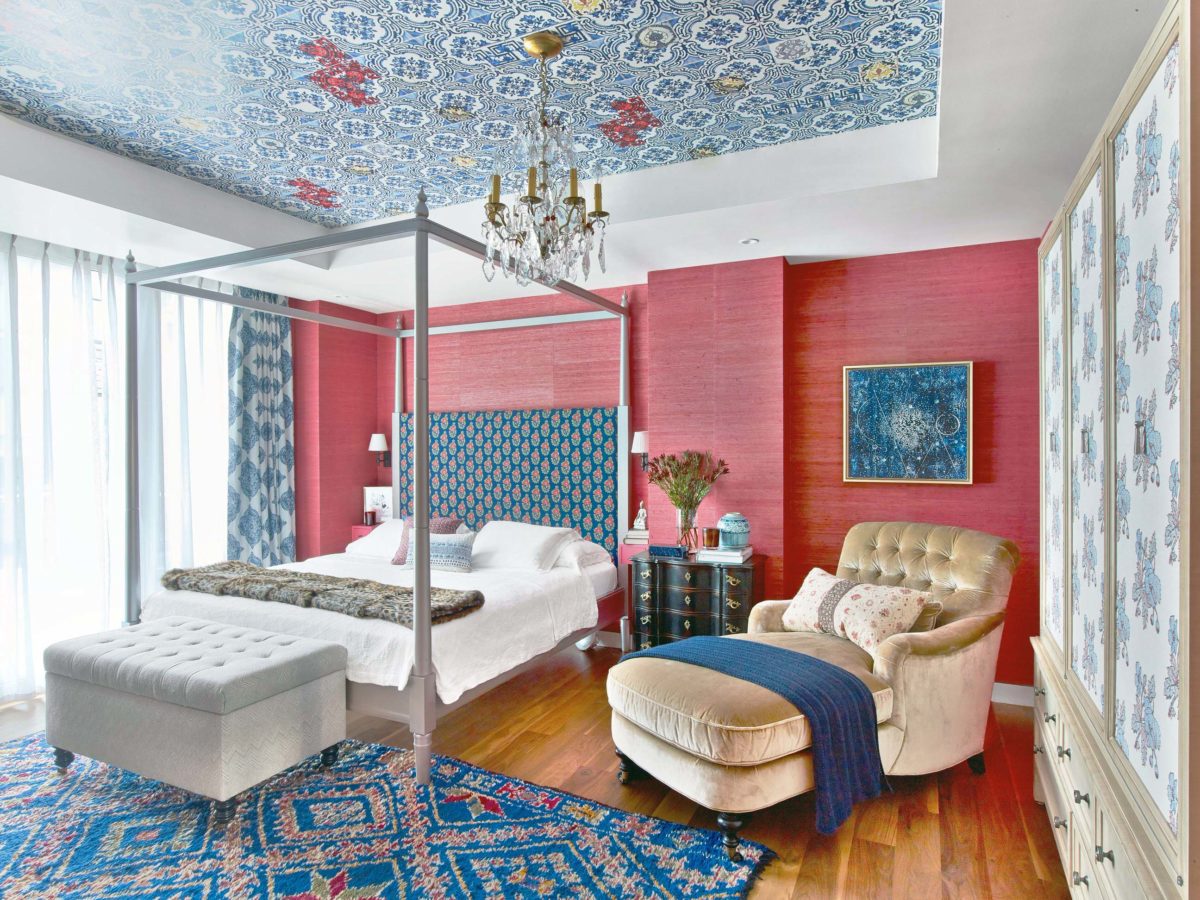
On the other hand, you can also work with complimentary colors. If you look at a color wheel, the colors opposite from each other are complimentary. Take, for instance, red and blue. These colors are across from each other and create a natural contrast. You can see in this Chelsea Penthouse bedroom how we mixed modern pieces, like the bed frame, with more traditional accents, like the dresser and chaise, harmoniously within the color palette.
Mixing in Family Heirlooms or Antiques
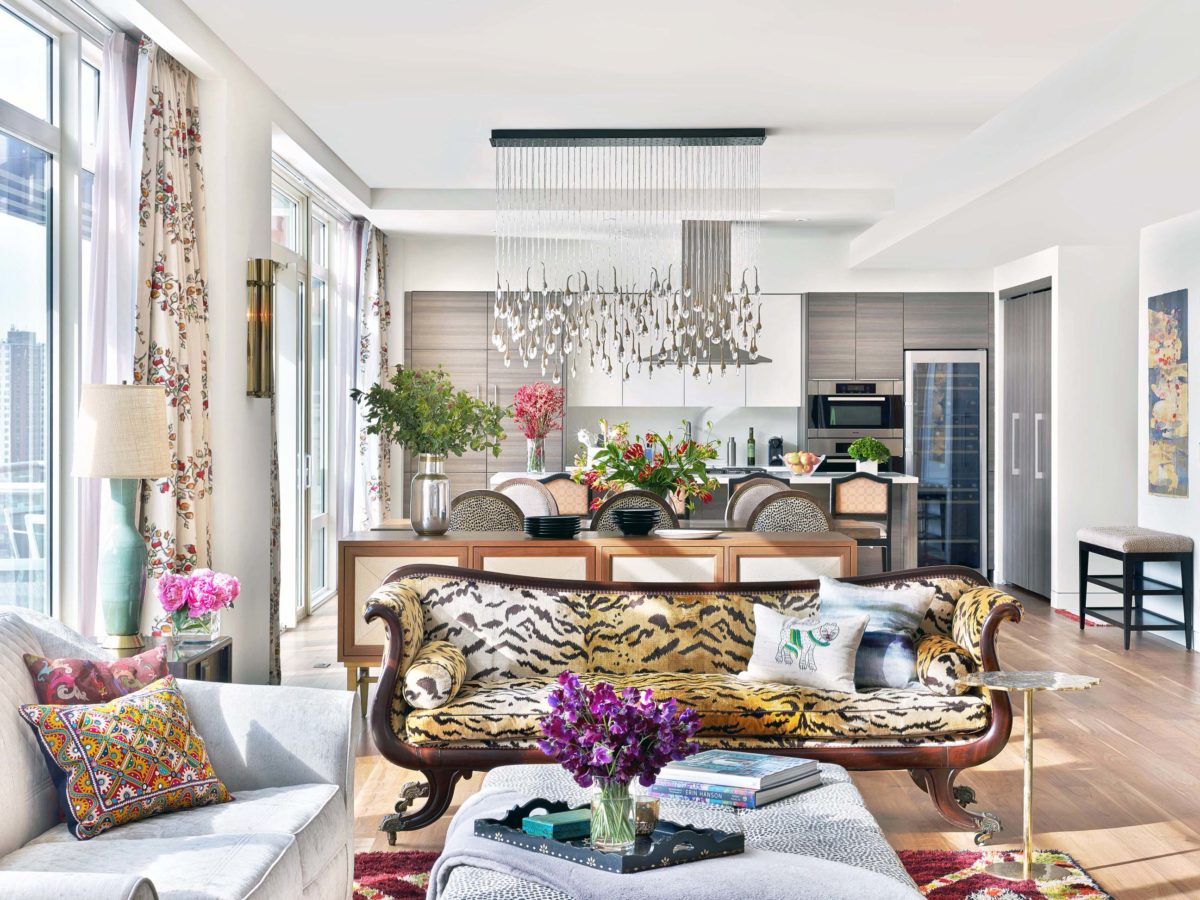
The next thing we look at is if we have any existing pieces to mix in. Many of our clients have beautiful antique pieces or family heirlooms they want to incorporate, but they feel dated compared to what the client wants overall. The key to this is balance. In the above picture from our clients' Penthouse apartment, we had this incredible tigress sofa to use within the space. In order to balance the very traditional lines of the sofa, we used more clean lines for the rest of the furniture. The upholstery is also very important. This sofa had an animal print to it, which always is in style (and very neutral). However, if the piece in question has a dated or more traditional fabric, we opt to reupholster in a more contemporary fabric to balance out the traditional lines. This helps it to fit in the space more without giving up the integrity of the piece.
Utilizing Contrasting Textures and Patterns
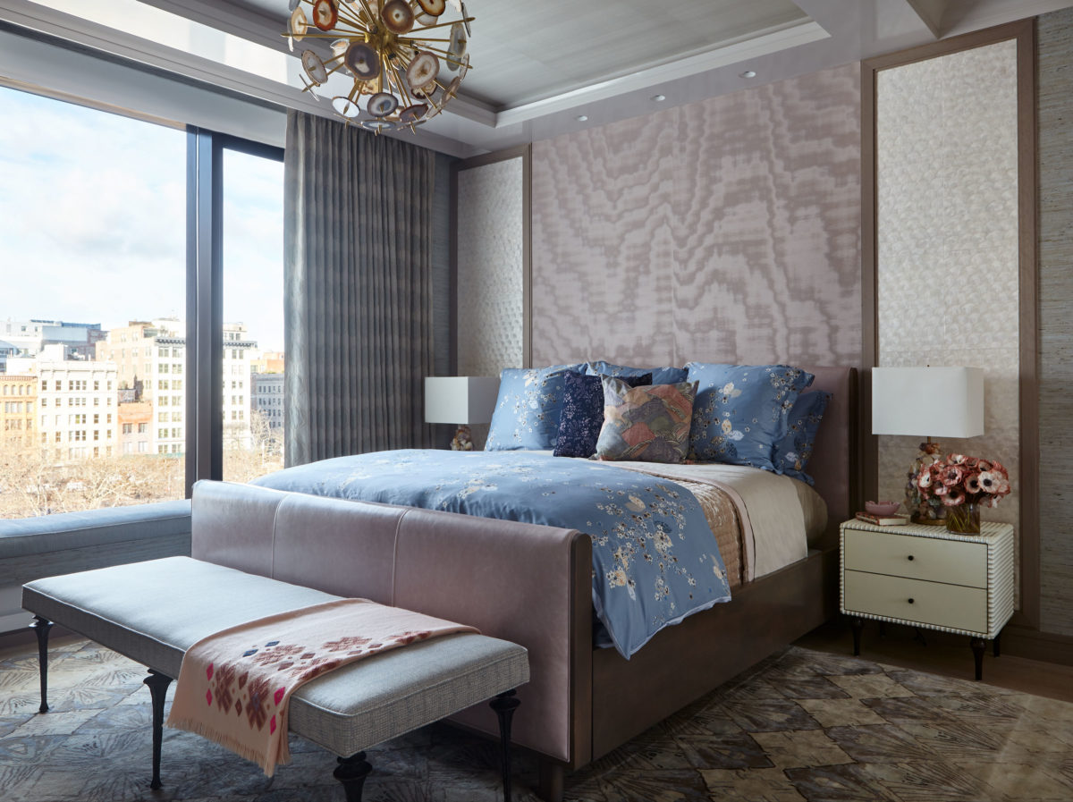
After working with the color scheme and any existing pieces, we move on to textures. Texture is one of the best ways to mix different styles in a more subtle way. In this Tribeca apartment, the clients wanted a primarily modern and contemporary feel throughout their home. In order to still give it that signature KCD layering, we mixed textures in each room. This bedroom sticks within a cool mauve color palette, but we utilize a delicate silk wallpaper, a luxurious leather bed frame, and bold steel legs on the bench to create contrast. This results in the room feeling layered and complex, but not overwhelmed with color.
The same can be said about pattern. Often times, people think you can't mix more than a couple patterns together or it becomes too busy. This isn't true! It's just about balance. For example, the floral duvet in the bedroom above has a delicate small pattern, so we mixed a bold velvet throw pillow with a larger scale pattern. The colors are all in the same family, but the large scale pattern mixed with the smaller scale floral print make for the perfect contrast.
Always Remember Balance When Mixing Interior Design Styles
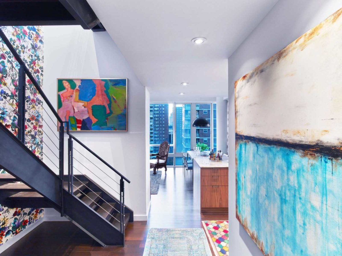
The most important thing to keep in mind when mixing styles is balance. Balance in your color palette, textures, patterns, and themes. The last example to show you is this colorful Chelsea Penthouse entry. The penthouse used to be a completely white box, with all white lacquer cabinets and accents. This steel staircase was once covered in white lacquer, and we needed a way to showcase this feature and add some depth to the space. We stripped it down to the bones and refinished it in this edgy masculine steel palette. To balance it and draw attention up to the roof deck, we added a feminine floral wallpaper all the way up. This balances out the raw steel look and draws attention to one of the main features of the home.
That's it for today! We hope this helps you in understanding the perfect way to mix interior design styles. If you're ready to start your own layered design project, contact us here to get started!
