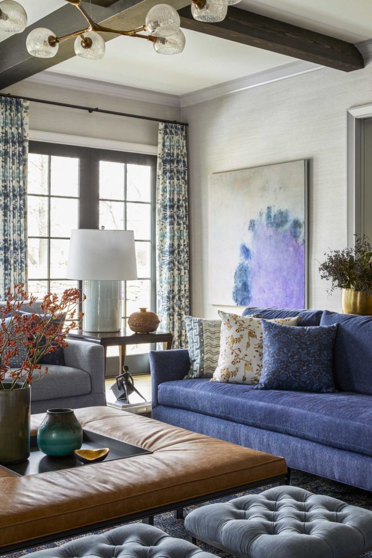
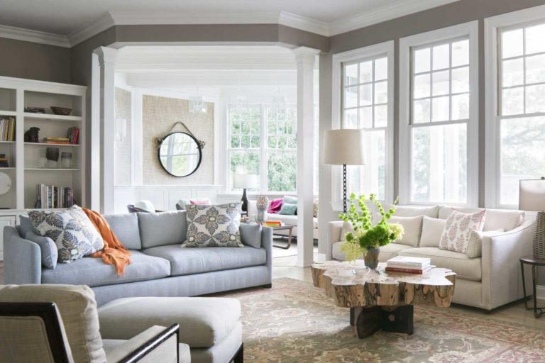
Our pets are some of the most special members of our family. However, no matter how hard we may try, sometimes our furry friends can make a big mess out of our furniture and decor. As a proud pet mom, I've learned a thing or two about how to pet-proof your home so that both you and your babies are happy. Take a look! Use performance fabrics for the ultimate pet-proof solution Textile technology has come a long way, and now there are so many great performance fabrics out there you don't have to sacrifice design for durability. Here are two happy clients in a Chelsea Penthouse interior design: I have 2 cats and used to have these Jens Risom chairs upholstered in classic wool fabric. Wool is a FAVORITE for cats to dig their claws into, so I had them reupholstered in a soft DESIGNTEX Crypton velvet. Beautiful and impervious to cat claws!! You can see they enjoy the chairs and they continue to look brand new. There are so many performance fabrics out there now you don’t have to sacrifice design for a pet-proof home. For our client's Westchester interior design, we upholstered all of the seating in performance fabrics. You'd never know that their dogs tear through the family room as this room looks just a beautiful now as the day we installed it and they have a pet-proof home! Built-in Dog Shower In another Westchester...
Loading...
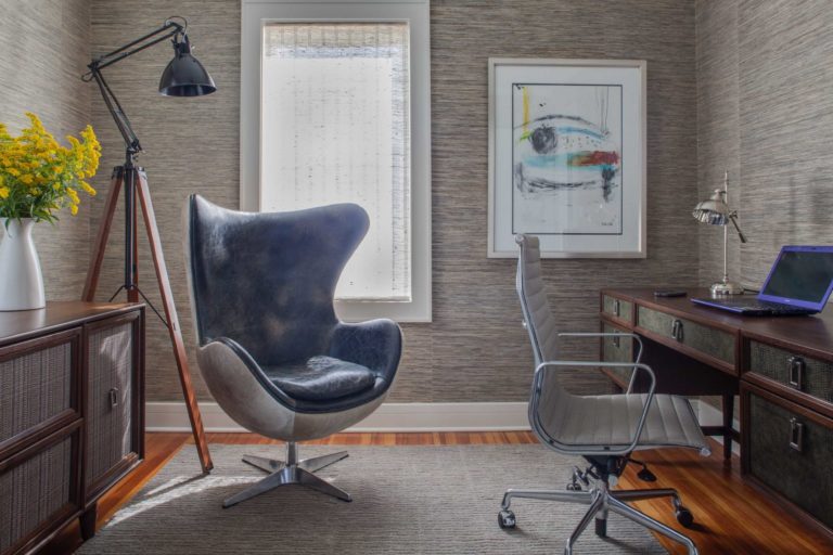
With the state of the world as it is, many of us are now trying to manage a new normal of "work from home". Whether you've got a designated room or are working out of the guest bedroom- there are a lot of adjustments to be made in order to transition your space for ultimate productivity! With our years of experience in designing commercial offices, we've learned a thing or two about how to make a productive workspace. We've compiled our top tips to design the perfect home office design that will make "work from home" just as productive as being in the office. Sit/Stand Desk Since you're less likely to be taking your hourly stroll around the office, it's important to find ways to stay active and retain good posture. We recommend getting a convertible sit/stand desk to allow yourself a comfortable movement while working! One of our favorites is the Vitra Tyde station. It's not only a sleek, modern option, but it's also extremely customizable and is optimized to work for you. With features such as technical beams, various screens, and CPU holders- you're sure to be set up for success with this station. Sound and Light Control Make your home office work for you! Try installing sound and light control in your home office that you can change via your phone or AI devices (such as Amazon's Alexa or Google Home). In our home office designs, we...
What It's like to work with a Hamptons Interior Designer One of the most common questions I get asked as a Hamptons Interior Designer is, "How does this all work?" For many, this may be their first time working with an interior design team, and there's a lot that goes into the design and installation process. Now, every design firm is different, but today we thought we'd share a bit about what it's like to work with us. (And if you're still trying to decide who to work with- take a look at our last blog that shows you all the right questions to ask!) Once you decide that we're the Hamptons Interior Designer for you - here's an idea of what you can expect from the process. Most importantly, the process should be fun and effortless for you as we're here behind the scenes taking care of every last detail so you don't have to. WHAT TO BRING TO YOUR KICK-OFF MEETING Any documents you have related to the project: floor plans, photos, clippings from things you have saved. A list of what you are looking for in a professional designer - thinking through this in advance helps us better understand your needs and goals. Links to any of your online resources such as Pinterest - be sure to go ahead and have images saved so we can review them together when we meet. If you like, you can...
When it comes to hiring a Greenwich interior designer, there's probably a lot of questions that come to mind. If you've never worked with an interior designer, it can feel a bit intimidating! You want to make sure you have found not only the perfect match when it comes to design, but also in professionalism and their knowledge of the field. Here at KCD, we want our clients to turn into lifelong relationships they can depend on. We've compiled our top 10 questions to ask an interior designer before hiring them to help make the decision easier. What is your process like? While interior design can seem all fun and creative, there's really a lot of technical work that goes into it. It's so important that the interior design team you work with has a tried and true system in place! Ask anyone you are considering working with what kind of project management systems they use, what types of questionnaires they work with, and how they hold themselves accountable. In interior design, the smallest mistake can be extremely costly and time consuming. For example, one missed letter on a paint color specification can end up costing hundreds of thousands in a new paint job when you show up and it's the wrong color. When you're spending six figures on furnishings and custom fixtures, you can't afford errors. You want to be certain the team you hire is extremely detail oriented...
After the year we've had, many people are leaving cities in favor of a slower pace in the suburbs. Suburban areas like Westchester, New York, Greenwich, Connecticut, and the Hamptons are starting to attract a lot more residents who desperately want to escape the crowded city. If you're thinking about leaving the city life, we get it!! We've compiled some of our favorite healthy home tips to incorporate into your interior design to turn your home into the perfect urban sanctuary. A place of respite from the hustle and bustle that also supports all the comfort and convenience of city living. 1. Infrared Sauna New York City and Los Angeles were once full of places you could go to detox and relax in an infrared sauna. Places like Higher Dose and Chill Space were the places I frequented to recharge and reboot. Infrared saunas are one of the most effective ways to detox - so why not put one in your home? Infrared saunas are safer to use in your home since they use light rather than conventional heat to warm the body. Some of the health benefits include detoxifying the body, sore muscle relief, clearer, and firmer skin, and improved circulation. We are carving out spaces to give our clients their own in-home saunas, which is a perfect way to take advantage of the less utilized space in your home. It's the perfect way for us to bring this...
Could the days of the less is more, pared-down decor aesthetic be behind us? It’s not a secret: We LOVE a good (healthy) dose of pattern-mixing, color-splashing, and bold-layering in our work. In fact, we have built a reputation for dousing our interiors with colors, motifs, patterns and textures - all influences brought home from our world travels. So much so that last month the Wall Street Journal featured us, alongside other fabulously maximalist designers, showcasing some highly curated and refreshingly bold interiors. Maximalism is definitely not for the faint of heart. But if you feel your inner maximalist calling, don’t be shy! Go ahead, bravely take the plunge and embrace the wildly fun and dynamic style in your own home! Here are some ways we incorporate more is more in our projects: Books, art, china, vases, you name it! If you have more than a couple of your favorite object, bring them out, display them front and center and make a statement! Wallpaper is a great paint alternative and can powerfully transform a drab, sometimes eyesore of a corner into the pièce de résistance of your home. This is where you can be most adventurous. When it comes to patterns and styles, matchy-mathcy is not always better. There's beauty in an antique heirloom piece juxtaposed with the cleaner lines of a contemporary one. You will be amazed how harmoniously well leopard, tiger and floral prints fit together. Sure there's nothing wrong with neutral, muted tones - there's...
It's always such a joy to have our work featured, but I especially loved getting to talk to Pilar Vidalas at 1st Dibs. We discussed how I'm getting through quarantine, our office in NYC, some latest projects, and what's inspiring me now. One of the latest projects featured in this piece was this Tribeca interior design we recently completed. The owners are a family from Toronto who owns an international shipping company. They recently relocated their home base from Canada to the US. It’s at 11 Beach Street, New York in Tribeca, which is a recently opened building designed by BKSK and Thomas Juhl Hansen. We completely renovated the interior from top to bottom to accommodate their Tribeca Interior Design. First, they transitioned from Canada to the US. But the second was from suburban to city life as they downsized from a large home in the Toronto suburbs. They wanted the details and comfort of their very traditional home in Canada, but also an environment conducive to their new modern city lifestyle. The original apartment entry had low ceilings and no storage at all. We wanted to create a sequence of discovery by designing a cerused oak built-in with a coat closet clad in antiqued mirror. First, adjustable shelves house finds from the clients’ vast travels. Then, grasscloth paper in alternating patterns give the walls texture. Continuing down, custom rugs add just the right amount of softness and pattern. Finally,...
Of course, we love it when our work is published. What's even more meaningful to me is the long term relationship we have with our clients. This one, in particular, has spanned all the way from 2011! We were first contracted to design the renovation and interiors of a land-marked West Village Townhouse. As their family grew, KCD was there to update the home. The latest included creating 2 bedrooms out of 1 when their 3rd child came along and revamping things to highlight their ever-changing art collection. It's been a true joy and honor to watch their family grow and to help adapt their beautiful home to fit their new lifestyle. We created a home– European in flavor and sensibility, yet, cleanly and minimally modern. And because the client are avid art collectors, we approached the project as “designer as curator.” Meaning? We curated the interiors as we would curate a collection, designing a “home as gallery space.” The result? A home perfectly crafted to showcase the family’s taste, as well as their appreciation of culture and beauty. Head on over to Architectural Digest to read more about this West Village townhouse. There are so many interesting elements carefully curated and collected over the years- you won't want to miss it!
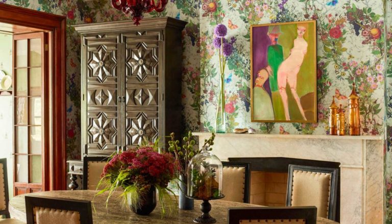
Last month we headed to Napa Valley with other top NYC interior designers for the 2nd Annual Luxe Red awards! We were awarded the Classic Interior Design award for New York. The Luxe Residential Excellence in Design Awards recognizes and honors excellence, innovation, and the best residential architecture, interior design, and landscape architecture projects across the country. The awards winning designers were hosted at the Signature kitchen center in Napa where we enjoyed a cocktail party and awards ceremony. Our award-winning project was A Colorful Townhouse in the Meatpacking District and is one of our special favorites. Our client’s main residence in Palm Springs, CA where they live in a very modern home: clean lines, light, and glass, but here, in their city-dwelling, they wanted warm, cozy, and comfortable. Considering our fondness (alright, passion) for contrasts, we loved hearing this. We wanted to reflect the vintage era of the townhouse, and at the same time acknowledge the hip and modern nature of this couple; we decided on “vintage with a twist.” One way we expressed this was through the wallpaper, by Timorous Beasties, in the dining room; it captures the Victorian feel of the home but with the most modern pattern. We honored to be among the country's best interior designers and architects honored at this event. We'd like to extend a huge thank you to Pamela Jaccarino and the Luxe team for this incredible accolade.
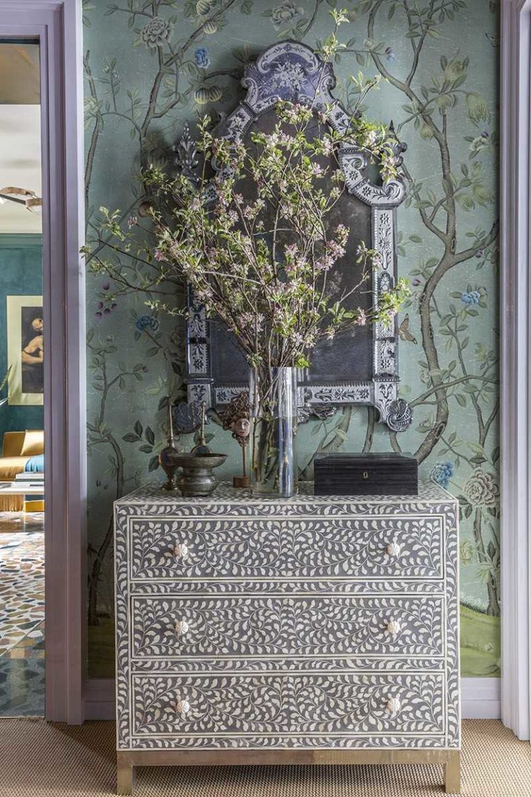
Although I like to think that we create "timeless" interiors, everyone want to know what we think is IN or OUT at the beginning of the year. While I hope we're trend-less, it's true that we can't help but be influenced by what's available in the marketplace. Here's our Round-Up of What's IN and What's OUT for modern Interior Design Trends: In Chinoiserie: Seen everywhere lately from our Kips Bay room to the Whitby Hotel - chinoiserie is making a comeback in a big way. Whether wallpaper, fabric, or Chinese porcelain, Chinoiserie adds depth and interest to any space. I feel its so popular now because people are looking for something unique, handmade, and full of exotic fantasy! Memphis style: The '80s hype is back!! The popularity of the Ettore Sottsass exhibit at the Met Breuer was indication that people are ready for this epic look again. In smaller doses that is... We're using an iconic chair, accessory or light fixture as a nod to the post-modern! The Mtv generation is ready to have some fun again. We're not looking for full-on Memphis like Karl Lagerfeld's Paris apartment of the '80s, but carefully executed can this modern interior design trend can add interest and impact. Colored glass: As lighting or accessories, colored glass is everywhere. We are using colored glass chandeliers in almost all of our projects, both in bold and subtle hues. Ceramics: There seems to be a resurgence of pottery as a collectible item. People are...
End of content
No more pages to load

