Loading...
In addition to beautiful interiors, Kati Curtis also provides tailored advisory for Private Equity in Customized Furniture & Design. The world of private equity is one of ambition, transformation, and untapped potential. For firms looking to invest in the lucrative fields of interior design and online furniture retail, the opportunities are vast—but so are the complexities. When investing in specialized industries like these, it takes more than just financial acumen. It takes an insider’s understanding of the artistry behind the products, the nuances of customer behavior, and the intricate supply chains that drive this market. This is where our advisory services come into play. Designing Success Through Industry Expertise An investment in the interior design or online furniture sector is more than a numbers game; it's about understanding the heart of the industry. The interior design world thrives on customization, storytelling, and personalized experiences, while online furniture retail demands the right marketing, scalability, and seamless customer journeys. Kati is a seasoned expert with both financial and industry-specific experience, making her uniquely positioned to guide private equity firms toward successful investment outcomes. Why Invest in Interior Design and Online Furniture? Both interior design and online furniture retail sectors are poised for growth, driven by changing consumer lifestyles and increasing attention to home aesthetics. Here's why these industries are compelling investment targets: Elevated Demand: With the rise of remote work and shifting priorities, more people are investing in their living spaces, fueling...
We are thrilled to be a part of Design Share - a group of the Top 10 NYC Interior Design Firms that gather each month to share tips, challenges, and offer resources and support to each other. If you have recently purchased an apartment in one of the luxurious buildings in Manhattan, the interiors have to be just as awe-inspiring. Whether you want a traditional or modern aesthetic, an expert interior designer can help in bringing your dream apartment to life. Our group is comprised of many design firms with different tastes and styles, and it's important to choose a designer whose work resonated with your personal aesthetic. Kati Curtis Design: Kati Curtis Design is an award-winning interior design firm specializing in high-end residential and home renovation projects. Kati is admired for her ability to create layered interiors that combine function, texture, and color. The firm's design aesthetic is contemporary, timeless, and infused with color, art and personality. Lisa Frantz Interiors: Lisa Frantz Interiors is an award-winning interior design firm focused on residential projects. Their approach is to create a space that reflects its owner's personality and style. Lisa Frantz Interiors offers services from design concept consultation to full project management. Neal Beckstedt: Neal Beckstedt Studio is known for its timeless, sophisticated designs. The firm's design philosophy is grounded in a keen sense of proportion and scale, combined with the use of quality materials. Neal Beckstedt specializes in creating spaces...
Featured

As Featured in Press

Don't you want to be the first to hear when Kati updates her shop with one-of-a-kind finds?
Subscribe to Our Newsletter

All About NYC
Loading...
In addition to beautiful interiors, Kati Curtis also provides tailored advisory for Private Equity in Customized Furniture & Design. The world of private equity is one of ambition, transformation, and untapped potential. For firms looking to invest in the lucrative fields of interior design and online furniture retail, the opportunities are vast—but so are the complexities. When investing in specialized industries like these, it takes more than just financial acumen. It takes an insider’s understanding of the artistry behind the products, the nuances of customer behavior, and the intricate supply chains that drive this market. This is where our advisory services come into play. Designing Success Through Industry Expertise An investment in the interior design or online furniture sector is more than a numbers game; it's about understanding the heart of the industry. The interior design world thrives on customization, storytelling, and personalized experiences, while online furniture retail demands the right marketing, scalability, and seamless customer journeys. Kati is a seasoned expert with both financial and industry-specific experience, making her uniquely positioned to guide private equity firms toward successful investment outcomes. Why Invest in Interior Design and Online Furniture? Both interior design and online furniture retail sectors are poised for growth, driven by changing consumer lifestyles and increasing attention to home aesthetics. Here's why these industries are compelling investment targets: Elevated Demand: With the rise of remote work and shifting priorities, more people are investing in their living spaces, fueling...
We are thrilled to be a part of Design Share - a group of the Top 10 NYC Interior Design Firms that gather each month to share tips, challenges, and offer resources and support to each other. If you have recently purchased an apartment in one of the luxurious buildings in Manhattan, the interiors have to be just as awe-inspiring. Whether you want a traditional or modern aesthetic, an expert interior designer can help in bringing your dream apartment to life. Our group is comprised of many design firms with different tastes and styles, and it's important to choose a designer whose work resonated with your personal aesthetic. Kati Curtis Design: Kati Curtis Design is an award-winning interior design firm specializing in high-end residential and home renovation projects. Kati is admired for her ability to create layered interiors that combine function, texture, and color. The firm's design aesthetic is contemporary, timeless, and infused with color, art and personality. Lisa Frantz Interiors: Lisa Frantz Interiors is an award-winning interior design firm focused on residential projects. Their approach is to create a space that reflects its owner's personality and style. Lisa Frantz Interiors offers services from design concept consultation to full project management. Neal Beckstedt: Neal Beckstedt Studio is known for its timeless, sophisticated designs. The firm's design philosophy is grounded in a keen sense of proportion and scale, combined with the use of quality materials. Neal Beckstedt specializes in creating spaces...
Gone are the days when a grand entryway was a symbol of wealth and status. Nowadays, modern design trends prioritize practicality, space efficiency, and a seamless connection between the entryway and the rest of your home. If you're looking to update your entryway, it's important to know the interior design trends to avoid that can consume valuable space and compromise your living experience. In this guide, we'll go over some entryway trends to avoid and offer tips on how to create a welcoming and inviting entryway that suits your lifestyle. Here are interior design trends to avoid for entryways: Large, extravagant, two or three-story grand entry halls were popular in the past, but now they're outdated and impractical. These types of entryways can consume valuable usable space, making it challenging to blend them with the rest of your home. They can also be a hassle to maintain and decorate, particularly for people who want to infuse their personality into the space. Instead, modern design trends lean toward creating welcoming, inviting entryways that flow seamlessly into the rest of the home. Contemporary design values practicality, efficiency, and a seamless connection between the entryway and the rest of the home. In addition to the grand entryways, white and monochromatic entryways are an Interior design trends to avoid. While they used to be a symbol of purity and sophistication, they now look bland and unoriginal. If you want your entryway to reflect your...
Loading...
As an NYC interior designer, I'm constantly on the lookout for inspiration and ways to expand my skillset. It's so important as a designer to keep your mind fresh and stimulated. This week we wanted to share some of our favorite interior design books with you. We hope you can find inspiration throughout these pages! Take a look. On Style: Inspiration and Advice from the New Generation of Interior Design "On Style brings together today's top up-and-coming interior designers who together reflect the future of decorating, illustrated with never-before-published photos of each designer's work. The world is changing, and interior design is changing along with it. Today's designers are presenting a fresh take on decorating, and they are connecting directly with their audience over social media. In his follow-up to Interior Design Master Class, editor Carl Dellatore turns his curatorial eye toward this next generation of decorators, culling fifty of the top designers working in America today. On Style provides an intimate view into the personalities, inspirations, and aesthetics of these members of the new guard. Each profile spotlights a never-before-seen project, as well as each designer's story and influences, and of course, their advice for achieving great style." As you peruse this interior design book, you may even see some familiar faces on page 50! The Interiors and Architecture of Renzo Mongiardino: A Painterly Vision Hardcover "A fresh look at the interiors of Renzo Mongiardino—considered one...
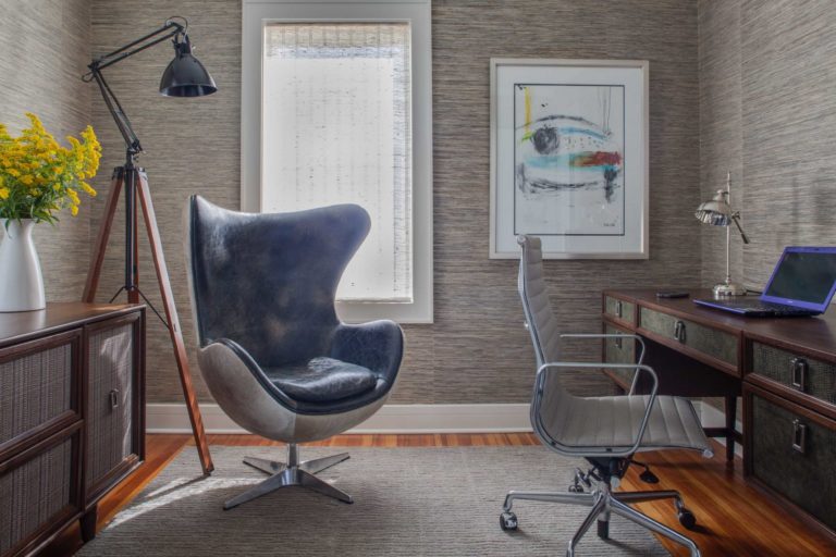
With so many working from home these days, you may be thinking "It's time to rethink my home office interior design". We don't blame you! You spend so much time in your office, and it should be a space that is not only functional, but beautiful. Today, we are sharing some of our top tips for making your home office feel like an inspiring workspace. From color palette to finishes, every detail matters. Take a look! Warm Color Schemes A typical home office interior design usually gravitates towards white and stale colors, but why not make your space warm and inviting? For our client's Central Park West home office, she wanted a space that was warm and bright, and we delivered. The red grasscloth wallpaper is warm without being overstimulating, and the rich wood furniture makes the space feel more welcoming and cozy. To balance out all the warmth, we added in bright blue accents to give contrast. Most importantly, we positioned the desk right by the window for lots of natural light and beautiful views of the park. Luxe Finishes Our clients' Tribeca apartment was full of rich color and luxurious finishes. It was only natural to continue this palette into the home office! We believe that your workspace affects your headspace, so we brought in beautiful brass and gold accents to promote prosperity and mindfulness. The cabinet doors have a luxurious rich blue overlay, which...
After the year we've all had, we're seeing more and more of our clients ask for extra color in their homes. Of course, we are more than happy to oblige. Bold color statements are a great way to brighten up your home and perk up your spirits on even the darkest of days. Here at KCD, we are no strangers to color, so today, we're sharing our secrets to mastering bold color. Take a look below for colorful interior design inspiration! Monochromatic Color Inspiration One of the most obvious ways to make a bold color statement in your interior design is to use a monochromatic color palette. In our client's Central Park West apartment, she insisted on a "red" bedroom. Of course we wanted to honor her wishes, but we needed to figure out a way to make it feel natural and not overwhelming. Red has a tendency to be overstimulating when used too much, so it's all about balance. We started with a red grasscloth wallpaper, which was the star of the show. With such a bold color, it's important to keep it simple. The grasscloth texture gave that bit of visual interest without feeling too busy. We then moved to the bed, which featured a red blockprint fabric upholstery, and was complimented by the antique red ikat at the foot of the bed. Complimentary Colors Next, we have complimentary color schemes. Complimentary colors are on...
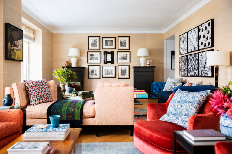
After the year we've all had, I think it's safe to say a trip to the Hamptons sounds like the perfect escape. The clean breeze, soothing waves, and tranquility all are so appealing, no wonder the Hamptons are such a popular destination! Many of our clients have stunning beach houses in the Hamptons, and we've come to find that bringing a little bit of that refined, yet relaxed Hamptons energy into our NYC interior design can be a great choice. Today, we wanted to share a bit of our philosophy into channeling that Hamptons interior design style no matter where you live. Take a look! It's All in the Mix If you've been following us for a while, you know that style mixing is a big part of how we create our magic. And designing with the Hamptons Interior Design style in mind is no different! As you can see above, we mixed a multitude of styles, patterns, and textures to attain this relaxed look. We mixed materials like the raw wood table and the exposed brick fireplace with crisp, clean lines in the furniture. We added abstract art above the fireplace to balance the very contemporary lines of the millwork and windows. To tie it all together, we added in subtle, yet intricate patterns in the wool rug and the throw pillows to add some more interest and culture to the space. Contrast is Everything Next,...
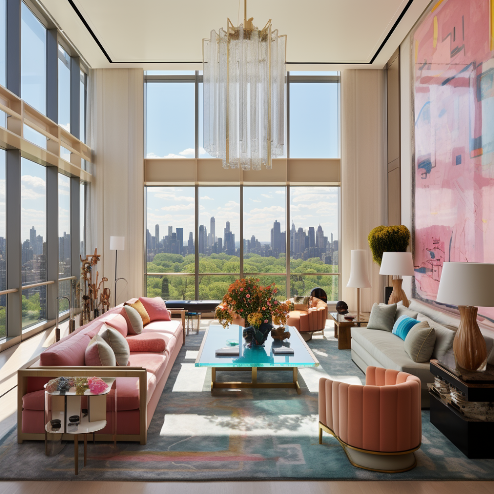
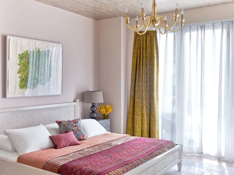
While it may be hard to believe with all the recent snow storms, spring is just around the corner! Today we wanted to go over some of our favorite ways to brighten up your home for spring. Here are a few of our favorite spring interior design ideas. Muted Pastels: In our clients' Chelsea Penthouse, they wanted to have lots of color (and we were happy to oblige!). We chose this gorgeous bright bedding, but needed to find a way to keep the color moving without being overwhelming. The paint color we chose is a beautiful muted pink, toned down with a gray undertone. This color is perfect to bring in those warm spring feelings without it being too much. Now, we don't mean Easter egg pastels. Look for colors that have a gray or taupe undertone to keep them feeling warm yet livable. Chinoiserie Chinoiserie is one of our favorite spring interior design ideas. By definition, Chinosierie is the European interpretation of Chinese decorations and art. We love using Chinoiserie prints throughout many of our designs. In this Central Park West interior design, we added this stunning wallpaper in the main bedroom. While we may be surrounded by the concrete jungle, this whimsical wallpaper created our own magical indoor garden that lasts all year. You can pick a more subtle print, like this one, or go bold with bright colors and larger scale prints. Floral...
End of content
No more pages to load




Pingback: The New Guard: Kati Curtis of Kati Curtis Design | CJ Dellatore - Resources For Design Professionals