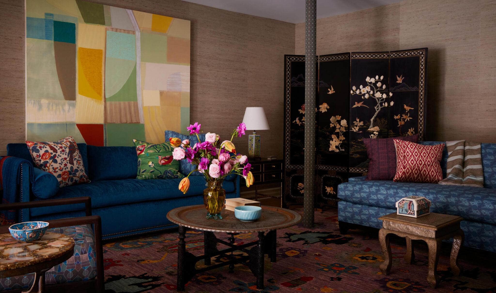
As seen in the Wall Street Journal. A little bit edgy, a little bit refined; a little bit rock ‘n roll, a little bit cotillion. That’s how to describe one of KCD’s longest-time clients. So when she came back to us because she was moving back into Manhattan after forsaking us (or was it the city?) for years, we were thrilled. Yes, in part because she is amazing, yes, in part because who doesn’t love a Springsteen lover, and yes, in part because she gave us a dream interior design opportunity!
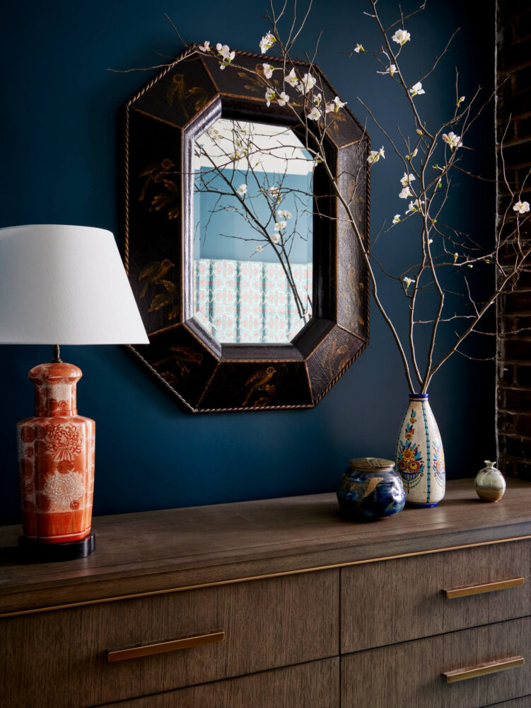
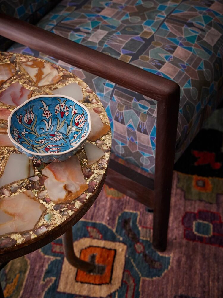
Welcome to St. Marks Place, an iconic street in Manhattan known for poets, politics, and creatives, and to a building that had, for years, been home to doctors’ offices on the ground floor. What could we do but gut the entire space, then transform it into a moody + colorful sanctuary?
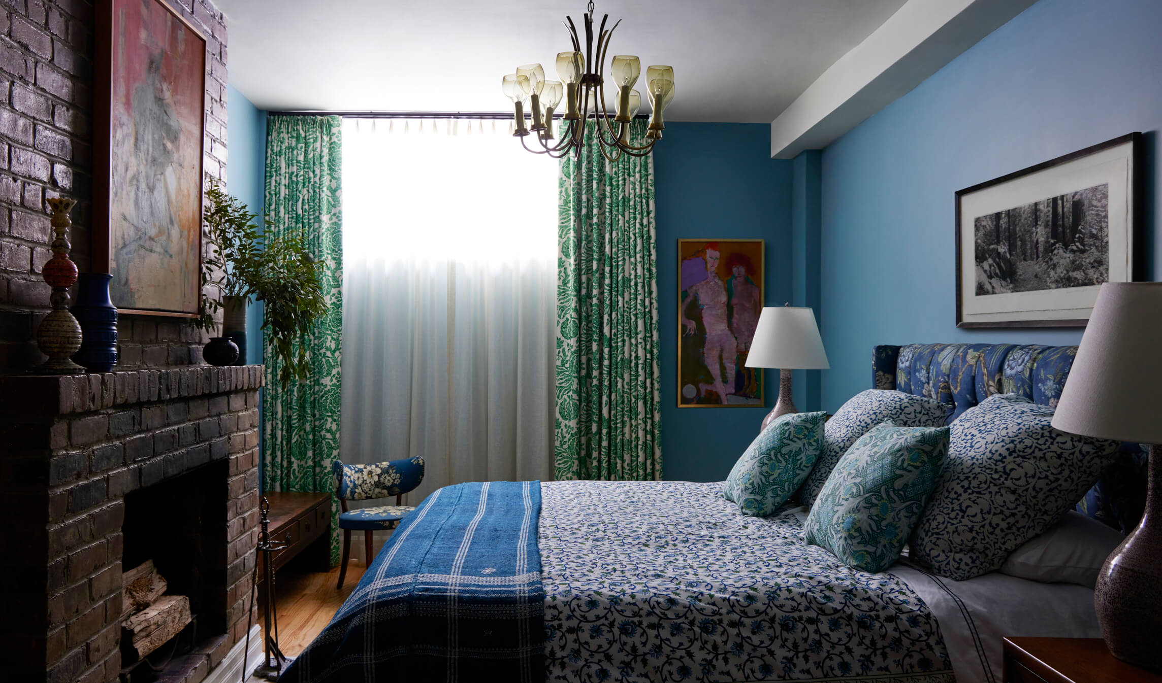
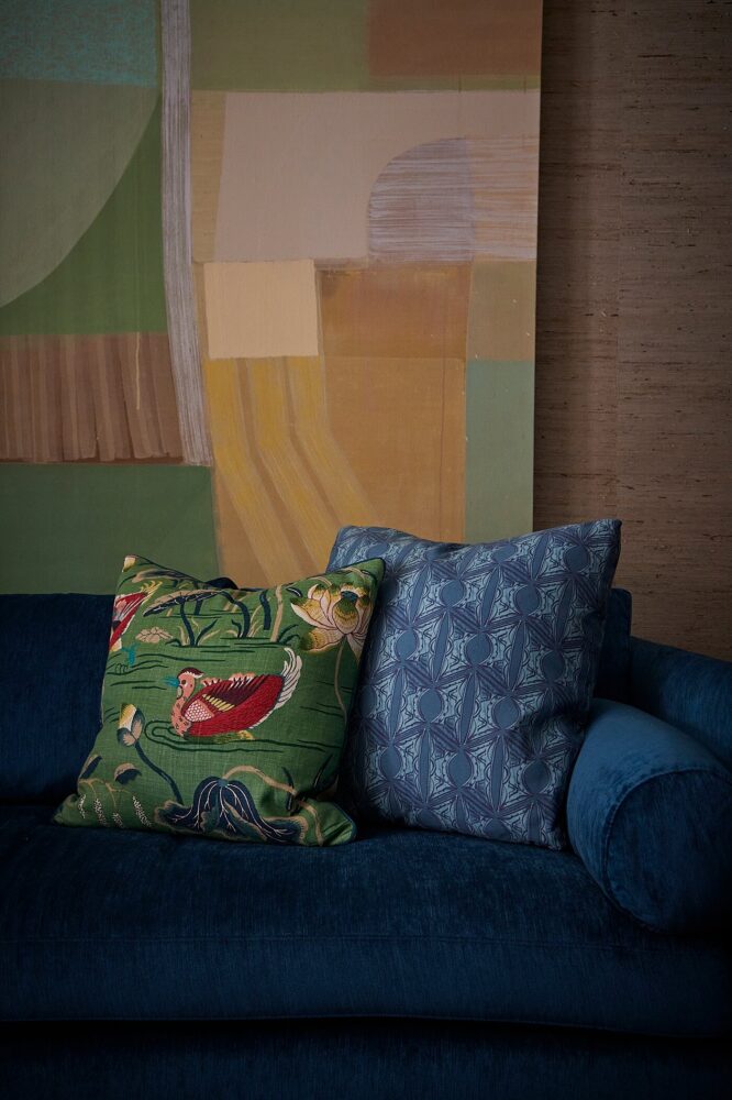
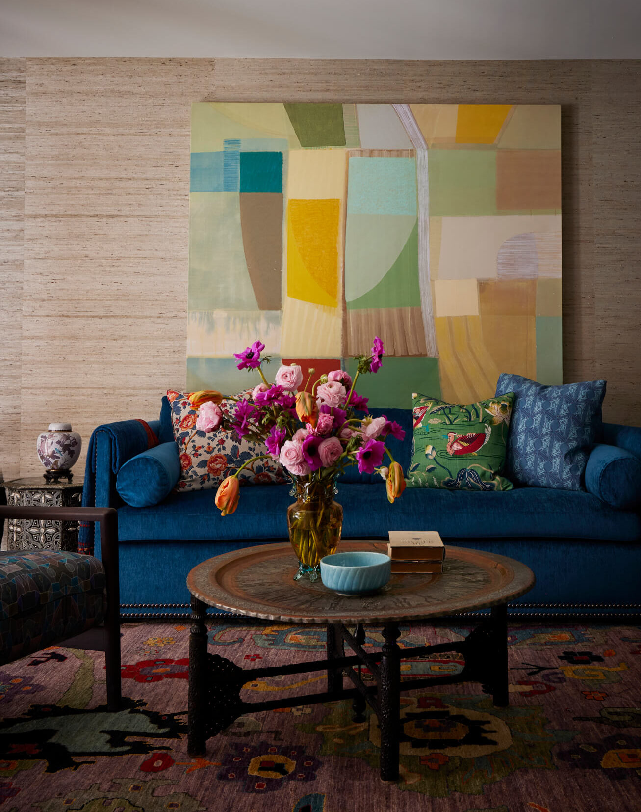
Instead of trying to fight the darker qualities of the townhouse interiors, we embraced our client’s directive to create “a cozy and warm home” and set out to enliven every space. Gorgeous jewel tones helped us do that, so did using textural wallcoverings throughout the main living areas. Further helping to fulfill her wishes: velvet mohair on one blue sofa, and an exuberant contemporary print from Anthony George on the other. Putting a St. Marks Place vibe (did we mention that antique shops once proliferated on the street, too?) into a collected feel for this home was critical. In the living room, it meant using her own antique inlaid Japanese screen and juxtaposing it with contemporary art, conveying those little bit traditional/little bit funky sides.
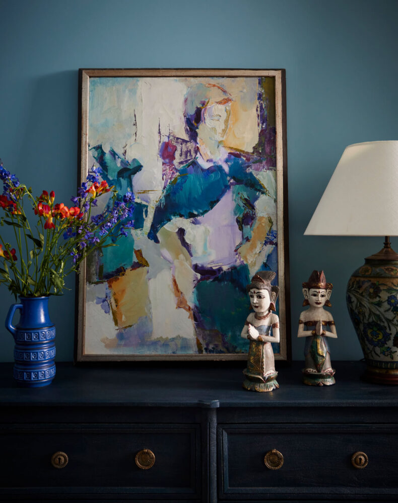
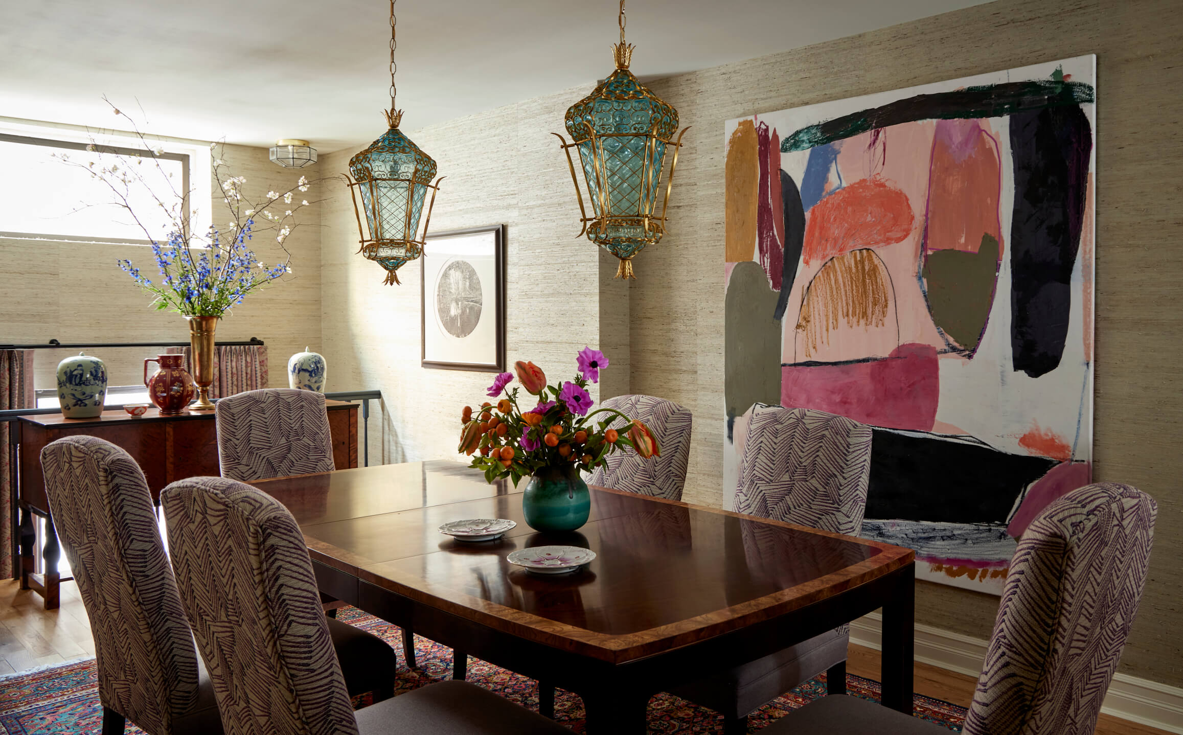
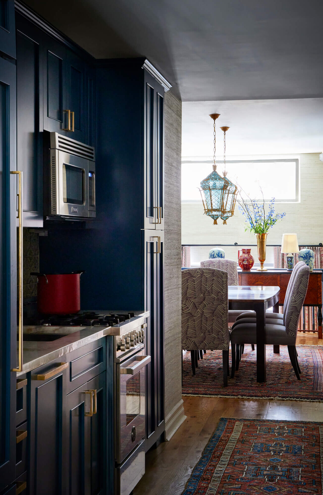
Entertaining and hosting gatherings is a large part of her life, so finding a vintage dining table that expands to include upwards of 12 people made us very, very happy. Then we looked around and knew exactly what came next: the vintage Murano glass pendants suspended over the table. From there, we turned our focus to the walls where now large scale modern art brings color and life into the room.
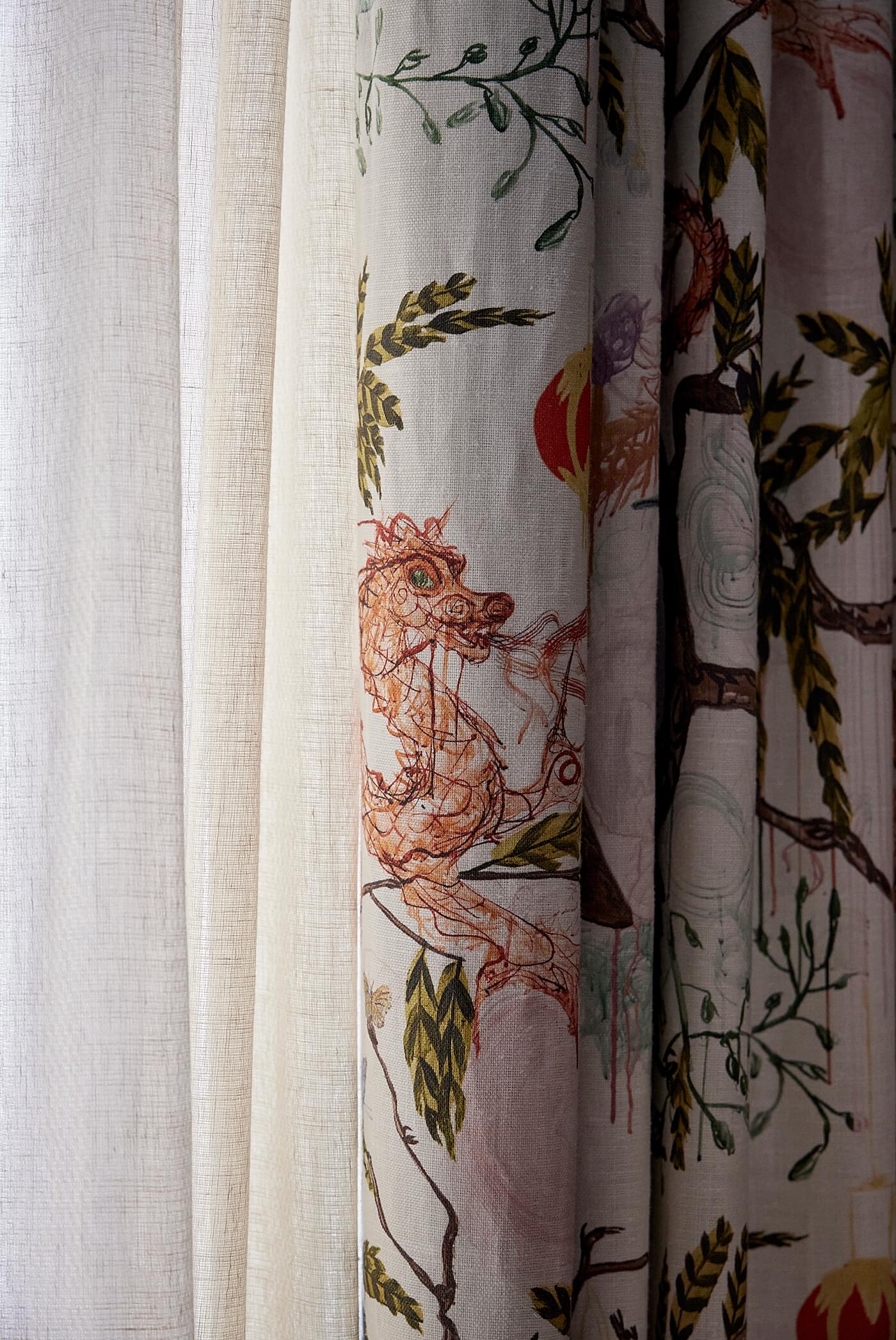
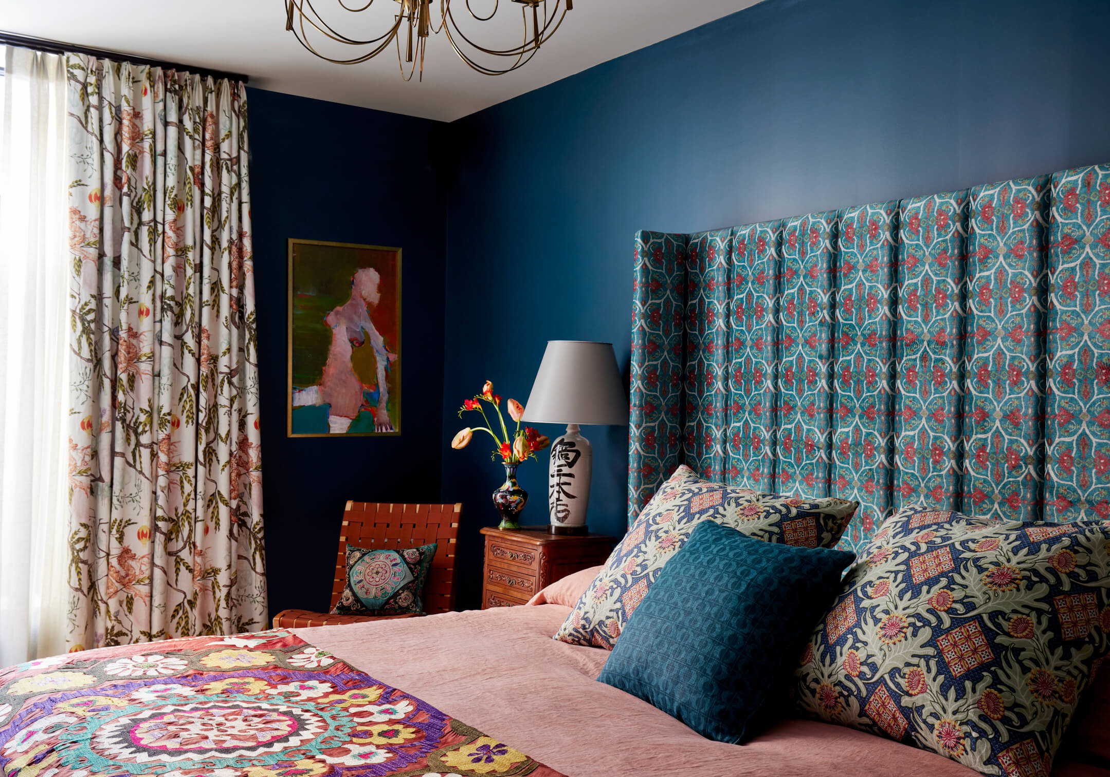
Next? Her bedroom. How do you not fall in love with curtains that, on first glance, seem like a traditional English floral pattern, but upon closer viewing, you realize they’re Dragons! Unconventional? Yes. Once again, taking our cue from our client’s personality, we balanced the curtains with stunning, more conventional French provincial nightstands that fit the tight space perfectly.
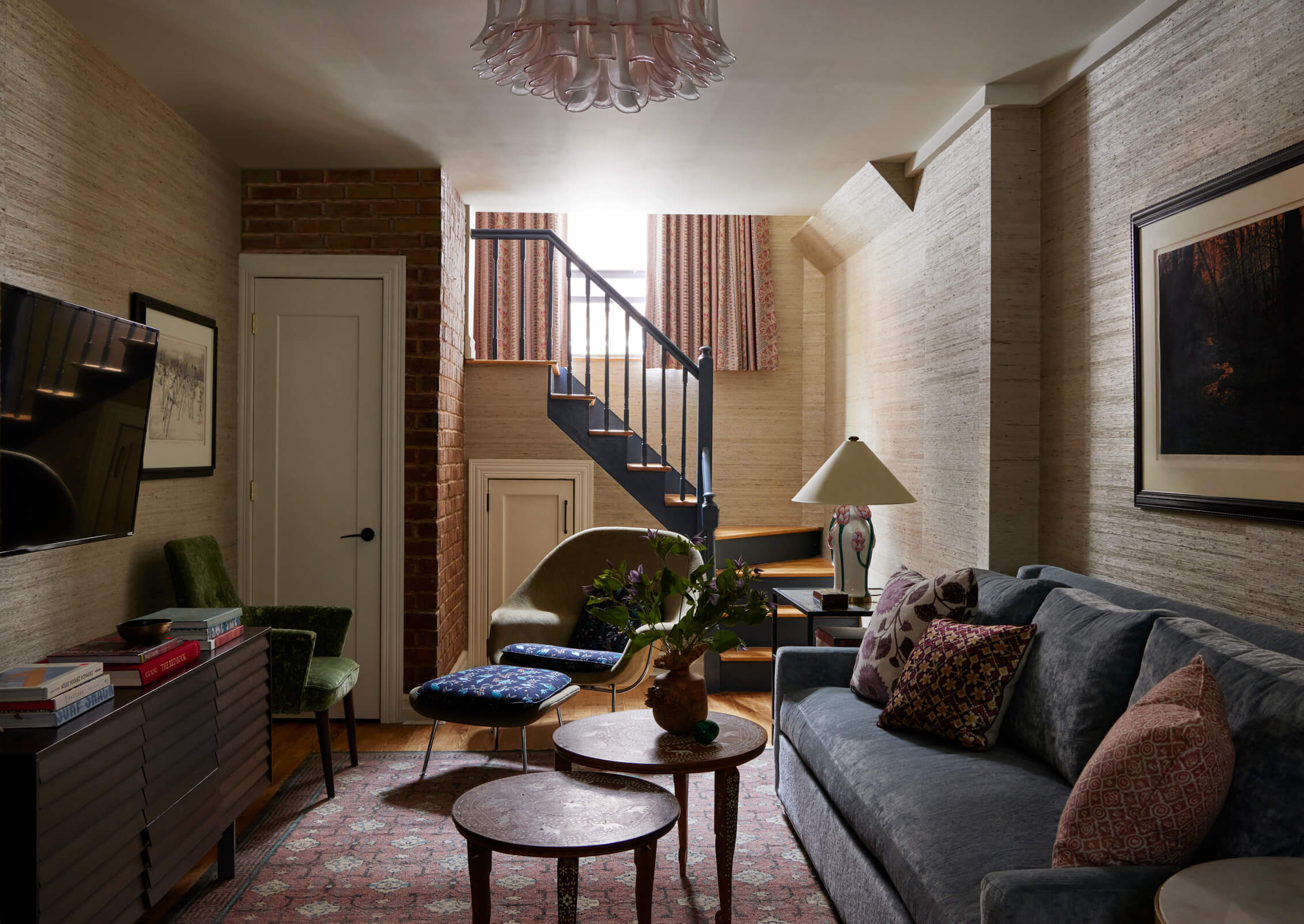
On the lower level, where family, grandkids and friends from all around come to visit, we made sure comfort is at a premium. And even though the spaces are below ground level, we created the above ground illusion through floor to ceiling curtains by Caroline Irving.
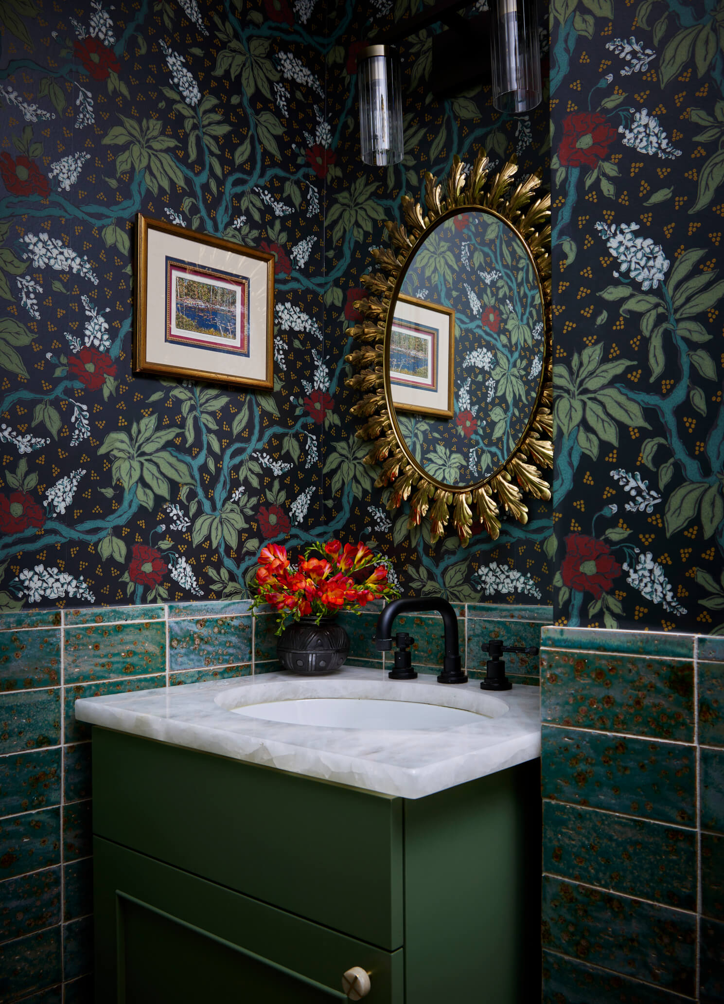
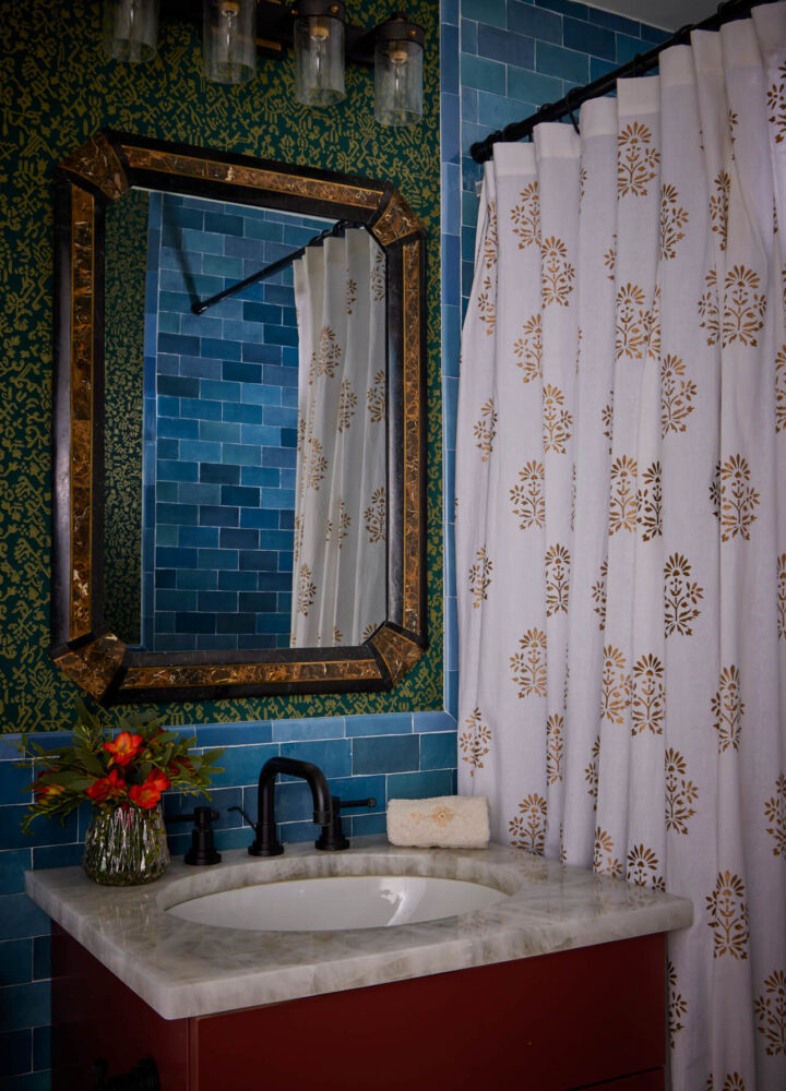
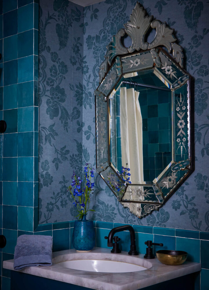
We designed each of the three bathrooms to be little surprises, capitalizing on the jewel-like qualities of the small rooms, we used vintage bath sconces, beautiful hand-cast tiles, and perhaps added astonishment (or two) with moody wallpapers.
Living in a city where you can love entertaining and also love not the imperative of cooking, let us borrow space (okay, steal!) from the kitchen where it wasn’t needed and add it to a place it was: her library. Today, her massive number of books are happily housed on the book shelves we designed to accommodate them.
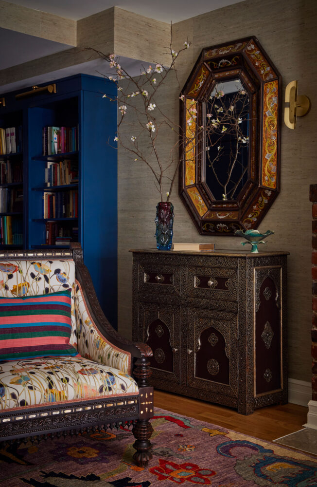
We really believe that every home needs a little intrigue, and we found it here when a working fireplace was uncovered during the renovation. It was the perfect ending to our fabulous client’s “cozy” and literally “warm” design story. A story of coming home.
