As seen in NY Cottages and Gardens Built in 1898, this true Beaux Arts belle is as magnificent in her architectural details as in her gilded era history. It’s not every day we’re asked to add our Tribeca interior design vision within McKim, Mead & White’s original, so jumping at the chance puts it mildly.
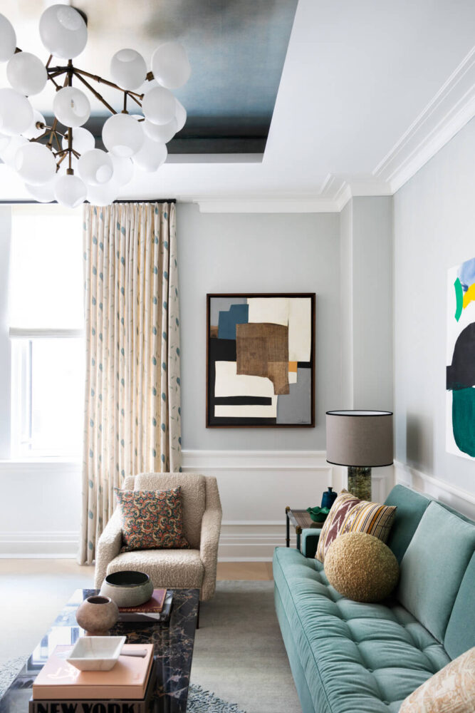
Our client wanted a pied-a-terre, one that would let her spend more time in the city. Us? We wanted (and loved) the chance to address two challenges: 1. How to combine Beaux Art with Modern Tribeca, and 2. How to design enormous function + beauty into a small space—the age old NYC apartment dilemma, this time within an ages-old, but newly “white boxed” NYC apartment interior design.
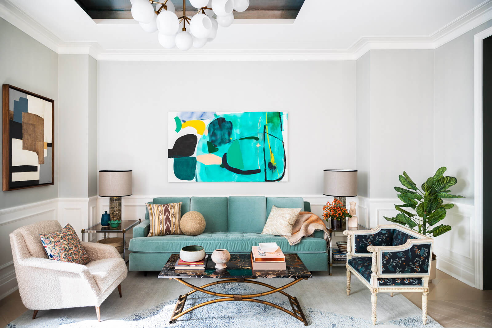
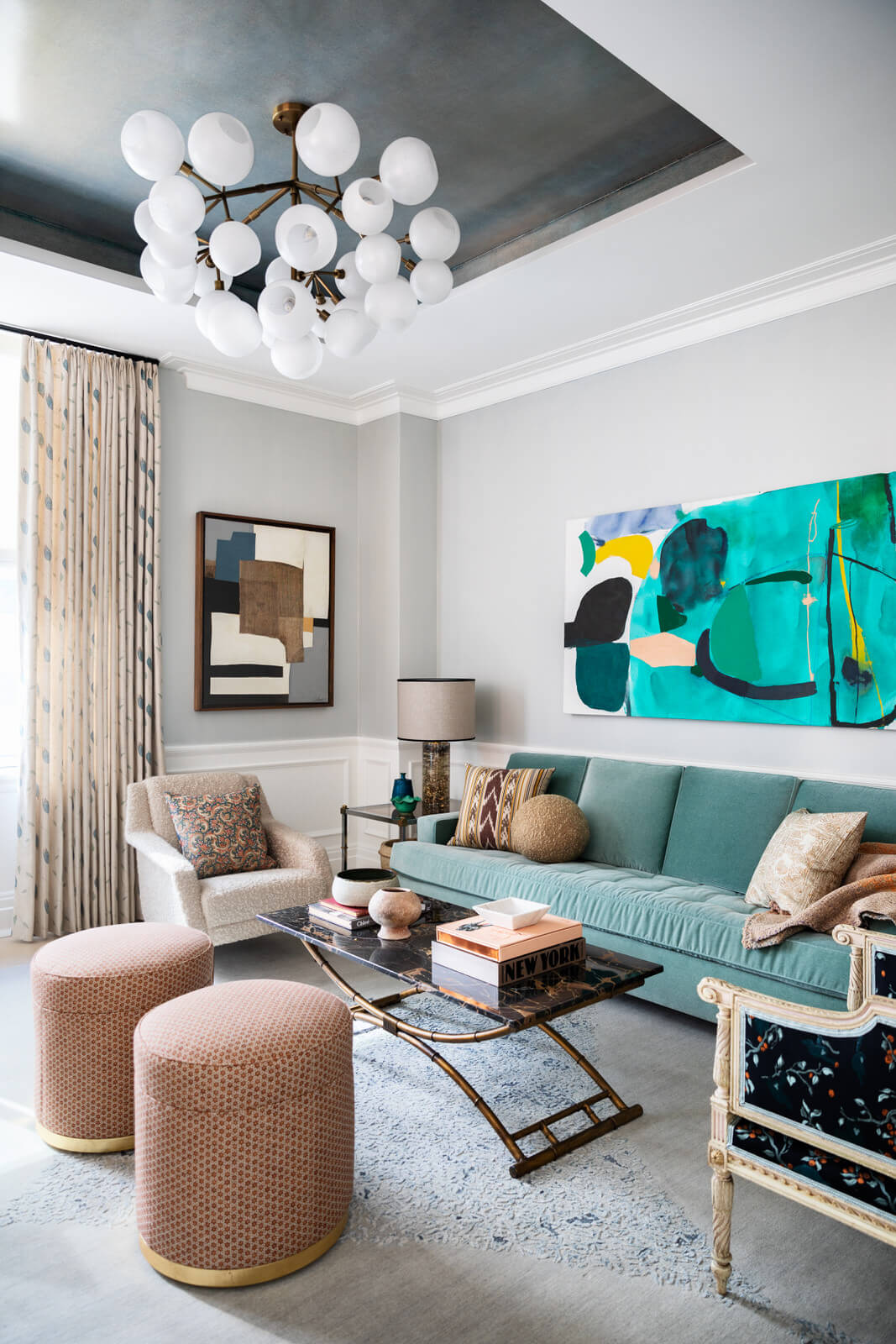
Looking right outside we found our inspiration–the original patinated dome atop the roof. Inside the great room, we faux painted the tray ceiling a brilliant turquoise that turns copper depending on the angle at which you’re viewing it, that mimics the beauty and natural patina of the original copper dome.
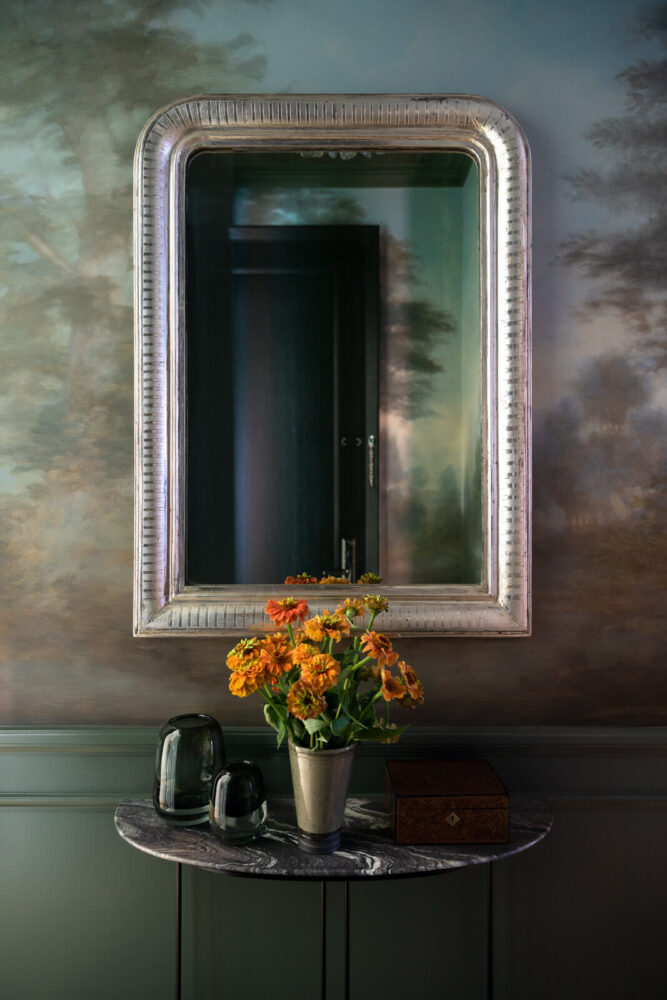
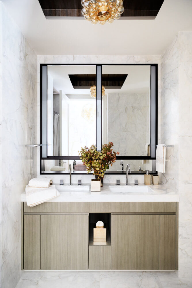
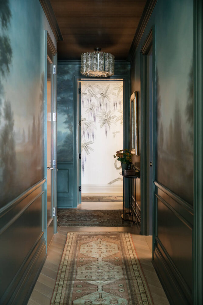
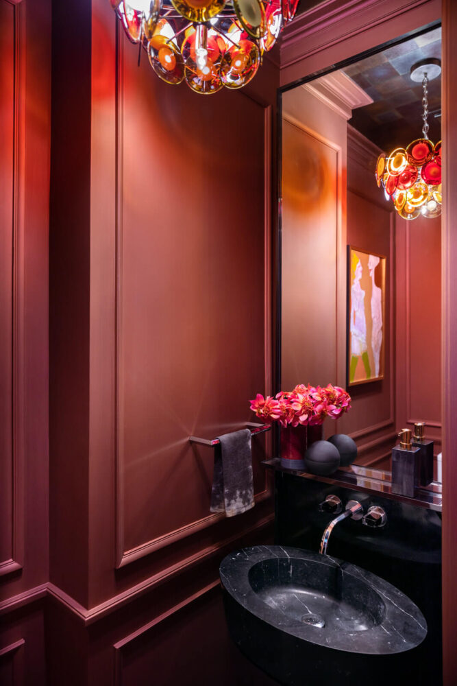
We next assigned two words to serve as our guiding interior design principles: drama and detail. A dramatic hallway draws you in with its hand painted trompe l’oeil. Part dreamscape, part landscape, it’s moody and luscious and took a tight, dark space from claustrophobic to a dreamy fantasyland. More drama is found in the powder room, where the decorative paint finish we created moves from bronze to red. With walls that have a subtle sparkle, it feels like you entered a magical salt cave, and the Vitossi light fixture only enhances the overall effect.
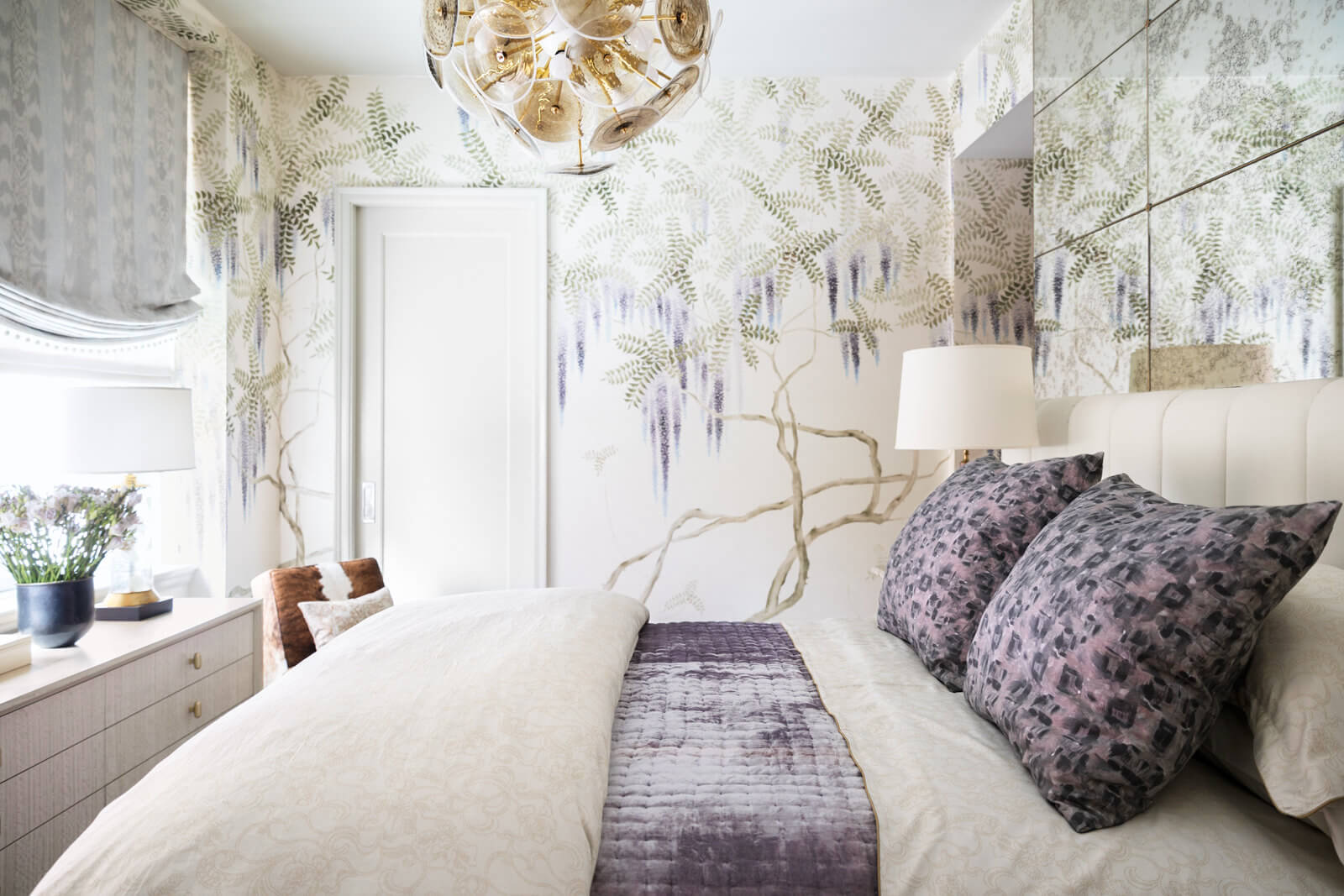
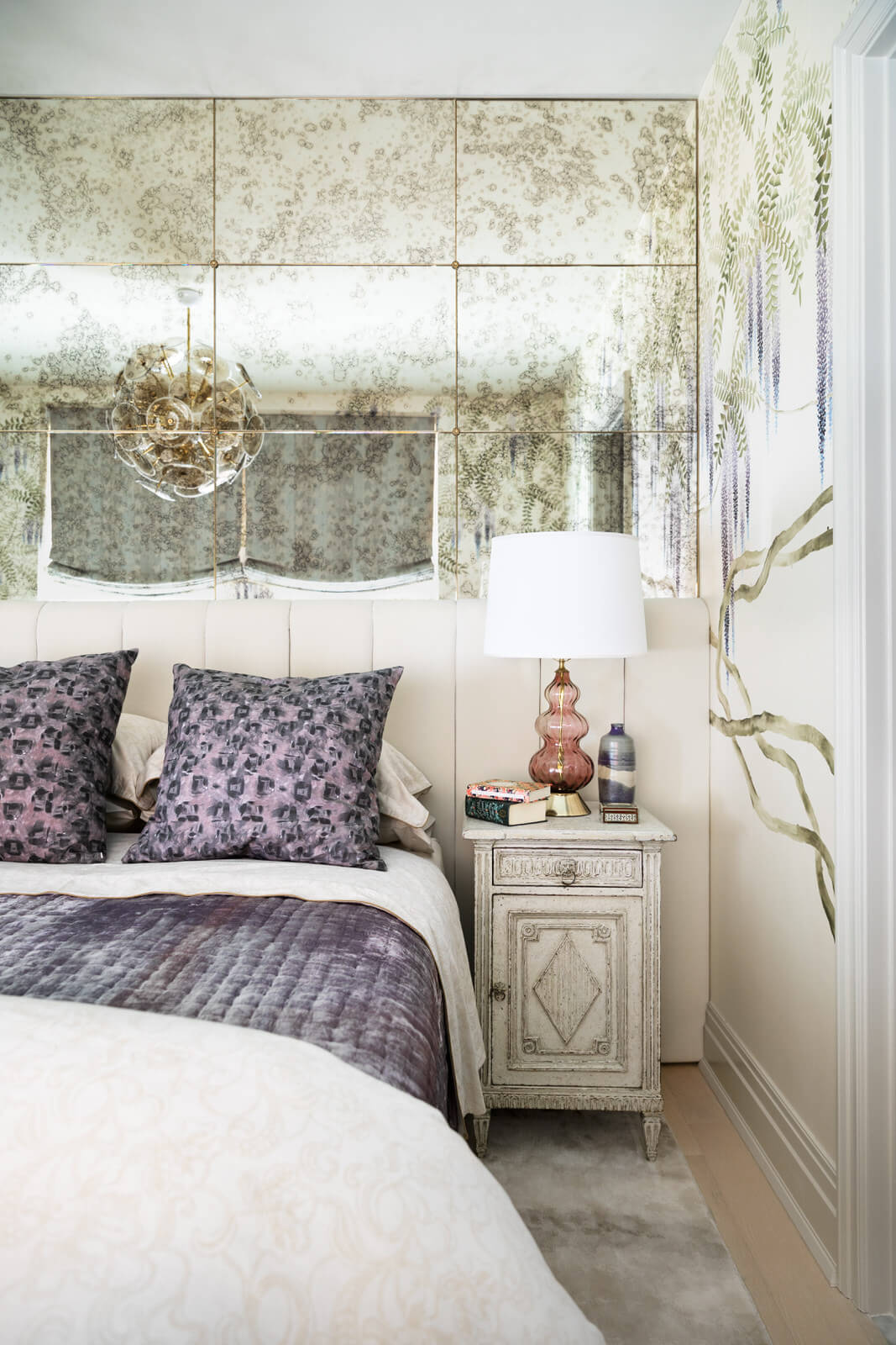
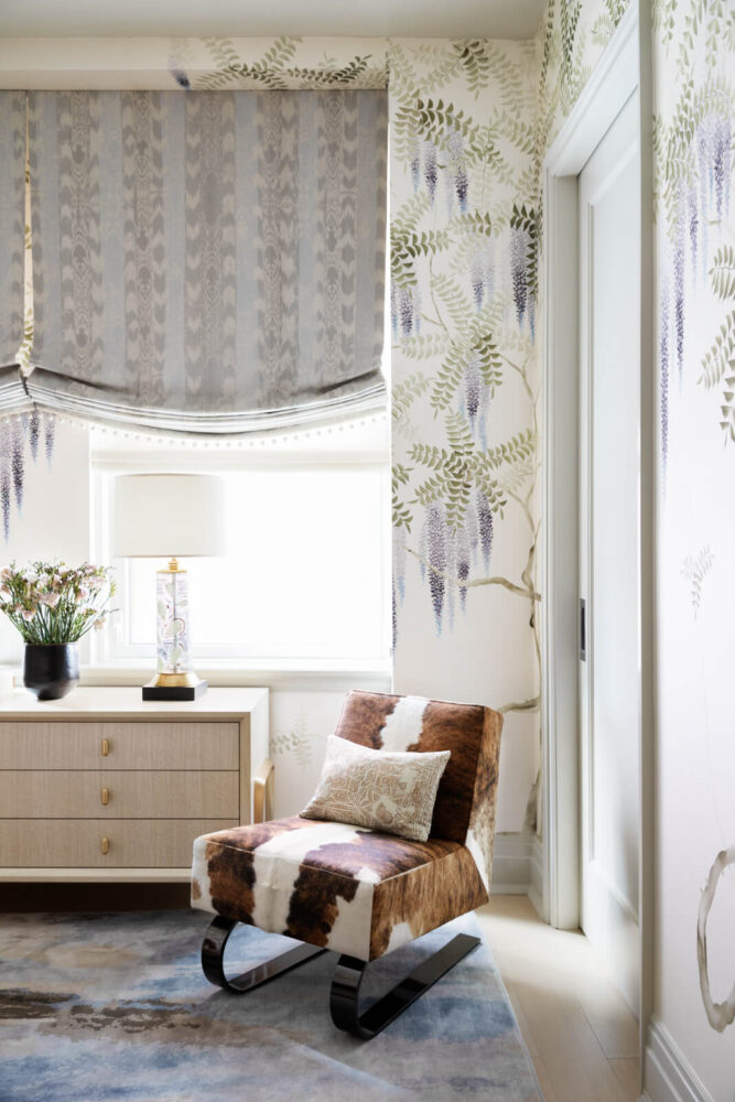
In the very small primary bedroom we installed antiqued mirrors above the headboard to give the illusion of more space, and then played off the edginess of a chair we loved from one of the client’s past apartments we’d designed fondly referred to as the “cow chair”, juxtaposed with the loveliness of de Gournay wallpaper and modern Anthony George pillows.
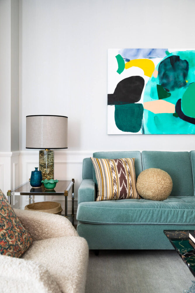
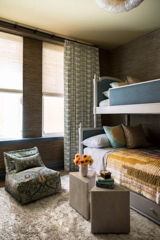
Details? They’re there in the kids’ bedroom in the bunk beds we designed that combine neoclassical detailing with the modern edge of Holland & Sherry fabric. You’ll see more details in the open living-dining-kitchen area where a KCD designed sofa is tufted and upholstered in a soft velvet mohair: comfy, pretty and perfect for the space.

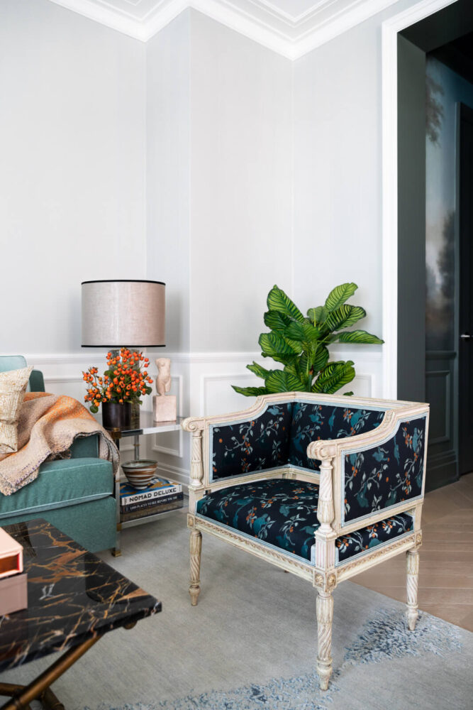
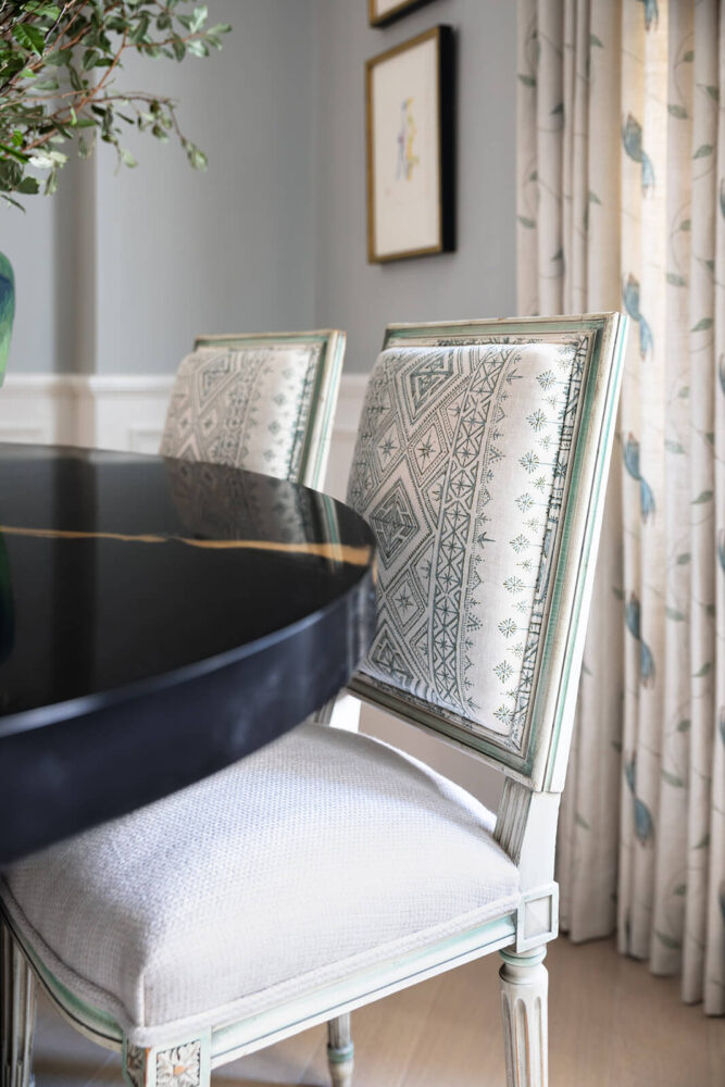
A deep dive into the details of the Louise XVI dining chairs might cause you to lose minutes, maybe hours of your life. Yes, they’re quite old; yes their detailing is beautiful, and yes, they’re a perfect patinaed expression of our Beaux Arts meets Modern Tribeca Interior design theme, but thanks to their white performance fabric, they’re also there to be used and enjoyed daily. Balancing all that feminine energy is the dining table we selected; its steel base and resin top, with its gold marble pattern, makes a statement in the room’s pale, soft interior design palette.
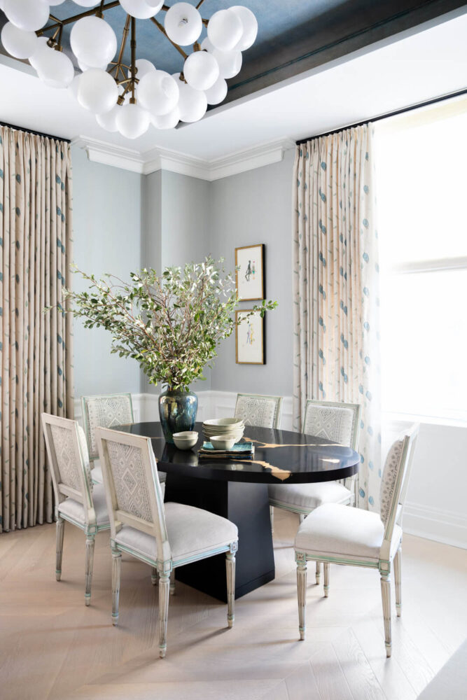
Home is indeed where the heart is; it’s also where the gorgeous mix of eras live contentedly amid the details and drama of modern Tribeca.
