NYC Townhouse Interior Design featured in the Wall Street Journal
So when the client called Kati Curtis Design about working on the top two floors of the townhouse, we jumped at the chance to work on this NYC townhouse interior design. The client’s main residence is Palm Springs, CA where they live in a very modern home: clean lines, light and glass, but here, in their city dwelling, they wanted warm, cozy, and comfortable. Considering our fondness (alright, passion) for contrasts, we loved hearing this.
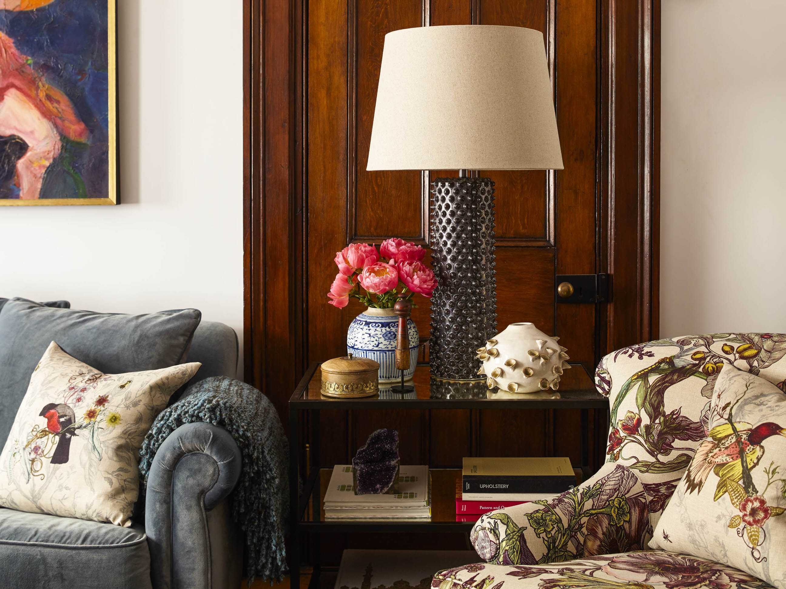
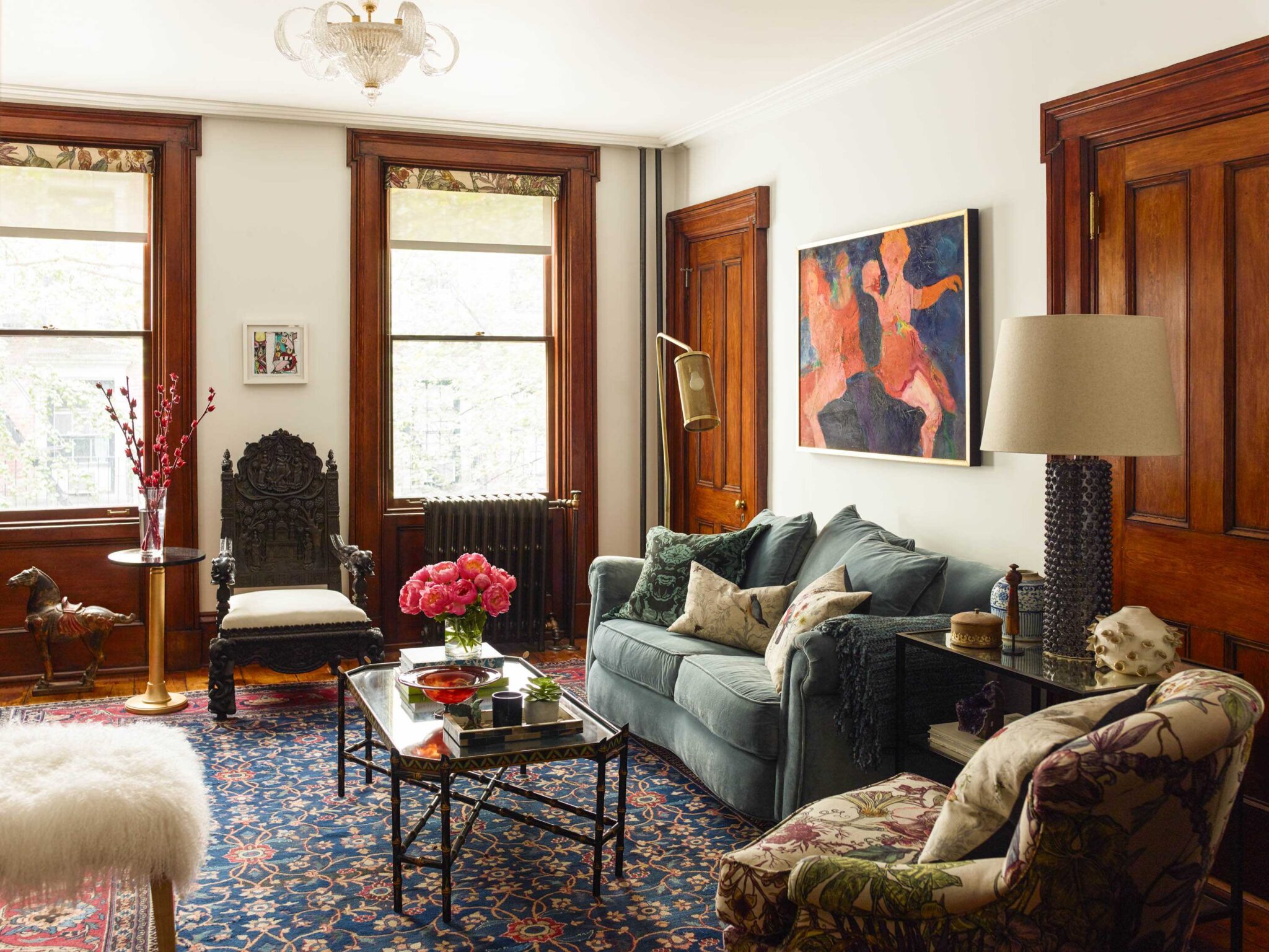
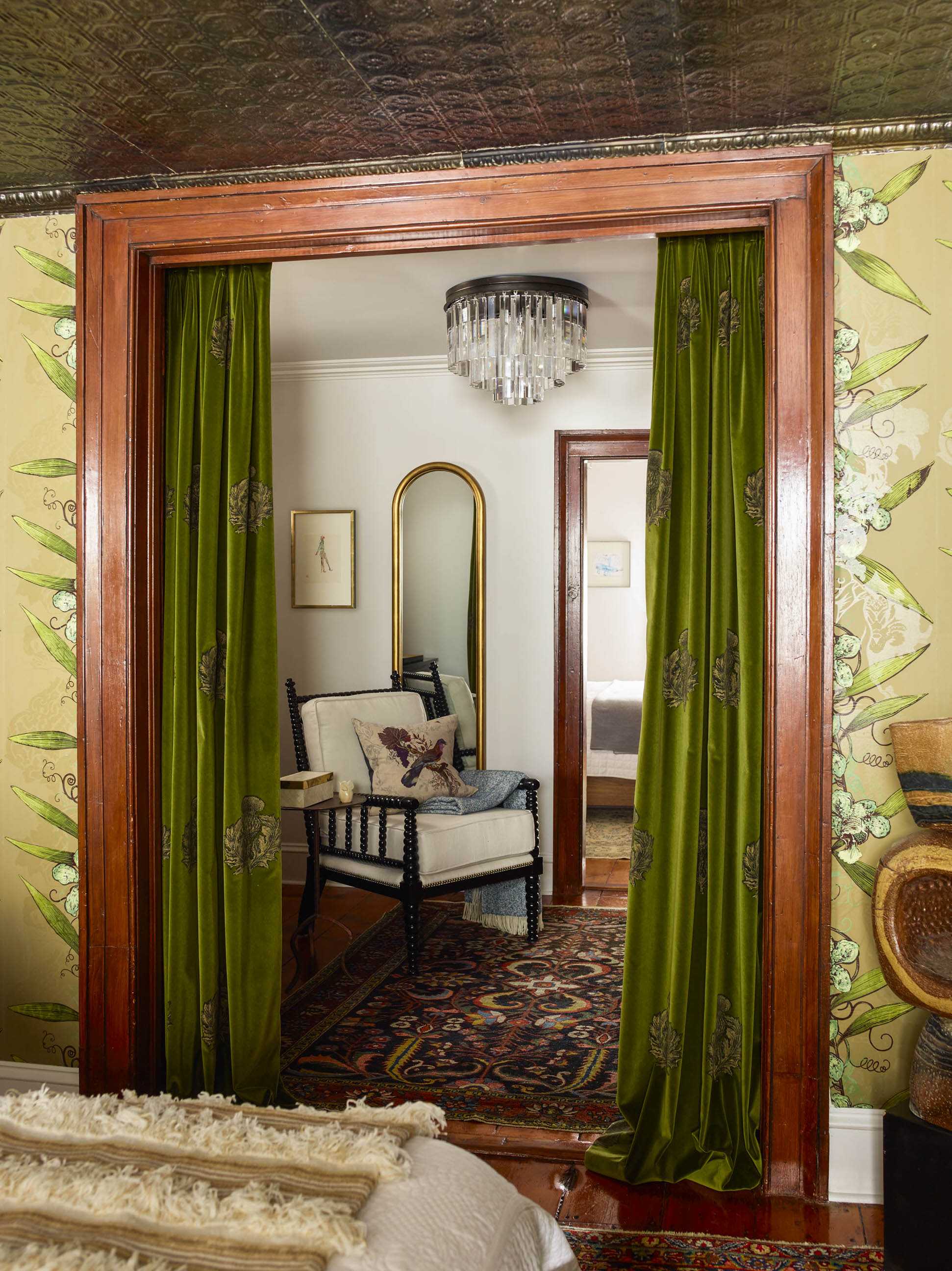
Over the course of the project we made two observations: 1) people really liked their doors back in 1899, and, 2) they also had different proportions then; the combination added interesting challenges to our process. One way we dealt with it was by designing a custom sofa to fit perfectly between the older proportioned (aka: smaller) spaces between the doors (well, two of them.)
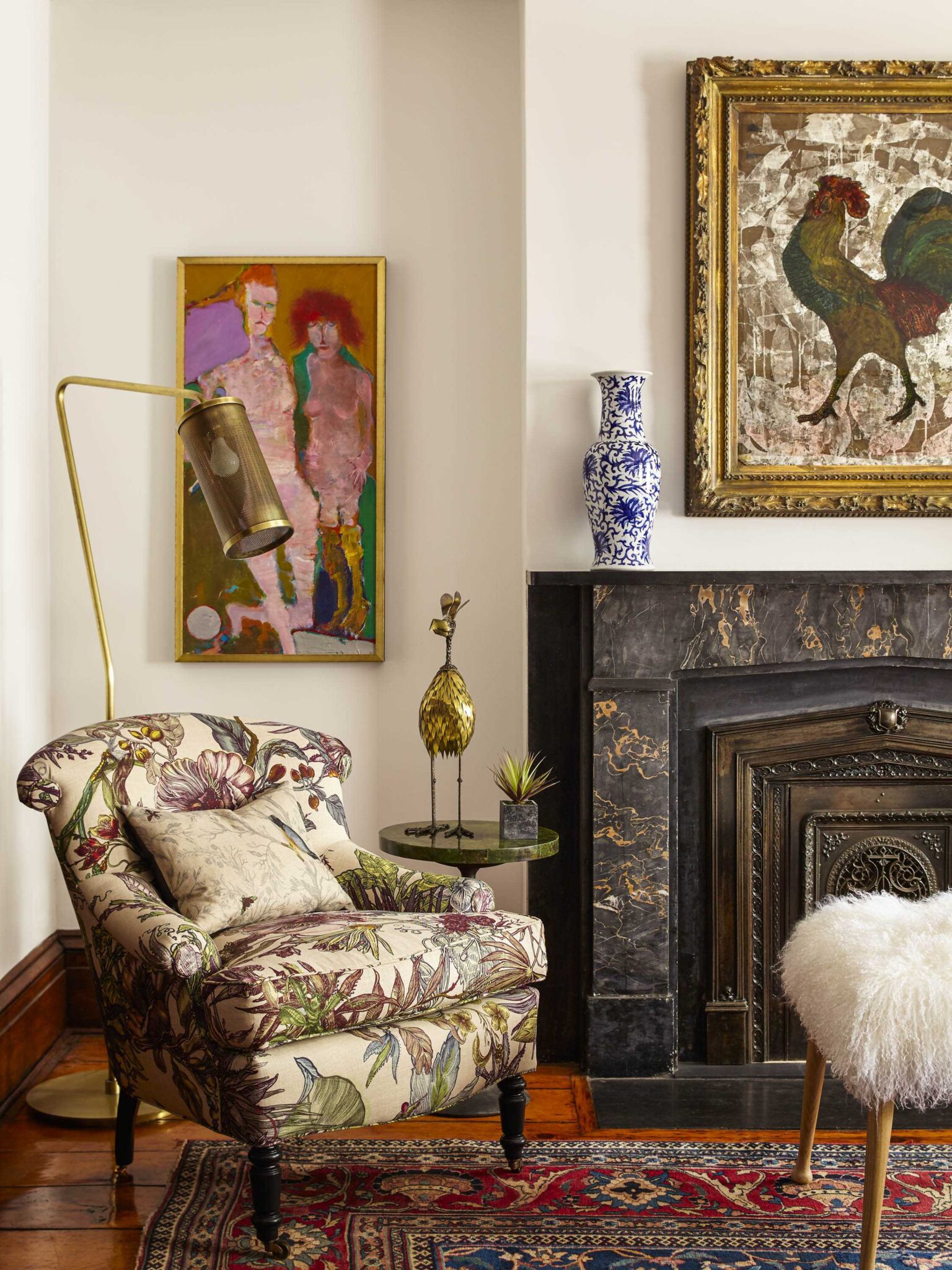
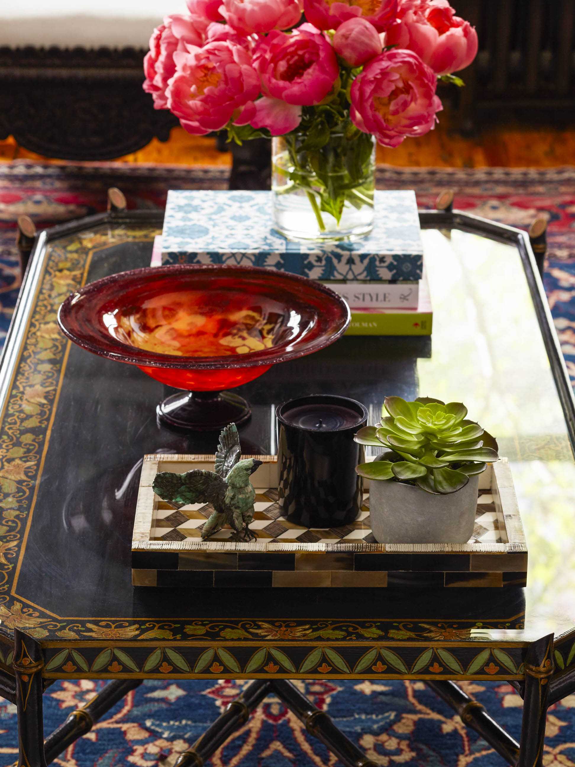
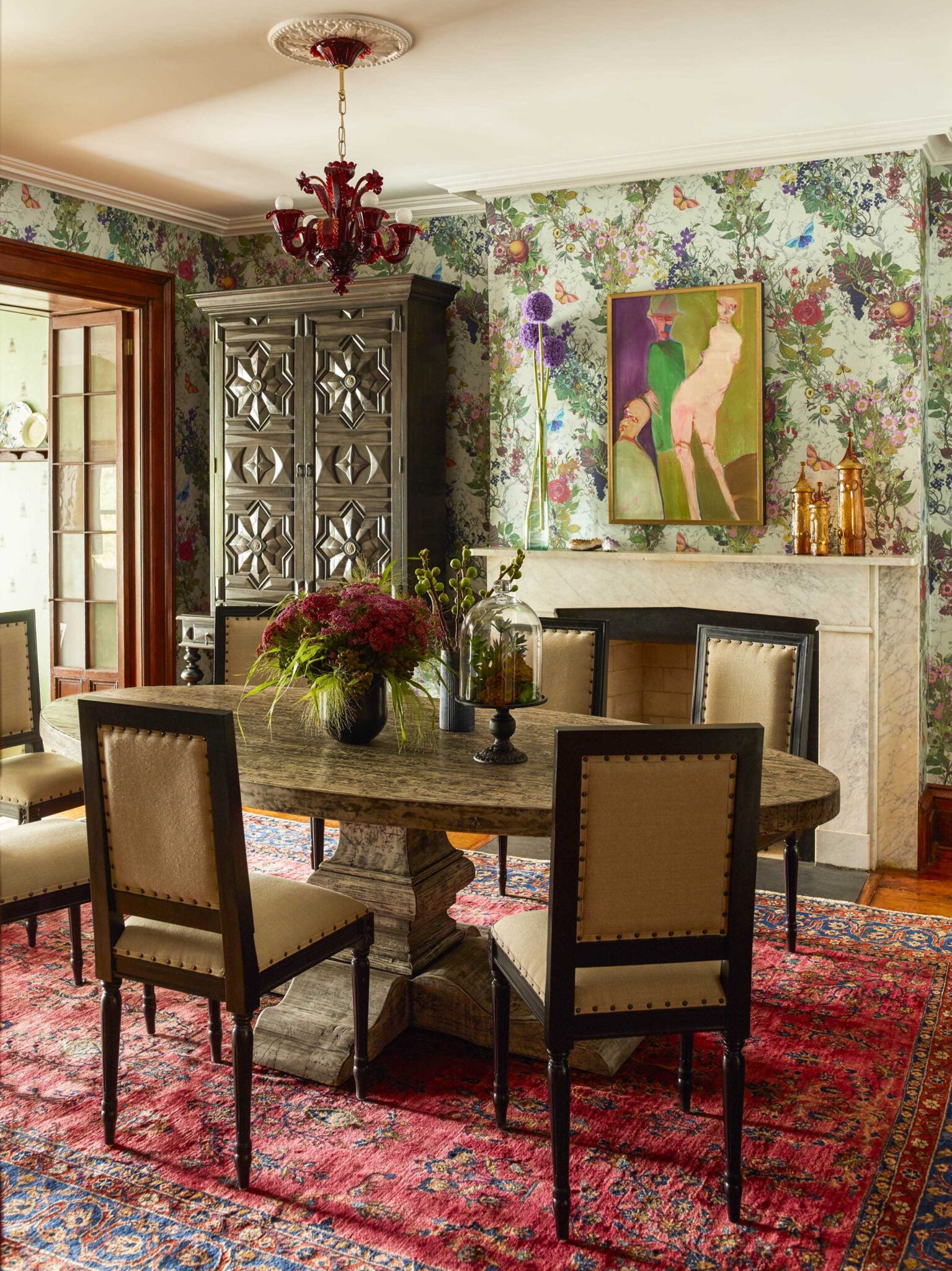
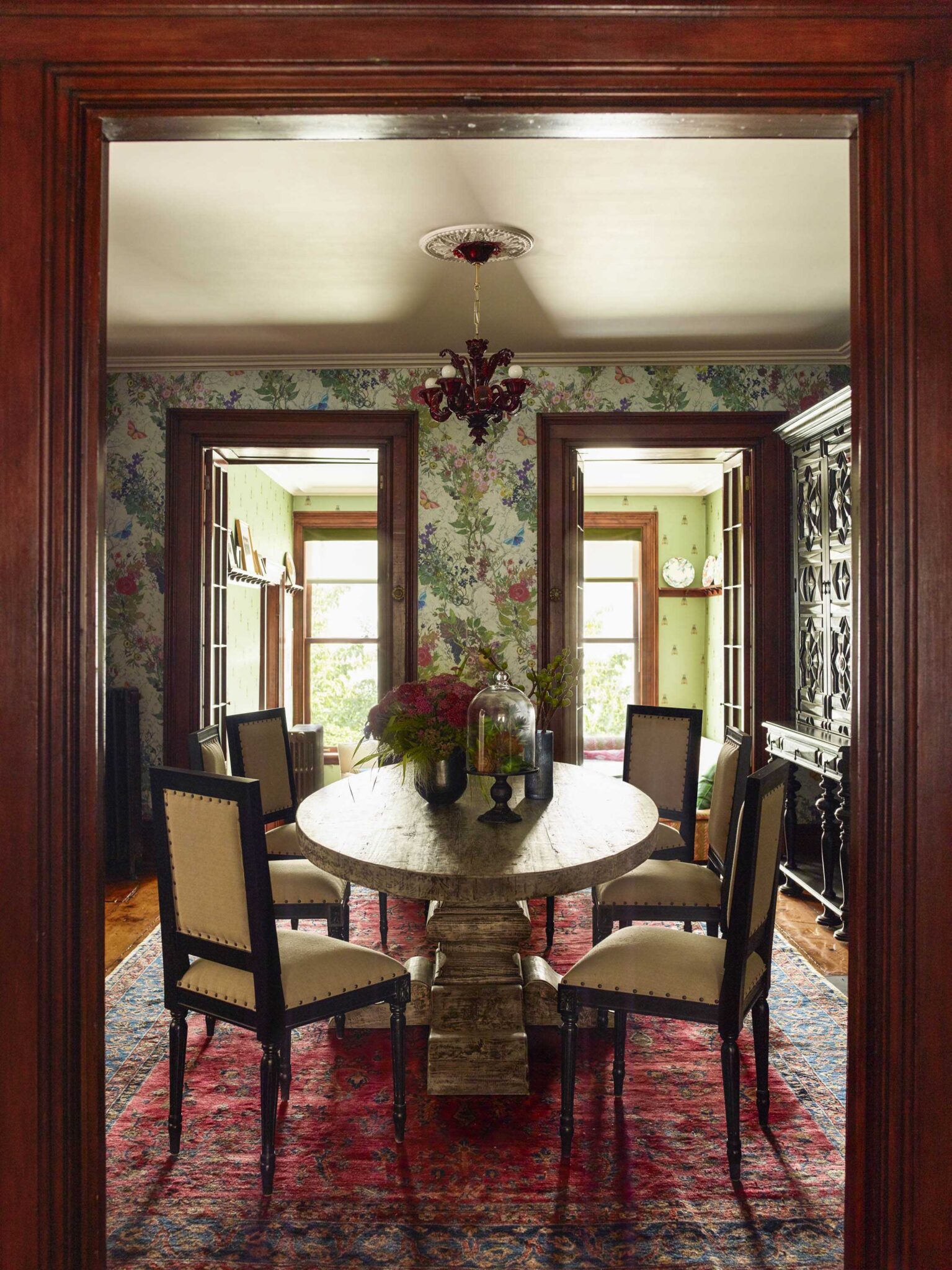
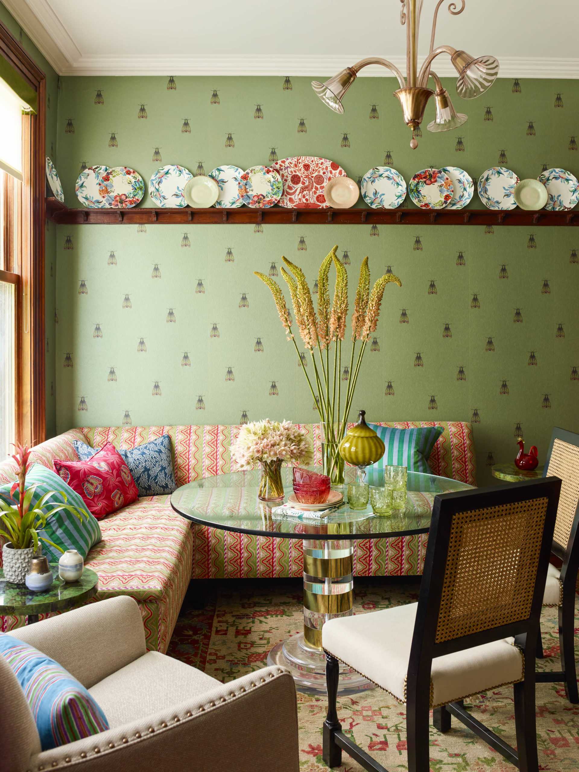
We wanted to reflect the vintage era of the townhouse, and at the same time acknowledge the hip and modern nature of this couple; we decided on “vintage with a twist.” One way we expressed this was through the wallpaper, by Timorous Beasties, in the dining room; it captures the Victorian feel of the home but with the most modern pattern. Another wallpaper, this one in “the family room,” looks like a sweet Victorian pattern…from afar. Upon closer inspection something far less benign is revealed: a pattern of evil-looking moths. The kitchen’s original cabinetry, its leaded glass and old brick had all been restored; we wanted to be respectful, yet we also wanted to give a surprising twist, so along with that crazy moth wallpaper, and a banquette we designed—we layered a very modern, lucite table on top of an antique needlepoint rug.
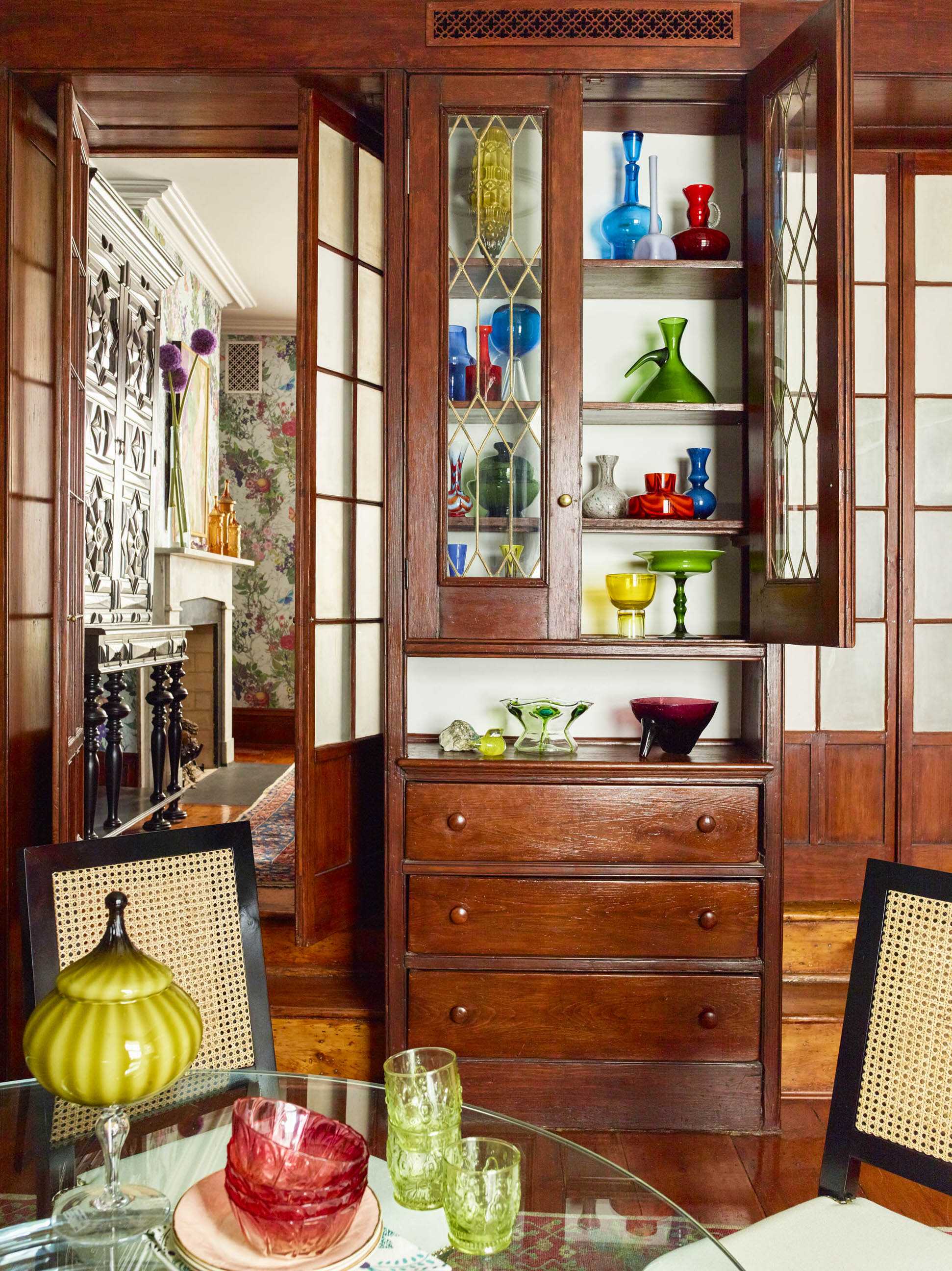
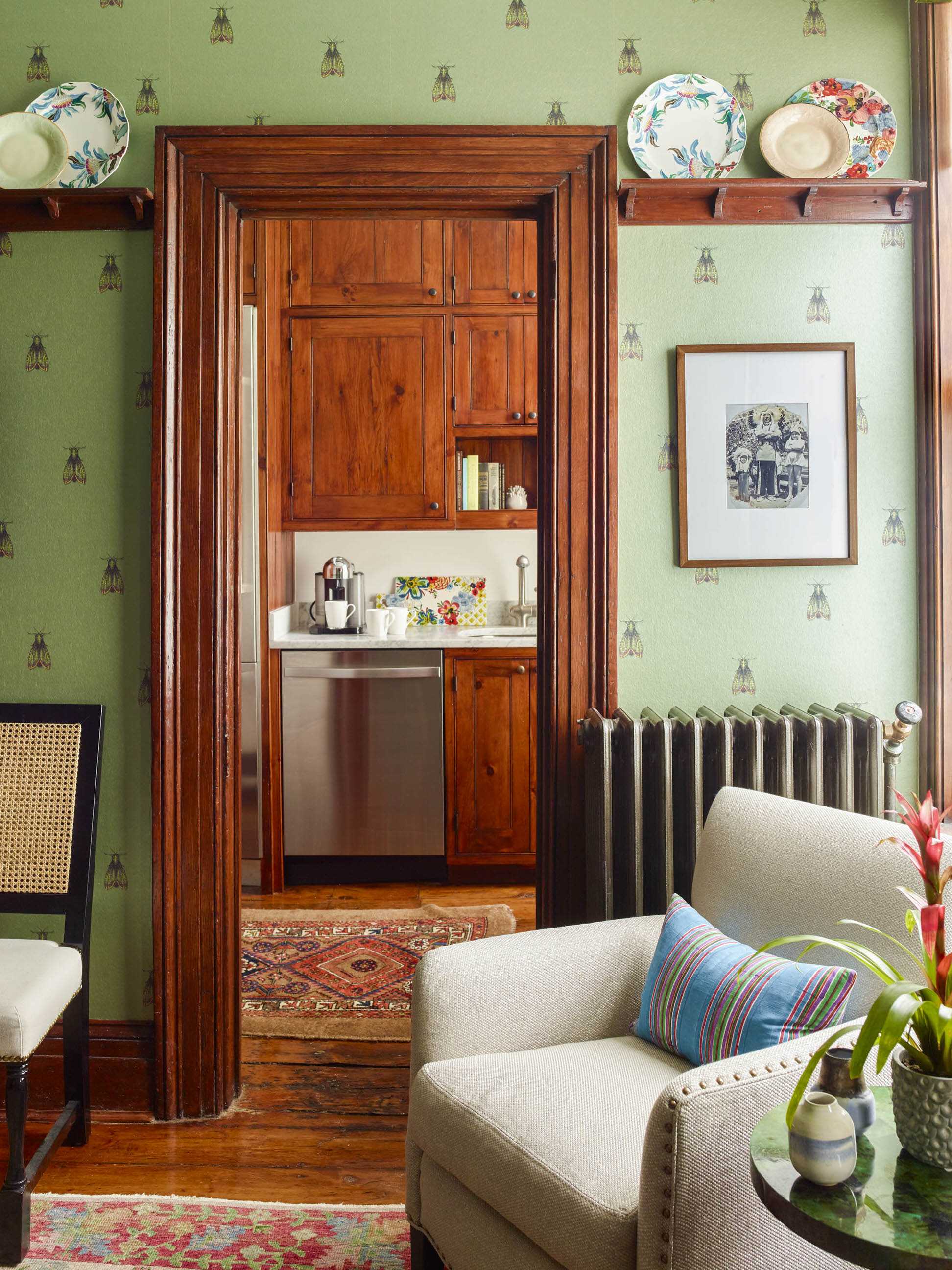
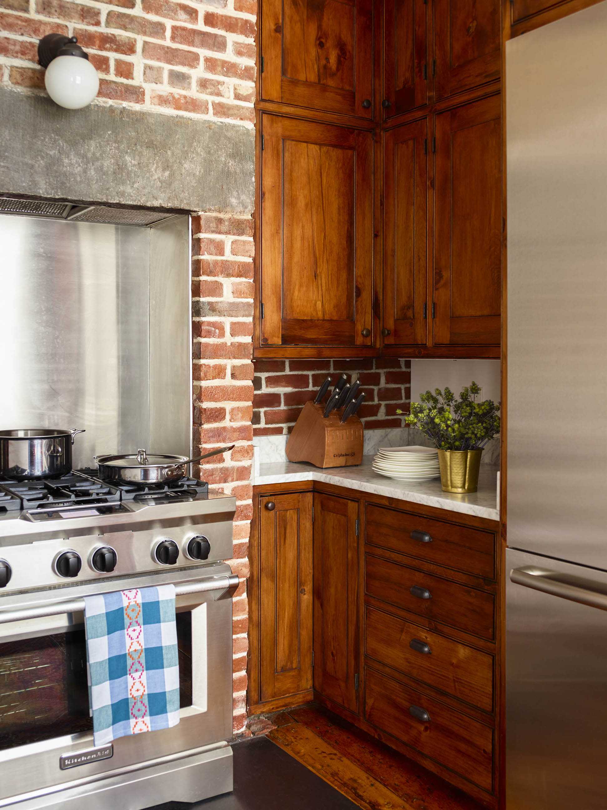
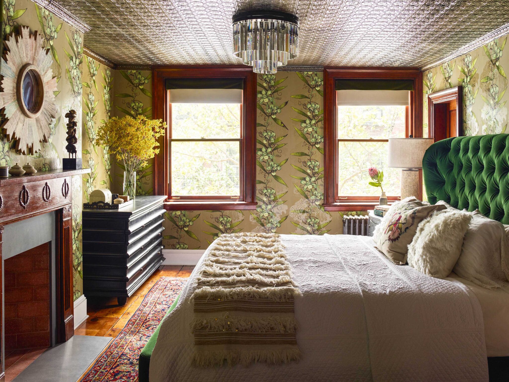
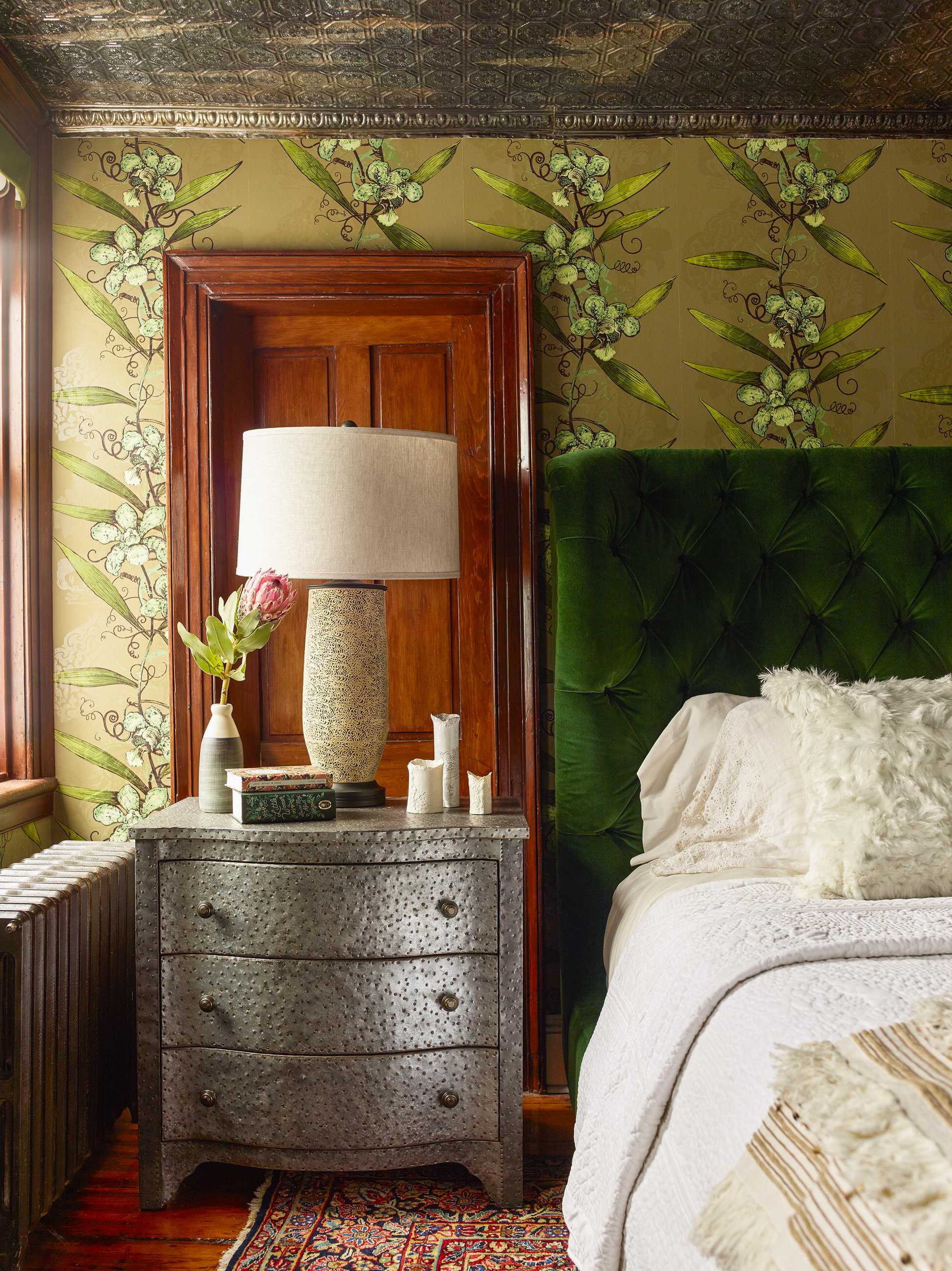
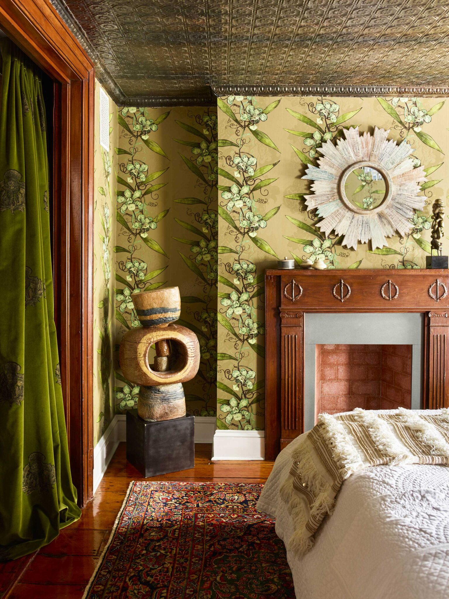
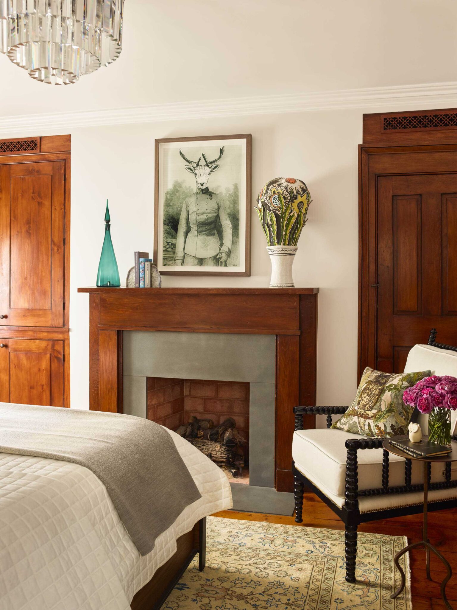
The tin ceiling in the master bedroom, as well as the fireplace, were both original– we added everything else– again with idea of it “being of the era” and with elements (like the wallpaper) adding an edginess. Vibrant patterns are balanced with quiet and calm moments of white and cream on the king sized bed.
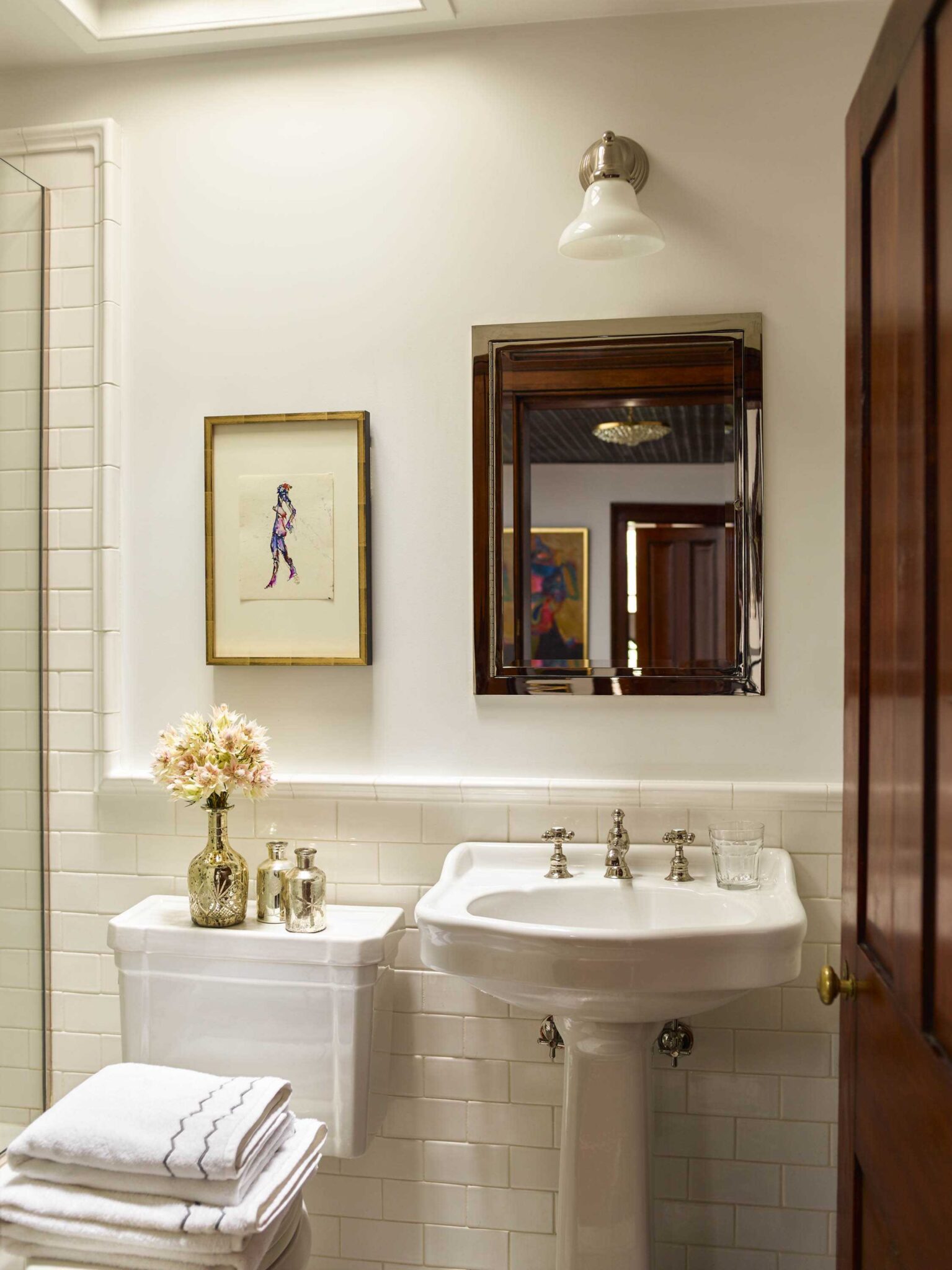
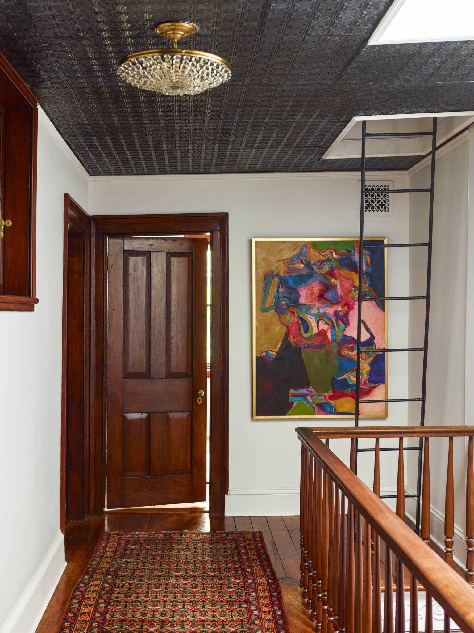
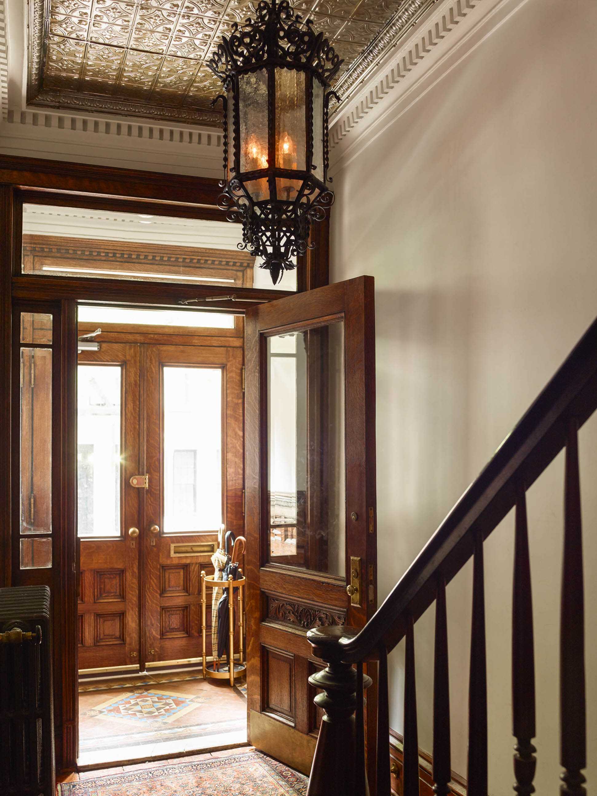
Because we had the wish for the clients to be engaged in their home even before they walked in, we added an antique lighting fixture inside over the original staircase and balustrade. Not only is its beauty evident (and dramatic) from the outside, it also pulls their eye in from the street and then continues to guide them up the stairs. The light’s wattage may be brighter today than in 1899, but what hasn’t changed over all the years is that feeling of home you get when you walk in—that’s timeless.
